Thursday, August 4, 2011

Adjusting levels: when too much is a good thing


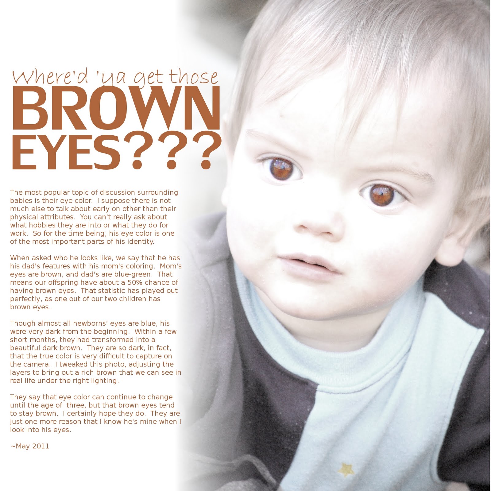
Journaling reads:

The most popular topic of discussion surrounding babies is their eye color. I suppose there is not much else to talk about early on other than their physical attributes. You can't really ask about what hobbies they are into or what they do for work. So for the time being, Thomas' eye color is one of the most important parts of his identity.

When asked who he looks like, we say that he has his dad's features with his mom's coloring. Mom's eyes are brown, and dad's are blue-green. That means our offspring have about a 50% chance of having brown eyes. That statistic has played out perfectly, as one out of our two children has brown eyes.

Though almost all newborns' eyes are blue, his were very dark from the beginning. Within a few short months, they had transformed into a beautiful dark brown. They are so dark, in fact, that the true color is very difficult to capture on the camera. I tweaked this photo, adjusting the layers to bring out a rich brown that we can see in real life under the right lighting.

They say that eye color can continue to change until the age of three, but that brown eyes tend to stay brown. I certainly hope they do. They are just one more reason that I know he's mine when I look into his eyes.

~May 2011


I came up with this image of his face purely through experimentation. I was playing around with some of my photos, adjusting the color levels to see what I could come up with.

Here is what the original photo looks like:
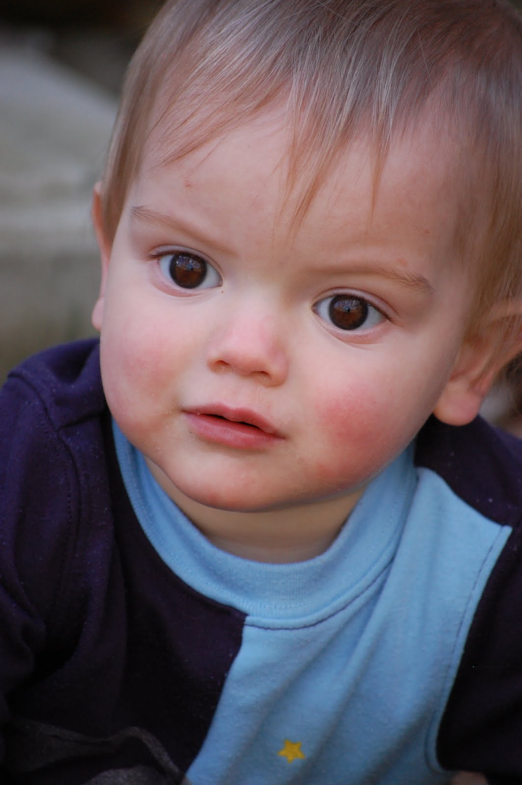


As you can see, his irises appear very dark, almost black. That changed drastically to my surprise as I adjusted the levels and contrast. To get this effect, I first adjusted the levels (color > levels). I slid the middle arrow down to 2.0. This left the photo a little muddy. To bring out more color in the eyes, I increased the contrast to +43 (color > brightness/contrast). Lastly, I lowered the saturation of the entire photo except the eyes because I didn't want his blue shirt to detract from the “brown” mood.

Levels is a tool that adjusts the brightness of a photo. One can use levels to stretch the histogram, making the brightest parts brighter and the darkest parts darker. The trade-off is that you can lose detail by reducing the number of tones in the image. Rather than producing a soft gradient of color, adjusting the levels too much can lead to “posterization,” showing stark lines in between color values. Professional photographers use levels to make minor adjustments on their photos. The general rule is that if it is noticeable, you've gone too far. Of course, I don't follow that rule. I'm a scrapbooker, not a professional photographer.

Indeed, editing photos can destroy details and make them look fake. Yet when using the software to create art, one can use these tools to their fullest extent. It's kind of liberating, actually. I think of it as using broad brush strokes to paint an image. No one says Monet's paintings are unrealistic. Duh, they're supposed to be!

As you can see, I lost details in the face with my edits. But I thought it worked well with this layout. The eyes came out so bright, you should know what the page is about before reading the title (I hope). It turned out to be a perfect image for the words I wanted to say about his intense eye color.

There is no magic formula to creating an effect. Every photo is different, and there are an infinite number of ways to adjust them. By playing with photos, I was able to discover a great image to go along with some words I wanted to express. The lesson I learned is that great things can happen through experimentation. I always remind myself that there are no wasted supplies in digital scrapbooking. The worst that can happen is that I don't order a print!

Thursday, July 28, 2011

Using a quote


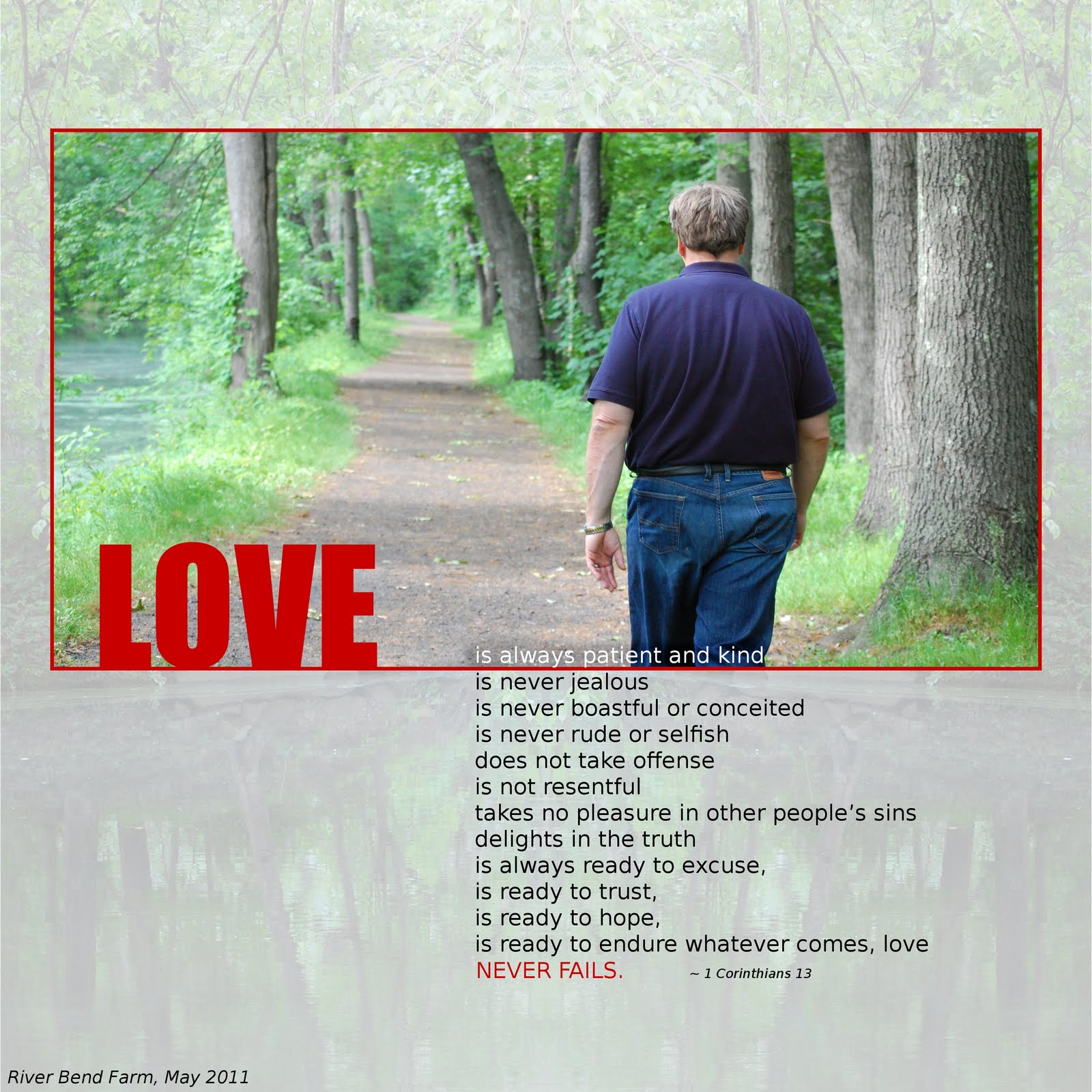
“Love is always patient and kind; it is never jealous, love is never boastful or conceited; it is never rude or selfish; it does not take offense, and is not resentful. Love takes no pleasure in other people’s sins but delights in the truth; it is always ready to excuse, to trust, to hope, and to endure whatever comes. Love never fails.” 1 Cor. 13

There are so many beautiful quotes out there. They come from popular literature, the Bible, music lyrics, and many from unknown sources that seem to have caught on. Quotes are great for scrapbook journaling. They solve two problems – it helps us remember our favorite quotes and it gives us something to say with a photo we love.

I took this photo of my husband walking on a trail by a river near our house. He's a bit camera shy, so I had to be sneaky. He though I had stopped to photograph a turtle in the river. Little did he know that I was trying to shoot him walking on the trail.

I wanted to make a layout featuring this photo, but I wasn't sure what to write. The Bible quote from 1 Corinthians 13 came to mind. It is probably the most quoted Bible verse, as it is often included in wedding ceremonies. I thought it worked well with this photo because it portrays love as a continuous walk, not a state of being.

The quote from 1 Corinthians 13 is very poetic. It has a parallel structure made up of phrases starting with the word “love.” I chose to emphasize that word and put the journaling in a list form, emphasizing the last phrase, “love never fails.”

The background image is from that same river. I made it into a mirror image to make in symmetrical.

I like this quote because it helps to remind me what I'm supposed to be doing. But quotes don't always have to be serious. They can also be fun or humorous. Even a cliche can be given new life with the right photo and layout.

Though original journaling is great, there is nothing wrong with borrowing. In fact, I like to call it “collaborating.” Just make sure you cite your sources, as my old teachers would have said.

Thursday, July 21, 2011

Blending photos with papers


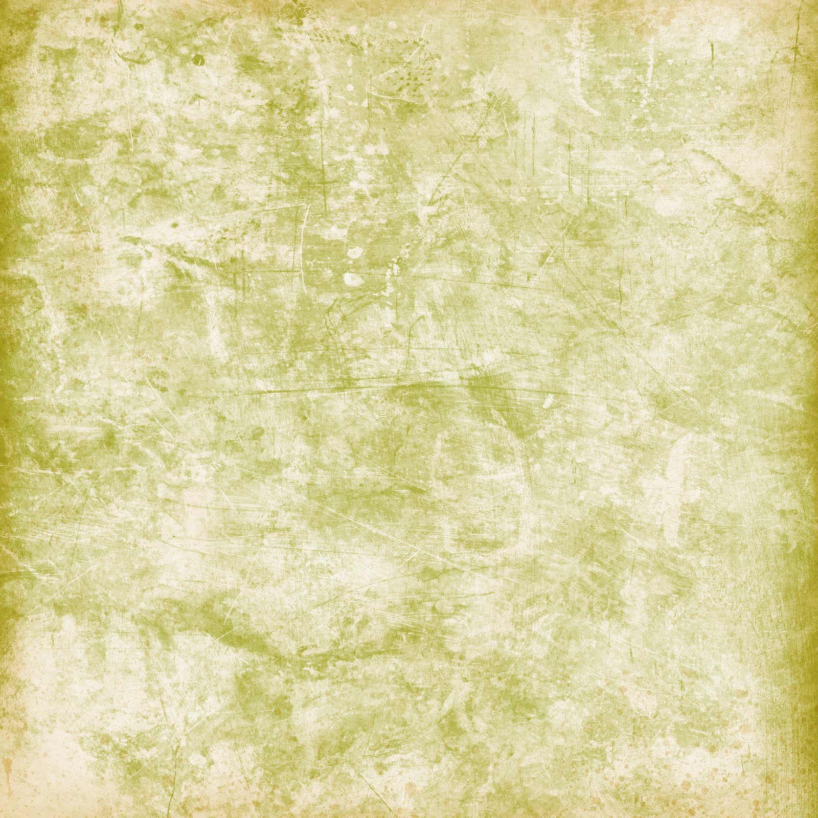
The paper, in it's original form, was created by Katie Pertiet. Of course, the word “paper” is a crossover from traditional scrapbooking that involved actual paper. “Paper” in digital scrapbooking would more accurately be called “digital paper.” It is actually a pattern or texture that comes in the form of a digital image.

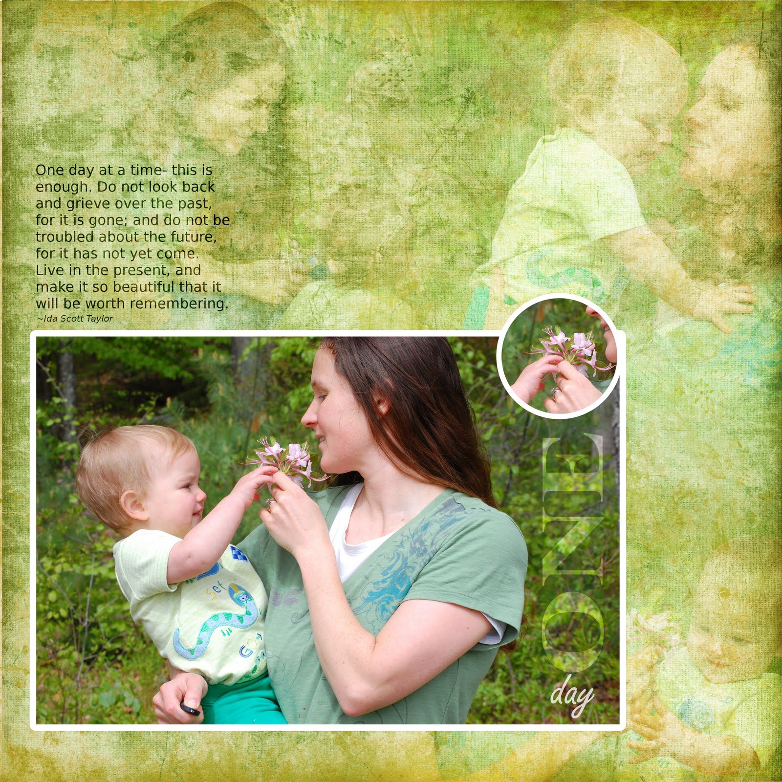
I've seen many digital scrapbook artists blend photos with papers. It looked like fun but I hesitated to try it because I think that great photos should not be messed with. Yet I have gotten around this issue, as shown above, by keeping the main photo untouched and designing a background of textured images.

I took these photos a few months ago when I was home alone with my son. If you're wondering how I got those photos by myself, look at my right hand at the bottom of the picture (oops!) I used a flower to try to get him to smile. I know that's not very boyish, but I thought it was cute.

The “how to”

Blending photos with paper is a trial and error process. For this particular layout, I used four different background layers below the photo. The original paper created by Katie Pertiet looked like this:


The texture was not dense enough for this layout, so I had to tweak it a bit. The first layer is a black and white copy of the paper (to tone down the green a bit). The second layer is the original layer with the layer mode set to “overlay.” The third layer is a duplicate of the second, with the layer mode set to “darken only.” The fourth layer is the same as the third with a mirror flip (to make the texture more dense). On top of these background layers are the photos set to “overlay.”

And there it is! Now, I'm always looking for ways to blend images with papers. Through experimentation, I've come up with lots of crazy stuff!