Friday, September 30, 2011
Creating your own borders
As a general rule of thumb, photos in a collage should have borders around them. The pages look much more elegant and really stand apart from a simple photo album. A straight line works fine, but I like to change it up sometimes.
There are plenty of digital borders available for purchase, but I'd rather make my own to save a little money and challenge the right side of my brain. All I do is make a selection around the photo, and do a stroke selection with the paintbrush (edit > stroke selection). You can pick any color and change the brush dynamics to come up with some fun and original lines. You can make anything from a straight dotted line to a rough edge simply by adjusting the jitter and spacing in the brush dynamics dialog box.
I did some experimentation and discovered a way to make borders that look torn, as shown above. I used a simple circle brush, added jitter to get the rough edges, then erased the inside part.
I took these photos of my husband and daughter at Beavertail in Jamestown, RI. I love taking pictures in open parks where I can use the sky to create a seamless background. It's great for portraiture and really makes the faces stand out.
On a personal note, I like looking at photos that show my daughter enjoying her daddy. My husband's parenting style is old school, and he doesn't tolerate disobedience. This is a difficult position to take in today's society, which says that we shouldn't do anything that makes our kids feel bad. They say it damages their self-esteem and causes mental illness later in life. Yet when I see my daughter's face totally enthralled with her father, I know that common wisdom isn't always right.
I wrote a few words to go with the collage:
A few smiles,
Lots of hugs,
And plenty of giggles.
What more could a man want from his little girl?
Friday, September 23, 2011
Photo card design
And now for something completely different --- photo cards! Photo card design is a natural crossover from digital scrapbooking, as it uses the same materials and skills. Just like traditional scrapbookers become card makers because the already have the paper, digital scrapbookers should become photo card designers as well. Photo cards have become popular for holiday greetings, birth announcements, and party invitations. Here is a party invitation I made for my daughters' (gasp!) third birthday.
Though Snapfish and Shutterfly provide ready-made templates, I think it's much more fun to design my own. And it's CHEAP, I might add. I create them in 4x6 format, upload them to Snapfish, and order them just like I would any 4x6 picture. They run about 10 to 15 cents a piece including shipping (or less if you have a coupon). I would pay more than that in the store for a stack of generic invitations.
I have much more flexibility when I design my own, as well. For this card, I wanted to show a progression of her from birth to age three. I had seen it done once before and I loved the idea. The 4x6 size gave me just enough room to include three small photos under the text. The one-year-old photo with frosting smeared all over her face is a little goofy, but it goes with the birthday theme.
The main photo shows one of the rare instances in which she was looking at me and smiling just long enough for me to focus and shoot. Just as a quick technical note, I took it with my 50mm/1.8 Nikon lens. It takes crystal clear shots under indoor lighting. For just over $100, it was a great investment.
I also love photo cards because it's an opportunity to distribute pictures to friends and family. Of course, people who aren't very close to my family probably will not keep it, but that's perfectly fine (did I mention they are CHEAP).
There is also a business opportunity in photo card design. I've heard of companies that design custom-made photo cards for people. Now that I have a little practice myself, maybe I could start making them for friends. Then I can see where that leads. Thanks for looking!
Friday, September 16, 2011
Kids say the darndest things
In the words of Bill Cosby, “kids say the darndest things.” The things that kids say are so entertaining, in fact, that a whole show was made about interviews with these kids. Yet I don't need to turn on the TV to enjoy listening to kids. I have a three-year-old that makes me laugh every day with the things she says. The sad thing is, though, that she will stop saying these things one day and we will quickly forget that she ever said them at all. Occasionally, something will remind me of something funny she used to say for awhile and then suddenly stopped. That gave me the idea to keep a record of the “darndest” things she says.
One great way to do this is to do an “interview” with the child and present it in the style of a magazine article. This is one of the easiest layouts to do and it gets your kid involved, too! Just sit down with her and ask a few questions about herself and her family. Favorite colors, animals, and food are the obvious ones. I also had some fun quizzing her about people's ages and other facts. It's amazing how confidently she gives me wrong answers! Then I'll ask the same question later and she'll give me a different answer just as confidently.
Though the answers are cute and entertaining, I think adults can learn something from them, too. For instance, most adults are preoccupied with age. I, myself, worry about my fast-approaching thirtieth birthday, as if me as a thirty-something woman is vastly different from me as a twenty-something woman. Yet my daughter said I was 45 years old, then the next minute said I was 10. To her, I'm just mom. Maybe we should all just see each other in the roles we fulfill and ignore age-related expectations and stereotypes.
For the visual, I included a little collage of photos. She still won't look at the camera and smile long enough for me to get a decent picture, but that's OK. I'll take what I can get and treasure them just the same. For this layout, the silly faces actually went well with the silly conversation.
This is something I could do every six months or so. Of course, I'll have to ask her more advanced questions as her little mind grows. I hope she doesn't get too smart too fast, though. I kind of like her as she is.
Here's my interview with my daughter:
How old are you? 3
How old is mommy? 45
How old is daddy? 10
What does daddy do for work? Makes money so we can eat!
Does he have a computer at work? No!
What did mommy do before you were here? I don't know.
Did mommy work? No, mommy doesn't go to work.
Did mommy go to school? No!
What time is it? 11:30
What day of the week is it? I don't know.
What day of the week do you go to church? Thursday.
What is your favorite color? Red.
What is your favorite book? I-Spy book.
What is your favorite animal? Wildebeest.
What's your favorite food? Noodles!
What do you like to do with mommy? Play with cars and go to the playground.
Who's mommy's mommy? Grandma.
Who's mommy's daddy? Grandpa.
What's your favorite movie? I went to the big room with the big screen.
What movie did you see on the big screen? Blue and Jewel.
Do you shake your tail feathers? No!
Why not? I have a butt!
What do you do at your auntie's? I eat macaroni.
What else? I eat macaroni.
Anything else? I eat macaroni.
How old is mommy? 10
How old is daddy? 60
Friday, September 9, 2011
What to do with those pictures
I've been practicing photography over the past few months, and occasionally I get an interesting shot. Then the question arises, “now what do I do with it?” My solution is to figure out a way to make it into a scrapbook layout. I could throw it down on the page and report the who, what, when, where, and why like a newspaper journalist. However, I'd rather just write about a topic of interest and use the photo to complement the journaling.
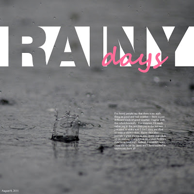
I took this photo from the inside of our garage during a rare violent sun shower. I say rare because here in New England, rain usually comes as an icky, cold drizzle that lasts all day long. This rain, on the other hand, came down heavy but lasted only about 15 minutes before shopping abruptly. That gave me just enough time to grab my camera, set it up, and get some shots.
Taking photos of raindrops is all about luck. Of course, my “luck” was improved with a 300mm lens and a camera that can shoot 6 frames per second. I just held the shutter button down as the camera snapped away as violently as the rain hit our driveway. Out of about 100 shots, this was one of the few ones that caught a drop in focus. I added contrast in the GIMP to make it stand out (Color > Brightness/contrast).
I used this photo to write about rainy days in general. The journaling reads:
I've heard people say that there is no such thing as good and bad weather -- there is just different kinds of good weather. I agree with this wholeheartedly. For instance, I'd much rather jog in the rain than jog in the hot sun. I just need to make sure I don't carry my iPod or wear a white t-shirt. Rainy days also provide a great excuse to stay inside and catch up on reading or engage in my indoor hobbies (like scrapbooking). Indeed, I wouldn't want every day to be the same and I have learned to appreciate them all.
I believe that there is always something to write about any picture. If it doesn't come to me right away, I'll put it away for a month or two and then come back to it. These photos are meant to be used, not to just sit on memory cards. Thanks for looking!
Friday, September 2, 2011
Fun angles
Laying out photos crooked is a cheap trick but I like to use it once in a while. Angled photos can be disorienting, as it is not immediately clear which way is up and which way is down. That's why they can be used to convey a sense of motion.
Here, my daughter and my cousin's son were enjoying a bumpy ride together around the yard. There wouldn't have been anything wrong with putting them straight, but I thought that would have been a little boring.
Many wedding photographers do artsy shots by holding the camera at an angle. Some people don't like crooked pictures, even when it is done intentionally. My husband sees those photos, frowns, and says, “it's not straight.” I guess this technique isn't for everyone.
Perhaps the trick for me is knowing when NOT to angle photos, namely when there is a horizon in the background. The ocean, especially, should be straight. But when it's two little kids being jostled around in the backyard, I think I can mix it up a bit.
To continue with the diagonal theme, I put my journaling diagonal as well. It reads:
Your second cousin Aiden is just three months older than you. When you were a newborn, that three months seemed like a big difference. Now that your older, though, that three months seems like nothing. Here you are at his third birthday party. You two played together the whole time just like best friends. Yet it was sad for me to think that in just a few short months, my baby would be turning three.
There it is. I hope that I don't give anyone a neck ache. But when you do a layout every day like me, you have to jazz it up a little once in a while. Thanks for looking!
Subscribe to:
Posts (Atom)