
Making a layout with three or more photos is always a challenge. I don't like to shrink photos because the subject can become too small and can get lost on the page. Instead, I try to crop each photo down to only the most essential part. If nothing else, I'd rather include pieces of photos than simply a collection of miniature images that the viewer can barely see.
So how should one arrange the images on the page? Camera viewfinders are the shape of a rectangle (approximately a 1:1.5 ratio). Yet there is no reason why we have to crop in the shape of a rectangle. In fact, laying all my pages out in a grid would get boring after awhile. Instead, I have found that there are many different ways to arrange photos in a visually pleasing way.
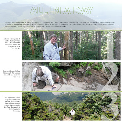
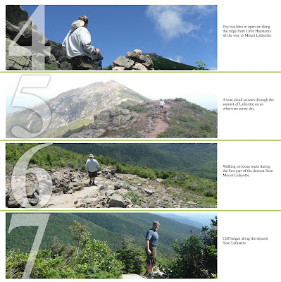
For the layout above, I wanted to show the diversity of terrains we covered back in July on the Franconia Notch ridge trail. Here's my description as it is written on the page:
It was a 9 mile hike that took us almost as many hours to complete. Yet it wasn't like spending the whole day at the gym. On the contrary, it seemed like there was something new around every corner. Covering 4,500 vertical feet, we started in the woods but eventually crossed over the tree line where the air became thin and vegetation sparse. Here is a sample of the variety of scenery we covered, all in a day's hike!
I wanted to include seven images on a two-page spread. I found that by cropping them into strips, I was able to show both my husband and the surrounding scenery. Most of the cropped part was just sky, anyway.
After creating this layout, I read a tip from a photographer that suggested we could create “fake panoramas” by simply cropping your landscape photos like this. That seems a little cheesy, but if you want to call it a panorama, go ahead.
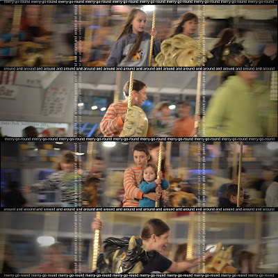
I used the stripe layout for another scene – a merry-go-round. I thought the arrangement worked well to show horizontal motion:

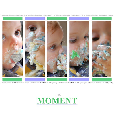
I've also done vertical stripes, such as this layout I did for my son's first birthday this past spring:

There are lots of different ways to arrange photos on a page. I try to think outside of the box (literally) and try all different arrangements. Thanks for looking!

No comments:
Post a Comment