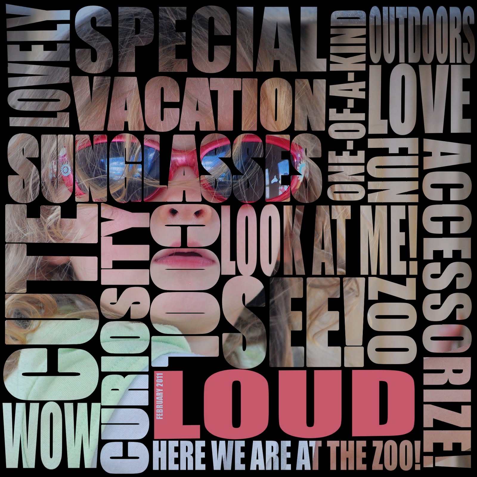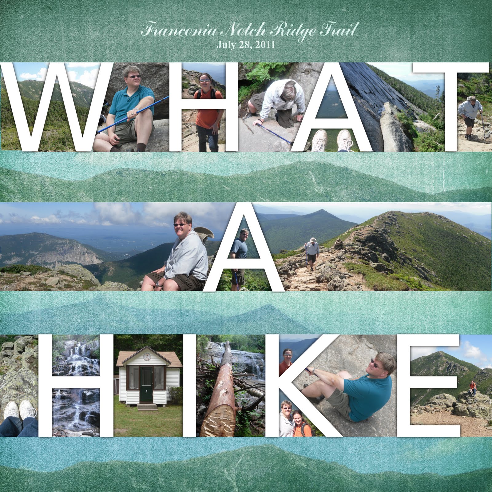
I am always looking for ways to creatively combine words and pictures. Here is my latest one. It's not completely original, though. I got the idea from a page of National Geographic in which they used a similar technique to display a collage of photos.
These photos are from the long nine mile, 4,500 ft climb we completed last month in the White Mountains. The trail took us to the summit of Little Haystacks mountain, across the summit of Mt. Lincoln, then to the summit of Lafayette Mountain. I got lots of great pictures and I've done several layouts already. Most are full-page photos of the great views from the top of the world. In this layout, though, I wanted to include the other photos I took along the way as well.
This technique works well with very short phrases. Even with the words “what a hike,” I used 18 photos. If I used any more words than that, the photos would be too small and the page would become too cluttered. Even as it is, I had a hard time fitting photos into the middle of the “K” and “A's.”
The font is important for this layout. Keep in mind that the lines of the letters frame the photos, so keep it thin and simple. I used the font “sans” here. Sans is a thin font without the little feet at the top and bottom, leaving more room for the photos.
Inevitable, the white text blends into the light parts of the photos. To fix this, I just duplicated the text layer, turned it black, and blurred it enough to get a very soft outline around the letters. Look at the top left of the “T.” That was completely invisible until I added that outline.
After I put the photos inside the lettering, my husband came up behind me and said that it would look better with pictures between the lines of text. I'm not sure if he really meant that it would look better artistically or that it is more economical, given that I pay for prints by the square foot. This threw me off a little, because I had intended to leave those spaces blank. I thought that if I put photos there, the page would become a crowded mess. My solution was to include photos of the horizon and overlay them on top of a textured digital paper (from Lauren Reid Designs). I think it makes good use of that space without taking emphasis away from the text.
This is just one more way to lay out a collage of photos in a fun and interesting way. Enjoy!