
Journaling reads:
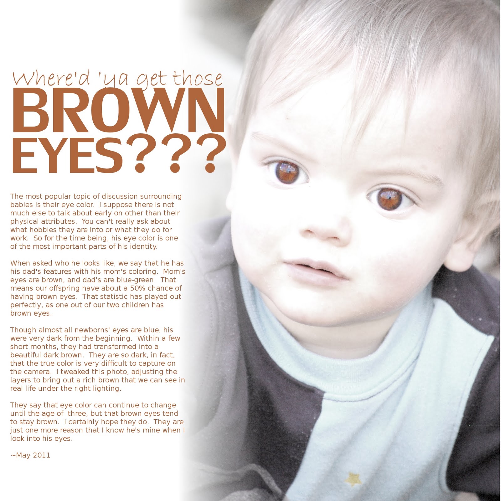
The most popular topic of discussion surrounding babies is their eye color. I suppose there is not much else to talk about early on other than their physical attributes. You can't really ask about what hobbies they are into or what they do for work. So for the time being, Thomas' eye color is one of the most important parts of his identity.
When asked who he looks like, we say that he has his dad's features with his mom's coloring. Mom's eyes are brown, and dad's are blue-green. That means our offspring have about a 50% chance of having brown eyes. That statistic has played out perfectly, as one out of our two children has brown eyes.
Though almost all newborns' eyes are blue, his were very dark from the beginning. Within a few short months, they had transformed into a beautiful dark brown. They are so dark, in fact, that the true color is very difficult to capture on the camera. I tweaked this photo, adjusting the layers to bring out a rich brown that we can see in real life under the right lighting.
They say that eye color can continue to change until the age of three, but that brown eyes tend to stay brown. I certainly hope they do. They are just one more reason that I know he's mine when I look into his eyes.
~May 2011
I came up with this image of his face purely through experimentation. I was playing around with some of my photos, adjusting the color levels to see what I could come up with.
Here is what the original photo looks like:
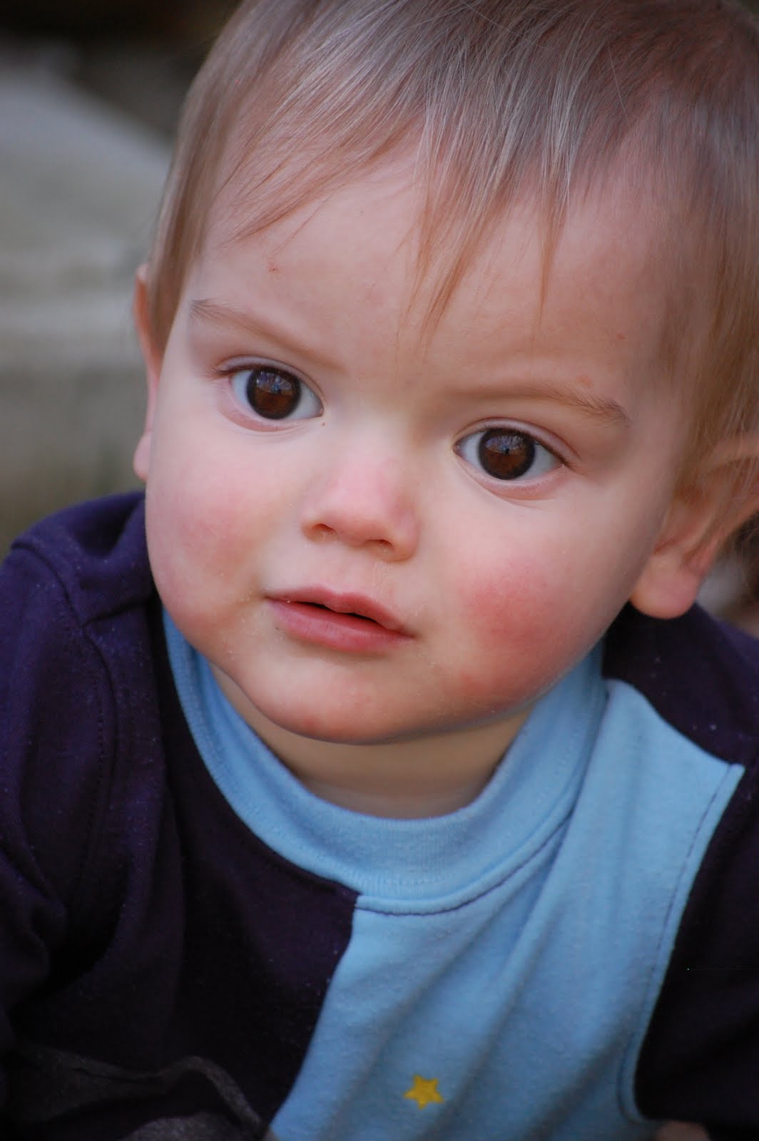
As you can see, his irises appear very dark, almost black. That changed drastically to my surprise as I adjusted the levels and contrast. To get this effect, I first adjusted the levels (color > levels). I slid the middle arrow down to 2.0. This left the photo a little muddy. To bring out more color in the eyes, I increased the contrast to +43 (color > brightness/contrast). Lastly, I lowered the saturation of the entire photo except the eyes because I didn't want his blue shirt to detract from the “brown” mood.
Levels is a tool that adjusts the brightness of a photo. One can use levels to stretch the histogram, making the brightest parts brighter and the darkest parts darker. The trade-off is that you can lose detail by reducing the number of tones in the image. Rather than producing a soft gradient of color, adjusting the levels too much can lead to “posterization,” showing stark lines in between color values. Professional photographers use levels to make minor adjustments on their photos. The general rule is that if it is noticeable, you've gone too far. Of course, I don't follow that rule. I'm a scrapbooker, not a professional photographer.
Indeed, editing photos can destroy details and make them look fake. Yet when using the software to create art, one can use these tools to their fullest extent. It's kind of liberating, actually. I think of it as using broad brush strokes to paint an image. No one says Monet's paintings are unrealistic. Duh, they're supposed to be!
As you can see, I lost details in the face with my edits. But I thought it worked well with this layout. The eyes came out so bright, you should know what the page is about before reading the title (I hope). It turned out to be a perfect image for the words I wanted to say about his intense eye color.
There is no magic formula to creating an effect. Every photo is different, and there are an infinite number of ways to adjust them. By playing with photos, I was able to discover a great image to go along with some words I wanted to express. The lesson I learned is that great things can happen through experimentation. I always remind myself that there are no wasted supplies in digital scrapbooking. The worst that can happen is that I don't order a print!
No comments:
Post a Comment