Tuesday, December 27, 2011

Putting silly group shots on the page


With group shots, many people like to do a serious picture and then a silly picture. Sometimes people make funny faces, stick their tongues out, or jump in the air. Here, my friends decided to raise their hands up.

Pictures with lots of people in them look much better when printed large. Individual faces are hard to make out in a 4x6 inch print, but are easier to see when printed in a larger size. I wanted to include both pictures but make them large enough to see the faces. My solution was to fill most of the page with the serious picture and put the fun picture in the background.

This was very easy to accomplish in the GIMP. I simply put the fun shot over a black background and added a gradient mask to make it fade at the bottom. I wanted to emphasize the serious photo, so I put a white border around the main photo and lowered the opacity of the background photo to about 70%.

I put this layout on the wall so guests can see themselves and their friends. Maybe someday I'll actually catch everyone smiling and looking at the camera at the same time.

Friday, November 25, 2011

Creativity is allowing ourselves to make mistakes


“Creativity is allowing yourself the freedom to make mistakes, art is knowing which ones to keep.” - Author Unknown

Anyone who has played with Photoshop knows that you can do some crazy things with photos. We are only limited by what we can imagine.

I sometimes like to play with photos to see what I come up with. This quote that I found in a photography book strikes the heart of what I am trying to do. When experimenting, I know that much of what I come up with will be garbage. Yet in the digital age, we can just hit the “delete” button and start again.

Through experimentation, sometimes we come up with something we like. Here, I captured my daughter hugging my husband at the beach. The original photo looks like this:


I reduced the image to shapes and a few details in her face. I kind of like what I came up with and decided to keep it. Occasional success inspires me to continue to allow myself to make mistakes. Thanks for looking!

Friday, November 18, 2011

Checklists and Diagrams


Usually, photographers are supposed to isolate their subject. Extraneous items clutter up the photo and take the focus away from the subject. But occasionally, that other “stuff” can help tell a story. We just have to make it look like we included them intentionally. The simple way to do this is to literally point to the items in the picture and say what they mean.

I was just playing around with the camera when I took this photo of my husband while we were on a bike ride this past summer. I thought I was just taking a picture of him sitting on a bench. But when I got home, I noticed that there was more stuff in the picture besides just him. It occurred to me that someone could tell what we were doing even though there was no bike in the picture.

I decided to make this into a checklist-style layout. I pointed to parts of the photo to tell the who, what, when, where, and why. The helmet obviously says that were were on a bike ride. He was also holding a cup of coffee from our destination point, McDonalds. You can tell it's summer because he's wearing shorts. I also pointed to his watch to say that we had left the kids with a babysitter, and his ring to say that we were out on a date.

I added the graph paper in the background to go with the analytical theme.

Do you have photos with lots of “stuff” in them? Use them to help tell the story!

Friday, November 11, 2011

Teasing our little ones


Most pages about babies have a similar theme. “Sweet Baby,” “Beautiful Baby,” and “Adorable” come to mind. I've done plenty of these layouts. Yet while we do love our babies to death, raising children brings about other emotions as well. They make us tired and frustrated and sometimes we just wish they would hurry up and reach the next stage of independence. Shouldn't we tell these stories in our scrapbook as well?

I took this photo of my son this past summer. He knew how to walk, but was just as happy to sit there and look up at me. I liked this photo and I wanted to feature it in a layout. But I had already done many “Sweet Baby” pages (just look at my walls). It was time for a “Pain-In-The-Neck Baby” page. Here's what I wrote about my reluctant walker:

Come on, boy! Get off your butt! You're almost 15 months old, and refuse to walk. Yes, I say refuse because I know you are capable of it. I've seen you walk across a room to get food or to take a toy away from your sister. Yet when I tell you it's time to leave the room, you just stare at me like this. Your expression says, “You expect me to walk? But I'm just a baby. Please carry me, mommy!” But can I really blame you? Who wouldn't want to be carried around everywhere? If only life were so easy. Your sister did the same thing. She didn't walk consistently until she was 15 months old. But you can't be a baby forever just because I'm not pregnant with another sibling. God gave us legs for a reason. It's time to stand up and enter the world of the upright!

Though fun to write about, venting our minor frustrations can be educational as well. My son is now 18 months old and walks just fine. In fact, I had forgotten about this little stage until now. It reminds me how fast each stage goes by, and makes me realize that the little problems I face now will be over and forgotten before I know it. It almost makes me angry at myself for wishing them away. I've learned to just enjoy each stage for what it is... and then joke about it in a scrapbook page!

Friday, November 4, 2011

Poster gifts


With the holidays around the corner, it's time to think about what kind of gift we want to give to our friends and family. I am a big fan of photo gifts because they are personal and thoughtful. Yet digital scrapbookers can take it a step further and add words or decorations.

I took this photo of my sister-in-law and daughter at the zoo a few months ago. My sister-in-law doesn't like pictures of herself, so I thought this one of the back of her head and hand made for a safe gift.

I edited this photo quite a bit to make it look like that. It actually started off like this:


I cropped away some elements at the bottom that we didn't want. That let space at the top. For any forensic people out there, you will be able to tell that the photo is patched and blended up there. I'm guilty as charged, but I can do what I want because it is my picture! It's called artistic license.

This composition left me plenty of room to write the sentiment, “Aunts like you are precious and few.” I added a soft black outline around the text to help it stand out from the photo. Also, I realized afterward that her other four aunts might get offended by saying that aunts like her are "few." I hope they don't take it the wrong way. We need the "few" to be there to rhyme with "you" anyway.

I also spent some time airbrushing the smudge marks on the glass from where all the other visitors had touched. I also played with the part of the photo behind the glass to make the blues richer.

I presented it to her on her birthday in an 11x14 matted frame. Now isn't that better than just buying something in the store?

Friday, October 28, 2011

'Tis sweeter to give than to receive (but receiving is pretty sweet, too)


At birthday parties, it is important to keep track of who gave what gift. And it's not just to write a proper thank you note, either. Reminding my daughter who gave her what gift encourages gratitude and helps her maintain relationships with friends and family that she doesn't see every day.

Rather than keeping a list tucked away in a drawer, why not incorporate it into an attractive layout with a picture? Here, I got a shot of her with her arms wide open in delight as everyone sang “Happy Birthday.”

I tried to make the squares resemble presents. To do this, I simply used digital patterned paper that went with the colors in the photo. I scaled them down to a small size. I used the text circle tool to make the title: “Tis sweeter to give than to receive (but receiving is pretty sweet, too).”

When I order the print, I'll hang it on the wall for awhile as a reminder. Then, when I put the page in a book, we'll have a permanent record of who participated in the celebration.

Friday, October 21, 2011

Putting Facebook in a scrapbook


These days, much of our lives take place on social network sites. I don't know if that's a good or bad thing, but at least I can easily put some of it into our family scrapbook.

I wanted to make a page about what happened on the day my daughter turned three, both in the world and in our family. I included some news headlines and economic data for historical purposes. We also met friends at a playground and had cupcakes (eaten with the candle still intact) and her grandparents celebrated her birthday in Florida without her. It's a little hodgepodge, I know. But the theme was simply October 5, 2011.

Of course, I had to put a picture of my her on Facebook and wish her a happy birthday. Many other friends and family wished her a happy birthday, too. I wanted to include these comments in the layout, and the easiest way to accomplish this was to do a screen shot.

A screen shot is super easy to make. First, hit F11 to make the window full screen. Then hold down Control + “Print Screen.” On my keyboard, it is a little button next to the F12 that says “Prt Scrn.” Then go to the scrapbook page and paste. It's as easy as that.

To get the best resolution for the picture, I pasted my JPEG copy of the photo over the photo within the screen shot. Why use a grainy photo when I have the original copy?

For anyone interested, here is the journaling:

You turn three today. You still love milk and Cherios, but not as much as you love mom, dad, your aunts, and grandma and grandpa. A gallon of milk costs $3.59. A new Honda Odyssey costs $28,225. You could get a 30-year mortgage at 3.8%. Minimum wage is $7.40 per hour. Patriots quarterback Tom Brady makes about $375,000 per game. It was a cloudy day with a high near 67 and a low of 38 degrees. The restaurant Friendly's went bankrupt. Illegal immigrants are granted in-state tuition for state colleges. President Obama is losing popularity and we wonder if he will be on the Democrat ticket next November. The unemployment rate in Rhode Island is 10.8%, and has been over 10% for the last two years. “Contagion” is the biggest movie in the theaters. The iPhone 4S is released. The Red Sox had a bad year and are out of the playoffs, while the Yankees are going strong. The Israelis and Palestinians are still fighting. The world population is slightly under 7,000,000,000. Eighteen people wished you a happy birthday on Facebook, and grandma and grandpa celebrated your birthday without you.

It may seem a little boring now, but in twenty years it will be interesting to look back at what was going on. Thanks for looking!

Friday, October 14, 2011

Arranging Photos in Stripes


Making a layout with three or more photos is always a challenge. I don't like to shrink photos because the subject can become too small and can get lost on the page. Instead, I try to crop each photo down to only the most essential part. If nothing else, I'd rather include pieces of photos than simply a collection of miniature images that the viewer can barely see.

So how should one arrange the images on the page? Camera viewfinders are the shape of a rectangle (approximately a 1:1.5 ratio). Yet there is no reason why we have to crop in the shape of a rectangle. In fact, laying all my pages out in a grid would get boring after awhile. Instead, I have found that there are many different ways to arrange photos in a visually pleasing way.

For the layout above, I wanted to show the diversity of terrains we covered back in July on the Franconia Notch ridge trail. Here's my description as it is written on the page:

It was a 9 mile hike that took us almost as many hours to complete. Yet it wasn't like spending the whole day at the gym. On the contrary, it seemed like there was something new around every corner. Covering 4,500 vertical feet, we started in the woods but eventually crossed over the tree line where the air became thin and vegetation sparse. Here is a sample of the variety of scenery we covered, all in a day's hike!

I wanted to include seven images on a two-page spread. I found that by cropping them into strips, I was able to show both my husband and the surrounding scenery. Most of the cropped part was just sky, anyway.

After creating this layout, I read a tip from a photographer that suggested we could create “fake panoramas” by simply cropping your landscape photos like this. That seems a little cheesy, but if you want to call it a panorama, go ahead.

I used the stripe layout for another scene – a merry-go-round. I thought the arrangement worked well to show horizontal motion:


I've also done vertical stripes, such as this layout I did for my son's first birthday this past spring:


There are lots of different ways to arrange photos on a page. I try to think outside of the box (literally) and try all different arrangements. Thanks for looking!

Friday, October 7, 2011

Recording "firsts"


Many parents set out out do a baby book when their first child is born. Usually, a baby book is a record of “firsts” --- the first time he rolled over, the first time he crawled, the first word, the first haircut, ect. Yet many good intentions fall to the wayside after a few months, and many parents don't do one at all for subsequent children. So why don't they take a minute or two to write down these events during their precious one's fleeting childhood? My theory is that they get bored. A date is just a number, and numbers by themselves are boring and devoid of meaning.

That's why I try to elaborate just a little, telling a simple story about these important, though inevitable events. It's more fun for me and will be more interesting for my children to read later on. This also helps remind me to get photos of the firsts (though for motor skills, the actual picture may be of the second, third, or fourth but you get the idea).

I snapped a few pictures as my husband cut my son's hair for the first time. I tried to make the title look like a sign that you might see at a barber shop. I just grabbed a generic looking barber shop logo from the internet and added the name above it. Here's the story:

We had decided that your hair had gotten too long when we could barely see your ears. It was kind of a spontaneous event, actually. Your daddy was playing with you in bed and decided to trim "just around the ears." Of course, that turned into a full haircut. Surprisingly, you hardly squirmed at all! In fact, it looked as though you enjoyed being groomed (look how patiently you are waiting in the photo on the left). The only sad part is that you don't look like such a little baby anymore. I kind of miss the whispy ends that you only see on a new head of hair. You definitely have the little boy look now. The cut ended up a little high in the back, but it wasn't bad for the first try. Besides, there is always next time. If your daddy does all your haircuts for the next 17 years, we'll save enough money to send you to college!

Now isn't that much more interesting than just a date? If nothing else, it motivates me to keep a record the firsts, which is what we are supposed to do anyway.

Friday, September 30, 2011

Creating your own borders


As a general rule of thumb, photos in a collage should have borders around them. The pages look much more elegant and really stand apart from a simple photo album. A straight line works fine, but I like to change it up sometimes.

There are plenty of digital borders available for purchase, but I'd rather make my own to save a little money and challenge the right side of my brain. All I do is make a selection around the photo, and do a stroke selection with the paintbrush (edit > stroke selection). You can pick any color and change the brush dynamics to come up with some fun and original lines. You can make anything from a straight dotted line to a rough edge simply by adjusting the jitter and spacing in the brush dynamics dialog box.

I did some experimentation and discovered a way to make borders that look torn, as shown above. I used a simple circle brush, added jitter to get the rough edges, then erased the inside part.

I took these photos of my husband and daughter at Beavertail in Jamestown, RI. I love taking pictures in open parks where I can use the sky to create a seamless background. It's great for portraiture and really makes the faces stand out.

On a personal note, I like looking at photos that show my daughter enjoying her daddy. My husband's parenting style is old school, and he doesn't tolerate disobedience. This is a difficult position to take in today's society, which says that we shouldn't do anything that makes our kids feel bad. They say it damages their self-esteem and causes mental illness later in life. Yet when I see my daughter's face totally enthralled with her father, I know that common wisdom isn't always right.

I wrote a few words to go with the collage:

A few smiles,
Lots of hugs,
And plenty of giggles.
What more could a man want from his little girl?

Friday, September 23, 2011

Photo card design


And now for something completely different --- photo cards! Photo card design is a natural crossover from digital scrapbooking, as it uses the same materials and skills. Just like traditional scrapbookers become card makers because the already have the paper, digital scrapbookers should become photo card designers as well. Photo cards have become popular for holiday greetings, birth announcements, and party invitations. Here is a party invitation I made for my daughters' (gasp!) third birthday.

Though Snapfish and Shutterfly provide ready-made templates, I think it's much more fun to design my own. And it's CHEAP, I might add. I create them in 4x6 format, upload them to Snapfish, and order them just like I would any 4x6 picture. They run about 10 to 15 cents a piece including shipping (or less if you have a coupon). I would pay more than that in the store for a stack of generic invitations.

I have much more flexibility when I design my own, as well. For this card, I wanted to show a progression of her from birth to age three. I had seen it done once before and I loved the idea. The 4x6 size gave me just enough room to include three small photos under the text. The one-year-old photo with frosting smeared all over her face is a little goofy, but it goes with the birthday theme.

The main photo shows one of the rare instances in which she was looking at me and smiling just long enough for me to focus and shoot. Just as a quick technical note, I took it with my 50mm/1.8 Nikon lens. It takes crystal clear shots under indoor lighting. For just over $100, it was a great investment.

I also love photo cards because it's an opportunity to distribute pictures to friends and family. Of course, people who aren't very close to my family probably will not keep it, but that's perfectly fine (did I mention they are CHEAP).

There is also a business opportunity in photo card design. I've heard of companies that design custom-made photo cards for people. Now that I have a little practice myself, maybe I could start making them for friends. Then I can see where that leads. Thanks for looking!

Friday, September 16, 2011

Kids say the darndest things


In the words of Bill Cosby, “kids say the darndest things.” The things that kids say are so entertaining, in fact, that a whole show was made about interviews with these kids. Yet I don't need to turn on the TV to enjoy listening to kids. I have a three-year-old that makes me laugh every day with the things she says. The sad thing is, though, that she will stop saying these things one day and we will quickly forget that she ever said them at all. Occasionally, something will remind me of something funny she used to say for awhile and then suddenly stopped. That gave me the idea to keep a record of the “darndest” things she says.

One great way to do this is to do an “interview” with the child and present it in the style of a magazine article. This is one of the easiest layouts to do and it gets your kid involved, too! Just sit down with her and ask a few questions about herself and her family. Favorite colors, animals, and food are the obvious ones. I also had some fun quizzing her about people's ages and other facts. It's amazing how confidently she gives me wrong answers! Then I'll ask the same question later and she'll give me a different answer just as confidently.

Though the answers are cute and entertaining, I think adults can learn something from them, too. For instance, most adults are preoccupied with age. I, myself, worry about my fast-approaching thirtieth birthday, as if me as a thirty-something woman is vastly different from me as a twenty-something woman. Yet my daughter said I was 45 years old, then the next minute said I was 10. To her, I'm just mom. Maybe we should all just see each other in the roles we fulfill and ignore age-related expectations and stereotypes.

For the visual, I included a little collage of photos. She still won't look at the camera and smile long enough for me to get a decent picture, but that's OK. I'll take what I can get and treasure them just the same. For this layout, the silly faces actually went well with the silly conversation.

This is something I could do every six months or so. Of course, I'll have to ask her more advanced questions as her little mind grows. I hope she doesn't get too smart too fast, though. I kind of like her as she is.

Here's my interview with my daughter:

How old are you? 3
How old is mommy? 45
How old is daddy? 10
What does daddy do for work? Makes money so we can eat!
Does he have a computer at work? No!
What did mommy do before you were here? I don't know.
Did mommy work? No, mommy doesn't go to work.
Did mommy go to school? No!
What time is it? 11:30
What day of the week is it? I don't know.
What day of the week do you go to church? Thursday.
What is your favorite color? Red.
What is your favorite book? I-Spy book.
What is your favorite animal? Wildebeest.
What's your favorite food? Noodles!
What do you like to do with mommy? Play with cars and go to the playground.
Who's mommy's mommy? Grandma.
Who's mommy's daddy? Grandpa.
What's your favorite movie? I went to the big room with the big screen.
What movie did you see on the big screen? Blue and Jewel.
Do you shake your tail feathers? No!
Why not? I have a butt!
What do you do at your auntie's? I eat macaroni.
What else? I eat macaroni.
Anything else? I eat macaroni.
How old is mommy? 10
How old is daddy? 60

Friday, September 9, 2011

What to do with those pictures


I've been practicing photography over the past few months, and occasionally I get an interesting shot. Then the question arises, “now what do I do with it?” My solution is to figure out a way to make it into a scrapbook layout. I could throw it down on the page and report the who, what, when, where, and why like a newspaper journalist. However, I'd rather just write about a topic of interest and use the photo to complement the journaling.

I took this photo from the inside of our garage during a rare violent sun shower. I say rare because here in New England, rain usually comes as an icky, cold drizzle that lasts all day long. This rain, on the other hand, came down heavy but lasted only about 15 minutes before shopping abruptly. That gave me just enough time to grab my camera, set it up, and get some shots.

Taking photos of raindrops is all about luck. Of course, my “luck” was improved with a 300mm lens and a camera that can shoot 6 frames per second. I just held the shutter button down as the camera snapped away as violently as the rain hit our driveway. Out of about 100 shots, this was one of the few ones that caught a drop in focus. I added contrast in the GIMP to make it stand out (Color > Brightness/contrast).

I used this photo to write about rainy days in general. The journaling reads:

I've heard people say that there is no such thing as good and bad weather -- there is just different kinds of good weather. I agree with this wholeheartedly. For instance, I'd much rather jog in the rain than jog in the hot sun. I just need to make sure I don't carry my iPod or wear a white t-shirt. Rainy days also provide a great excuse to stay inside and catch up on reading or engage in my indoor hobbies (like scrapbooking). Indeed, I wouldn't want every day to be the same and I have learned to appreciate them all.

I believe that there is always something to write about any picture. If it doesn't come to me right away, I'll put it away for a month or two and then come back to it. These photos are meant to be used, not to just sit on memory cards. Thanks for looking!

Friday, September 2, 2011

Fun angles


Laying out photos crooked is a cheap trick but I like to use it once in a while. Angled photos can be disorienting, as it is not immediately clear which way is up and which way is down. That's why they can be used to convey a sense of motion.

Here, my daughter and my cousin's son were enjoying a bumpy ride together around the yard. There wouldn't have been anything wrong with putting them straight, but I thought that would have been a little boring.

Many wedding photographers do artsy shots by holding the camera at an angle. Some people don't like crooked pictures, even when it is done intentionally. My husband sees those photos, frowns, and says, “it's not straight.” I guess this technique isn't for everyone.

Perhaps the trick for me is knowing when NOT to angle photos, namely when there is a horizon in the background. The ocean, especially, should be straight. But when it's two little kids being jostled around in the backyard, I think I can mix it up a bit.

To continue with the diagonal theme, I put my journaling diagonal as well. It reads:

Your second cousin Aiden is just three months older than you. When you were a newborn, that three months seemed like a big difference. Now that your older, though, that three months seems like nothing. Here you are at his third birthday party. You two played together the whole time just like best friends. Yet it was sad for me to think that in just a few short months, my baby would be turning three.

There it is. I hope that I don't give anyone a neck ache. But when you do a layout every day like me, you have to jazz it up a little once in a while. Thanks for looking!

Friday, August 26, 2011

DIY masks


Masking is a great way to display photos in a scrapbook. It can give the image a dreamy or handmade feel without taking away from the photographic quality of the subject. Many digital scrapbookers buy the masks in a kit, but I've discovered through experimentation in GIMP that that they are super easy to make!

First, get the brush you want. There are lots of free brushes that you can download from the Internet. My favorite site to browse for GIMP brushes is Deviant Art (www.deviantart.com). The brush set I used for this mask is from Akisu-Sama (he wants me to post a link to his website http://silence.carchive.net/)

Though there is a mask tool in the GIMP, I've found that it's just as easy to create a mask as its own layer. First, add a white layer above the photo layer (or whatever color you want your background to be). Set the opacity to about 50% so you can see both the mask and the photo at the same time. Then select the eraser and the brush and erase the part where you want the photo to show through. I added jitter to the brush to get the rugged outline that I wanted.

You can have even more fun by putting words on the mask, as I did here. I had wanted to use these lyrics from a song by the Indigo Girls that came onto my Pandora station:

I've got no worries on my mind
I know what to do
That's to treat you right
And love you kind
Thank you ever on my mind
Love is just like breathing
When it's true
And I'm free in you

In addition to writing them legibly on the photo, I wanted to mix them in with the mask as well. This was super easy. I just duplicated the text layer several times, turned them white, then moved them to random places along the edge of the mask.

Just as a note, we were at Beavertail in Jamestown, RI in this photo. I nice woman came up to us and offered to take our picture. She looked familiar, and after a few questions, I discovered that she was my kindergarten teacher! I can't believe that I recognized someone from when I was 5 years old! Of course, I had to get a picture with her to show my old classmates.


Friday, August 19, 2011

More word art ideas


I am always looking for ways to creatively combine words and pictures. Here is my latest one. It's not completely original, though. I got the idea from a page of National Geographic in which they used a similar technique to display a collage of photos.

These photos are from the long nine mile, 4,500 ft climb we completed last month in the White Mountains. The trail took us to the summit of Little Haystacks mountain, across the summit of Mt. Lincoln, then to the summit of Lafayette Mountain. I got lots of great pictures and I've done several layouts already. Most are full-page photos of the great views from the top of the world. In this layout, though, I wanted to include the other photos I took along the way as well.

This technique works well with very short phrases. Even with the words “what a hike,” I used 18 photos. If I used any more words than that, the photos would be too small and the page would become too cluttered. Even as it is, I had a hard time fitting photos into the middle of the “K” and “A's.”

The font is important for this layout. Keep in mind that the lines of the letters frame the photos, so keep it thin and simple. I used the font “sans” here. Sans is a thin font without the little feet at the top and bottom, leaving more room for the photos.

Inevitable, the white text blends into the light parts of the photos. To fix this, I just duplicated the text layer, turned it black, and blurred it enough to get a very soft outline around the letters. Look at the top left of the “T.” That was completely invisible until I added that outline.

After I put the photos inside the lettering, my husband came up behind me and said that it would look better with pictures between the lines of text. I'm not sure if he really meant that it would look better artistically or that it is more economical, given that I pay for prints by the square foot. This threw me off a little, because I had intended to leave those spaces blank. I thought that if I put photos there, the page would become a crowded mess. My solution was to include photos of the horizon and overlay them on top of a textured digital paper (from Lauren Reid Designs). I think it makes good use of that space without taking emphasis away from the text.

This is just one more way to lay out a collage of photos in a fun and interesting way. Enjoy!

Thursday, August 4, 2011

Adjusting levels: when too much is a good thing


Journaling reads:

The most popular topic of discussion surrounding babies is their eye color. I suppose there is not much else to talk about early on other than their physical attributes. You can't really ask about what hobbies they are into or what they do for work. So for the time being, Thomas' eye color is one of the most important parts of his identity.

When asked who he looks like, we say that he has his dad's features with his mom's coloring. Mom's eyes are brown, and dad's are blue-green. That means our offspring have about a 50% chance of having brown eyes. That statistic has played out perfectly, as one out of our two children has brown eyes.

Though almost all newborns' eyes are blue, his were very dark from the beginning. Within a few short months, they had transformed into a beautiful dark brown. They are so dark, in fact, that the true color is very difficult to capture on the camera. I tweaked this photo, adjusting the layers to bring out a rich brown that we can see in real life under the right lighting.

They say that eye color can continue to change until the age of three, but that brown eyes tend to stay brown. I certainly hope they do. They are just one more reason that I know he's mine when I look into his eyes.

~May 2011


I came up with this image of his face purely through experimentation. I was playing around with some of my photos, adjusting the color levels to see what I could come up with.

Here is what the original photo looks like:


As you can see, his irises appear very dark, almost black. That changed drastically to my surprise as I adjusted the levels and contrast. To get this effect, I first adjusted the levels (color > levels). I slid the middle arrow down to 2.0. This left the photo a little muddy. To bring out more color in the eyes, I increased the contrast to +43 (color > brightness/contrast). Lastly, I lowered the saturation of the entire photo except the eyes because I didn't want his blue shirt to detract from the “brown” mood.

Levels is a tool that adjusts the brightness of a photo. One can use levels to stretch the histogram, making the brightest parts brighter and the darkest parts darker. The trade-off is that you can lose detail by reducing the number of tones in the image. Rather than producing a soft gradient of color, adjusting the levels too much can lead to “posterization,” showing stark lines in between color values. Professional photographers use levels to make minor adjustments on their photos. The general rule is that if it is noticeable, you've gone too far. Of course, I don't follow that rule. I'm a scrapbooker, not a professional photographer.

Indeed, editing photos can destroy details and make them look fake. Yet when using the software to create art, one can use these tools to their fullest extent. It's kind of liberating, actually. I think of it as using broad brush strokes to paint an image. No one says Monet's paintings are unrealistic. Duh, they're supposed to be!

As you can see, I lost details in the face with my edits. But I thought it worked well with this layout. The eyes came out so bright, you should know what the page is about before reading the title (I hope). It turned out to be a perfect image for the words I wanted to say about his intense eye color.

There is no magic formula to creating an effect. Every photo is different, and there are an infinite number of ways to adjust them. By playing with photos, I was able to discover a great image to go along with some words I wanted to express. The lesson I learned is that great things can happen through experimentation. I always remind myself that there are no wasted supplies in digital scrapbooking. The worst that can happen is that I don't order a print!

Thursday, July 28, 2011

Using a quote


“Love is always patient and kind; it is never jealous, love is never boastful or conceited; it is never rude or selfish; it does not take offense, and is not resentful. Love takes no pleasure in other people’s sins but delights in the truth; it is always ready to excuse, to trust, to hope, and to endure whatever comes. Love never fails.” 1 Cor. 13

There are so many beautiful quotes out there. They come from popular literature, the Bible, music lyrics, and many from unknown sources that seem to have caught on. Quotes are great for scrapbook journaling. They solve two problems – it helps us remember our favorite quotes and it gives us something to say with a photo we love.

I took this photo of my husband walking on a trail by a river near our house. He's a bit camera shy, so I had to be sneaky. He though I had stopped to photograph a turtle in the river. Little did he know that I was trying to shoot him walking on the trail.

I wanted to make a layout featuring this photo, but I wasn't sure what to write. The Bible quote from 1 Corinthians 13 came to mind. It is probably the most quoted Bible verse, as it is often included in wedding ceremonies. I thought it worked well with this photo because it portrays love as a continuous walk, not a state of being.

The quote from 1 Corinthians 13 is very poetic. It has a parallel structure made up of phrases starting with the word “love.” I chose to emphasize that word and put the journaling in a list form, emphasizing the last phrase, “love never fails.”

The background image is from that same river. I made it into a mirror image to make in symmetrical.

I like this quote because it helps to remind me what I'm supposed to be doing. But quotes don't always have to be serious. They can also be fun or humorous. Even a cliche can be given new life with the right photo and layout.

Though original journaling is great, there is nothing wrong with borrowing. In fact, I like to call it “collaborating.” Just make sure you cite your sources, as my old teachers would have said.

Thursday, July 21, 2011

Blending photos with papers


The paper, in it's original form, was created by Katie Pertiet. Of course, the word “paper” is a crossover from traditional scrapbooking that involved actual paper. “Paper” in digital scrapbooking would more accurately be called “digital paper.” It is actually a pattern or texture that comes in the form of a digital image.

I've seen many digital scrapbook artists blend photos with papers. It looked like fun but I hesitated to try it because I think that great photos should not be messed with. Yet I have gotten around this issue, as shown above, by keeping the main photo untouched and designing a background of textured images.

I took these photos a few months ago when I was home alone with my son. If you're wondering how I got those photos by myself, look at my right hand at the bottom of the picture (oops!) I used a flower to try to get him to smile. I know that's not very boyish, but I thought it was cute.

The “how to”

Blending photos with paper is a trial and error process. For this particular layout, I used four different background layers below the photo. The original paper created by Katie Pertiet looked like this:


The texture was not dense enough for this layout, so I had to tweak it a bit. The first layer is a black and white copy of the paper (to tone down the green a bit). The second layer is the original layer with the layer mode set to “overlay.” The third layer is a duplicate of the second, with the layer mode set to “darken only.” The fourth layer is the same as the third with a mirror flip (to make the texture more dense). On top of these background layers are the photos set to “overlay.”

And there it is! Now, I'm always looking for ways to blend images with papers. Through experimentation, I've come up with lots of crazy stuff!

Thursday, July 14, 2011

Putting objects in the layout


Journaling reads:
With two children, we can now be considered the all-American family -- a mom, a dad, a son, and a daughter. This is an achievement for us. A family doesn't come ready-made. It is built through a series of events. After our wedding, we were just a couple. When our baby girl came along, we were a couple with a baby. Now that we have a son, we truly can be considered a complete family. My family now mirrors the one I grew up in, with one girl and one boy. And with two offspring, we have reached the replacement rate for human reproduction. In fact, the average American family has 2.2 children. Since a fraction of a child can only exist in the realm of statistical averages, this is as close as we can get. And who knows? We just might surpass it one day (by 0.8 of a child, of course).

I've created over 100 layouts now, and I think this is the first one that doesn't have a face in it. Yet I've noticed that some of the most creative layouts I've seen do not include a picture of a person at all.

I got the idea to take a photo of shoes lined up from a layout I saw on Scrapbook.com. When you walk into a house, seeing lots of shoes lined up by the door says that a family lives there. I loved the idea and I did a version of my own. An added benefit is that it is much easier to take a picture of shoes than it is to get two small children to smile at the camera at the same time.

Using a photo of an object rather than a person helps emphasize the journaling. Humans seem to be programmed to focus on faces. When there is a face in the picture, people's eyes are drawn to that and may overlook the narrative. Using an ordinary object rather than a face helps draw the viewer to the words, instead. I saw a layout that had a stack of pennies next to a story about her grandmother's frugality. It really made me focus on the journaling rather than the visual elements.

Now, when I have a story to tell, I look for objects that symbolize the theme. The possibilities are endless and they are all around me.

Thursday, July 7, 2011

Mosaic style word art


It's been awhile since I've posted. I've been a little distracted with life and haven't been able to summon the energy to write. I've still been doing layouts, I just haven't written about them. Here's a little post about a new style I've discovered. It's new for me, at least.

The GIMP version that I downloaded comes with hundreds of fonts. This makes it hard to find the single best one for each layout title. I usually just experiment with as many fonts as I can before I get impatient and settle with the best I could find. This is how I discovered the font “DecoBlack.”


As soon as I saw it, I recognized that it would be great for word art. It is fun to combine photos with letters. But it's not always easy to make the photos look good and the letters readable. Imagine trying to put a photo inside the letter “Y,” for instance. How would you frame it? Yet the font “DecoBlack” does most of the work for you. The letters are broken down into rectangles and triangles, making it easy to find photos that will fit the shape.

This layout was my first experiment with this style. I think there's a sculpture in New York City with the letters L.O.V.E. arranged in this manner, so I can't say that the arrangement is original. I used a solid red background and white borders around the letters to make them more legible. I converted the photos to black and white so that the colors wouldn't clash.

This is just one more way to have fun with letters and avoid boring titles. Next time I will graduate to longer phrases, which means more pictures!

Wednesday, June 8, 2011

Journaling in lists


I like to say that my main source of inspiration comes from my family. Yet I've realized that it's really been all about my kids, specifically. In the process, I've neglected the one who got the whole thing going. I guess the reason is that my kids are a little cuter (no offense, Steve) and they change much more quickly, which makes me desperately want to capture every fleeting moment.

Yet I've known my husband for longer than I've known my kids (of course), so I should have just as much to say about him. In fact, I've made a deliberate effort to focus some scrapbooking time on him. I took several photos of him last weekend when we went out by ourselves. The funny thing is that it is almost as hard to get him to smile for the camera as it is my two-year old daughter. You can tell in this picture that I told him to turn and smile for me. This is his half-hearted effort, but I'll take what I can get.

When trying to decide what to write about him, I drew a blank. All I could think of was a bunch of lovey-dovey cliches, and I don't really like to write in that kind of language. I wanted to do something more simple and original.

That's why I often write in lists. Using lists, I can jot down whatever random things come to mind. Unlike a narrative, a list doesn't have to expand on one idea. Lists are more fun, they're spontaneous, and they save time and energy. It took me just a few minutes to create the journaling and required minimal editing. I spent most of my time on the visual layout.


The journaling reads:

Top eight things that I love about you:

  • How you made me want to have kids.
  • How you call from work just to say hi.
  • How you handle problems so maturely.
  • How you deal with my mood swings so patiently.
  • How you are committed to your health.
  • How you are a great hiking partner.
  • How big and manly your chin is.
  • How great your cooking is!
(Paper is by Michelle Coleman of scrapartists.com.)

Why did I choose eight for this layout? For one thing, I thought of this great way to incorporate the number “8” into my word art. For another thing, I wanted to highlight the things that stood out most. I could have done 100, but it would have seemed repetitive and people probably would not read the whole thing.

So, if you're afraid to write because you don't feel like a poet, try writing in lists. It's much easier when you're not constrained by a narrative structure and you're free to throw out whatever comes to your head.

Monday, May 16, 2011

Ideas for a Book of Me


We scrapbook about our kids, our trip to the park, our dog, and everything else except ourselves. Indeed, many of us (including myself) are hesitant to scrapbook about ourselves. There are several reasons for this that I can think of:

1)It is considered impolite or narcissistic to talk about ourselves.

2)We are usually the ones behind the camera, and thus are left with few pictures of ourselves.

3)We think it has to be deep and serious (for more about that visit this post).

4)We get stuck in the habit of recording events, and forget to put things in a broader, more meaningful context.

Yet telling our life story is important. It is also easier than you may think. Most of us already have an online profile, and we tell our story through words and pictures we post on Facebook and other social networking sites. In fact, it is a simple step to organize that into a scrapbook. Here are some ideas I've either done myself, seen others do, or plan to do in the future:

  • Favorite things. This could be very general (think “Sound of Music”) or it could be specific, such as favorite foods, book, movies, or anything else.

  • Places I've been or would like to go

  • Names: Nicknames, maiden names, meaning of your name

  • Goals you have, or goals you've accomplished and how you did it

  • Why people think I'm weird (if you're brave)

  • Celebrities that friends have compared to you, including pictures

  • Then & Now – Comparing a childhood picture with a recent one, how I've changed, if I knew then what I know now

  • A day in the life of me

  • About me in a casual, stream-of-consciousness style

  • Your job – a description of your job, why you like it (or don't like it), why your job is important

The possibilities are endless, and these are just a few of them. Remember, your life story is worth telling, so start scrapping about it!

Monday, May 9, 2011

Creating texture with brushes


When I started digital scrapbooking, I didn't really know the power of the brush. I figured that the brush tool is just used for drawing and writing, and I stuck with the circle-shaped brush that came with the program.

Then I realized that there are many kinds of brushes out there, in many shapes and colors. I noticed other scrapbookers were using them as stamps to make beautiful embellishments. Still, I held out for a while. I figured that it amounted to using someone else's work, and I wanted to do as much as I could do myself. I even experimented with making my own brushes, as described here.

My scrapbooking style is generally clean and simple, but some layouts call for something a little more fun. Certainly, a layout of a boy in the dirt needs a dirty texture. Yet I had always had trouble when I tried to create texture with the GIMP's basic tools. The artistic filters just weren't cutting it. I definitely needed the right brush.

The Journaling reads:

You are all boy! Here is your first time playing in the dirt. Like everything else, it ended up in your mouth. I don't think you liked it very much, as you can see in the photo. The dirt stains didn't come out in the wash, either. I expect that you will be playing in the dirt for many more years to come, so I'll try to remember to dress you in your "play clothes." Play on, little boy!
~Bellingham Park, March 2011


Doing a quick Google search, I realized that there are lots of messy, grunge-style brushes out there. The brush I used in this layout is from a brush set called “Scratchie” at DeviantArt here. They served my purpose to create a messy, streaky look.

To create the effect, I chose a nice brown color and stamped away. I then went over it again using the same brush as an eraser. I used different sizes and tried to make it as random as possible to avoid creating a repetitive pattern.

I used the same brush to make distressed lettering. Big and bold font works best to create the distressed texturing without destroying the letters. I used “Impact Condensed.” I then used the erase brush and randomly stamped on top of the letters to create a worn appearance. To make the letters more legible, I used the erase brush on the “dirt” under the letters to create more contrast. All-in-all, I think it came out dirty enough to complement my son's hands, knees, and face.

There is a huge variety of free brushes on the Internet. Most are compatible with both Photoshop and GIMP. While many people have spent hundreds of dollars for Photoshop, us GIMP users can get the same stuff with our free program.

Be sure to read the terms of use before using the brushes. Most permit free, unlimited personal use as long as we give credit. Many also allow commercial use, but some charge a royalty fee.

Indeed, the power of the brush has overtaken my need to earn artistic merit. Now that I have started to use pre-made brushes, I don't think that I can go back to my strict DIY ways. Digital brushes are one of the most versatile tools available to us digital scrapbookers, and creating texture is just one way to use them.

Monday, May 2, 2011

Drawing sketches in your scrapbook layout


I love combining drawings with photos, and a scrapbook page is a great place to do it! Incorporating drawings makes your scrapbook layout truly unique.

Many scrappers accent their layout with a smaller, faded version of the main photo. It's almost like a visual echo. This type of repetition is attractive because it creates visual harmony. It is also very easy to do on the computer because it is so easy to duplicate images.

I took this concept one step further and simply made a sketch out of the photo. How do I do this, you ask? Drum roll please... I traced it!

My drawing skills are very limited, so I had to do this the easy way. The sketch took me about five minutes. I simply opened a new layer, traced the major lines, then shrunk it and moved it to the side.

You can use a mouse, but a pen tablet works better. A pen tablet works like a mouse but is shaped like a pen. You use the pen to draw or write directly on the computer. Here is the one I use.

There are many other ways to incorporate artwork in your scrapbook pages. You could create a more detailed drawing with the method I've described here. You could sketch in different colors or include a digital painting with a photo. There are endless possibilities, and I intend to explore more of them.

Monday, April 25, 2011

Blending Layers


I love trying new, creative ways to put words on a layout. Here, I used a photo of the word game, Scrabble. Many of my friends enjoy playing Scrabble and take it very seriously. I can't say I'm the best Scrabble player in the world. In fact, I often come in last. Yet as you can see here, I do alright when I play by myself.

I can't say that using a Scrabble board in a scrapbook layout is totally my idea. I've seen it floating around in the scrapbooking universe. This is my take on it, and I've included a photo of my daughter. Though now that I look at it, I'm not sure that I like the colors. Maybe I'll try one for my son and see if I can make something that looks more bright and cheerful.

The trick to this layout was blending the layers so the words remained legible. The ability to blend layers in different ways is just one more reason why digital scrapbooking blows away traditional scrapbooking. I have just recently started playing with different layer modes in the GIMP, and I already see the possibilities.

The layer mode tells the GIMP how to blend layers together. The default layer mode is "normal." However, in the "normal" mode, the only way to see underlying layers is to adjust the opacity. This can make the underlying layer look muddy. Instead, you can use other layer modes to help them blend together more attractively.

To adjust the layer mode, click on where it says "Mode: Normal" in the Layers toolbox. You will see that there are 20 other layer modes to choose from. Try different modes to see if you can produce better effects than using the "Normal" mode.

I am still learning what each mode does. I found a good, well-researched explanation of layer modes in the GIMP here.

For this layout, I wanted to include a picture of my daughter without shoving her to the side of the page or blocking out the Scrabble tiles. To accomplish this, I simply added her face above the scrabble image, changed it to black and white, changed the layer mode to "Darken Only," and adjusted to opacity to 50%. I believe these settings work best in order to see both her face and the Scrabble board clearly.

This is just one way that I have been able to use different layer modes to create an interesting layout. There are an infinite number of ways to blend layers. I will continue to experiment with layer modes in the future.

Monday, April 18, 2011

Turning fuzzy shots into clear concepts


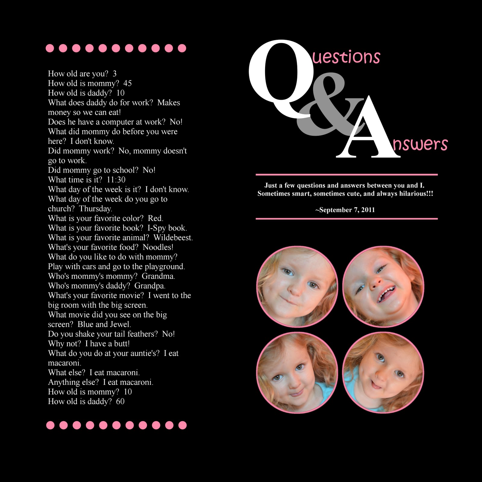
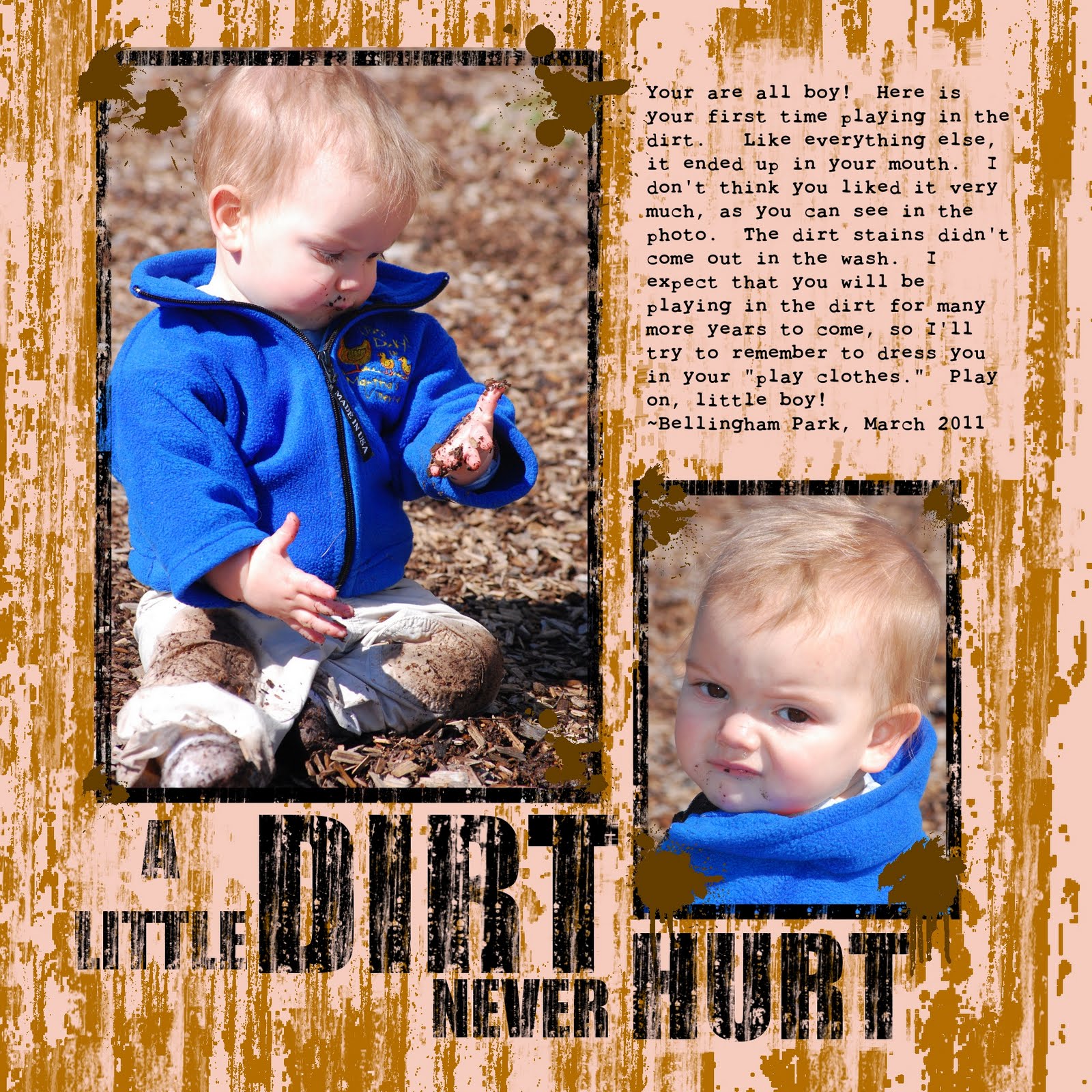
My photography techniques have changed since I started scrapbooking. For one thing, I don't hit the “delete” button quite as often. I have learned that just because a photo is not perfect doesn't mean it's useless. In fact, imperfect photos are like my children's “play cloths.” You can have more fun because you don't have to worry about ruining something nice.

I used to think that all my shots had to be perfectly in focus, have vibrant colors, and be free of any motion blur in order to show them to anybody. Yet even shots that I love have at least one thing wrong with them. In fact, I count on my husband to point out the flaws in my photos. The other day, I showed him a picture of our children when they were 6 months and two years old. The shot was in focus, the lighting was good, and my daughter had a smile on her face. He stared at it for a minute, frowned, and said, “there's dirt on her shoe.” I mean, come on! I'm lucky if there's not food all over her face!

Indeed, most people who consider themselves photographers frown on imperfection. This may be a good approach for professionals. After all, most people who pay good money for portraits want photographically perfect photos.

I, on the other hand, am just doing this for fun. Now I tell my husband that I'll take whatever kind of pictures I want and people can decided if they like them or not. I mean, if a few squiggles can pass for fine art, my bad photos can be made into something artistic.

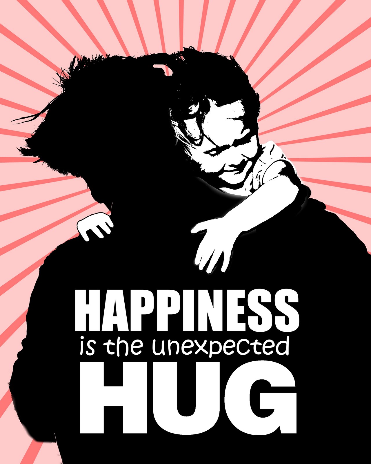
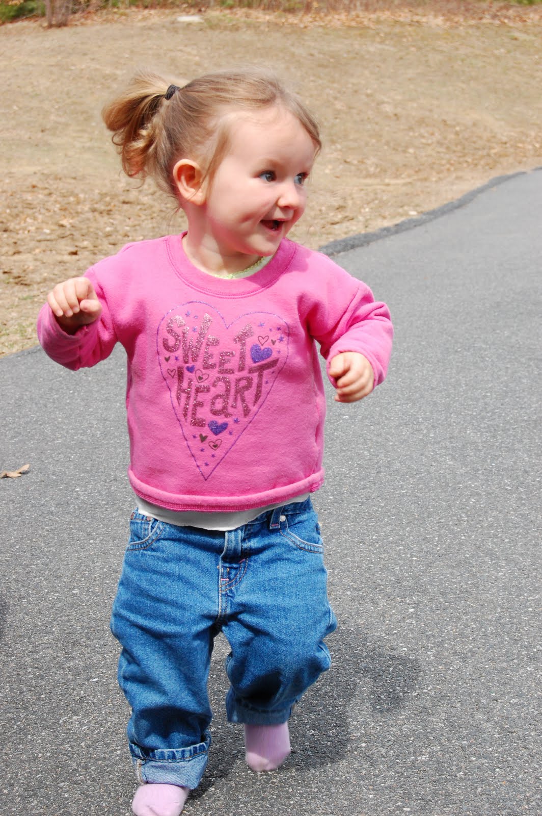
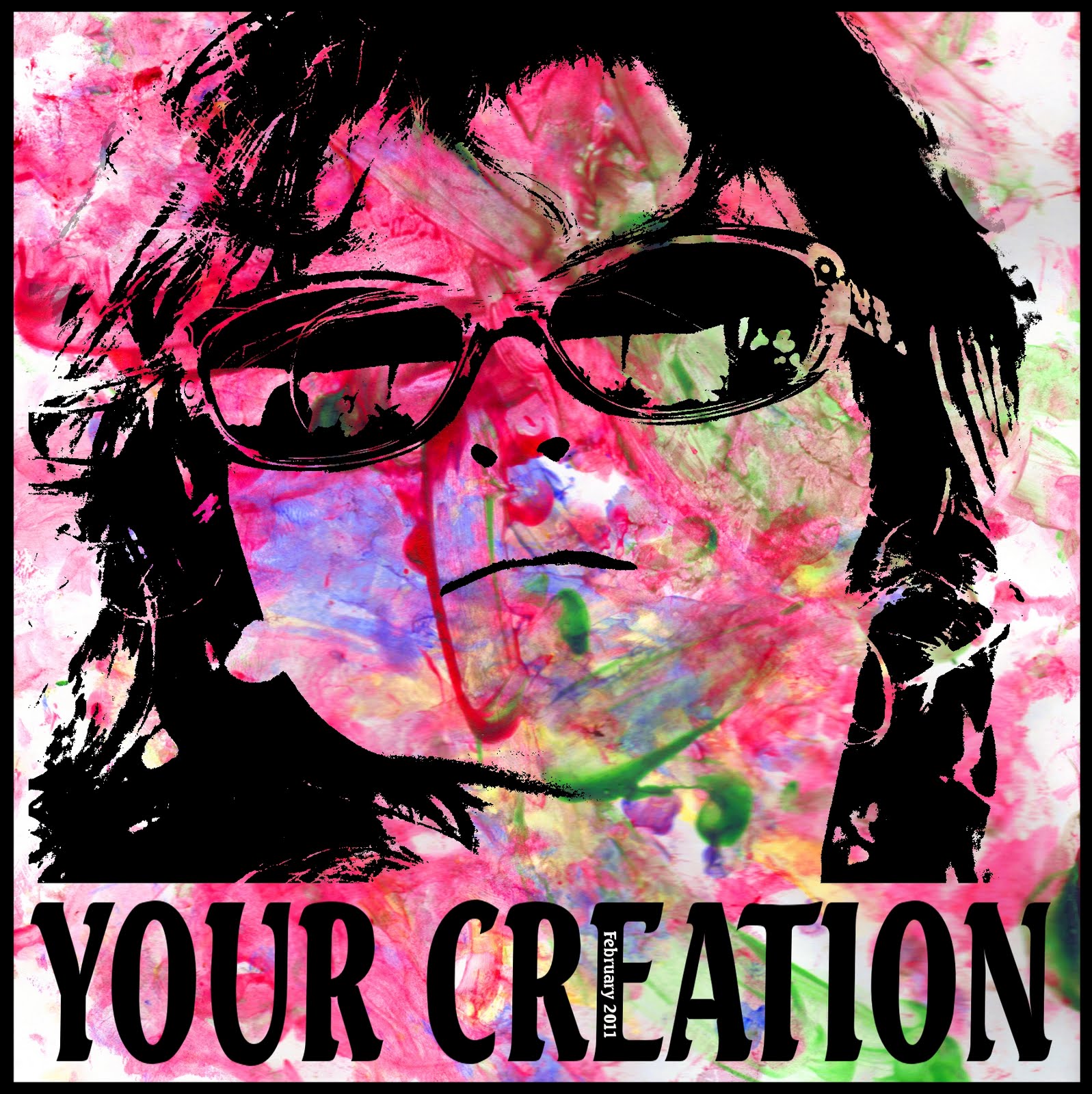
With digital scrapbooking, I combine titles, journaling, and photos to convey a concept. In this layout, I wanted to convey a loud, in-your-face quality. Here's the shot I took of my daughter as she ran around in circles in our driveway:


The harsh sunlight cast a nasty shadow on her face. And because she was running, the photo was out of focus and blurry. Indeed, the picture does lack detail. But I liked the position of her body and the look of sheer delight on her face. You couldn't get a kid to smile better than that in Disney World. So I kept my finger off the “delete” button and saved it for a fun layout.

The journaling reads and repeats: “Bounce, bounce, bounce, bounce. Run, run, run, run. Spin, spin, spin, spin. You go in circles and never seem to get tired. Where does all that energy come from, and when will it run out?” I like repeat journaling because I can do funky things to it and not worry about the entire thing being legible. Here, I put a gradient mask over the words to make them fade at the top.

I exaggerated the harsh lighting to add contrast. High contrast to me equals high energy. And energy is just what this layout is about. To do this, I simply duplicated the layer and set the layer mode to “hard light.”

I made it into 8x10 format so that I can print it out on my computer. I figured that there is no reason to spend the money to get a print when detail doesn't matter so much.

I read an article in the magazine Popular Photography that said that making photos appear old or faded is a “fad.” It is true that I would not want to take a great photo and mess with it. That's why I wait for the bad ones to have fun. In the words of the famous photographer Ansel Adams, “there is nothing worse than a clear shot of a fuzzy concept.” I take these words to heart and make fuzzy shots into clear concepts.

Monday, April 11, 2011

Getting layout ideas


While writers often struggle with writers' block, scrapbookers struggle with (um...) scrapper's block. It's happened to me many times before. I sit down to scrap my photos, assuming that the layout is going to automatically manifest itself on the screen. Then my mind goes blank and I can't think of how to start. How many pictures should I include? Should I do a collage or just one big photo? What color scheme and fonts should I use?

Ideas can sometimes feel like a limited commodity, but they don't have to be. Ideas are everywhere. No man exists on an island, and this couldn't be more true for us scrapbookers. In fact, the best way to get ideas is look around and seek inspiration from others. I get many ideas from these sources:

Books
When you go to your local thrift store, look for books about scrapbooking. I've built a small library of scrapbooking books that I've picked up for a couple of bucks each. When I'm looking for some fresh ideas, I pick one off the shelf and flip through it.

Surf the Internet
Surfing the Internet is the most obvious solution, as you are already on the computer. Search Google images for scrapbook layouts that people have posted to blogs and websites.

Scrapbook.com
Users like me have uploaded hundreds of thousands of layouts on Scrapbook.com. I scan through them every few days to get ideas. You can return the favor by uploading your own, too! This is also a great way to connect with other scrappers.

Advertisements
The most talented people in graphic design go into advertising. The rest of us make scrapbooks and blog about it. Magazine ads, catalogs, and billboards can give you great ideas about how to arrange your own pictures on a page. They also have catchy word art that you can mimic with your software.

Artists
Yes, I believe scrapbooking itself is an art. Yet we can also look at other art for inspiration. I've gotten many ideas from other artists, such as this word mask here.


Play pretend
I have had fun making layouts look like something else. There are many ways you can do this. I have made a newspaper article:


And a comic strip:


I've also seen layouts done to look like a wanted poster, a magazine cover, or an ad for a TV show. Playing pretend is a clever, fun way to depict your story or event.

Nature
Nature inspires many artists, and scrapbookers are no exception. Nature has been the inspiration of many of my layouts:


The key to finding ideas is to develop a scrapbooker's eye (yes, I made that term up). If you are always thinking about your next layout, you will constantly be inspired by things around you. You will find that you have more ideas than time to use them.

Saturday, April 2, 2011

Scrapping a child's artwork


This was a collaborative effort between myself and my two-year-old. I don't think she knew that she was helping me create a layout, though. I think she was just having fun and making a mess. Still, I like to call this project her first work of art.

Many people include their child's artwork in a scrapbook album. When the kid is older and can paint something that actually resembles a real-life object, the artwork could stand alone on the page. Right now, however, my daughter's style is purely abstract. That's why I added my own touch to make it a little more, ummm, interesting.

How to do it
This is actually one of the easiest layouts I've done. Of course, I should give credit where credit is due, as my daughter did most of the work for me. I started off with these two images:


Open the images in two separate layers. On the image with the face, erase around the background. It doesn't have to be perfect because most of the detail will be eliminated in the end anyway. Duplicate the layer to save a copy.

Then use the threshold function (colors > threshold) for the layer with the face. The threshold function turns the image into two colors – black and white. By adjusting the threshold, you can determine how much of the image is black and how much is white. Play around with it to get the best effect.

Change the layer mode to “darken only.” This will make the white parts invisible so that you can see the painting under her face.

I know that it is controversial to alter someone else's artwork, but I thought that the color in her painting needed a little help. So I adjusted the saturation to the highest level (color > hue/saturation). This really brightened up the painting and helped the black image of her face show up more clearly. I hope she forgives me when she's older and realizes what I've done to her masterpiece.

For the text, I used Seagull Bold. I stretched it out a little to make it fit.

Other ideas
You could also make a layout ABOUT her projects, not just OF the project. Include pictures you took of the process. Here are a few I've done:


All of this is to say that there are many unique ways to incorporate a child's artwork into your layouts. Rather than simply throwing them in an album (which is still better than nothing), have a little fun with it. For me, it makes the mess-making worth it.