Friday, March 23, 2012

Handwriting in the digital age


In this computer age, I get little opportunity to practice my penmanship. Maybe that's why it's so bad. At least that's my excuse. Yet there are so many traditional scrapbookers with elegant handwriting whose lettering really makes the layout pop. I'm not gifted and I don't have the motivation to study calligraphy. So most of the time I settle for typing because I feel that putting my messy chicken scratch on the page will would take away from it. Yet when I think about it, typing is really just using someone else's creation. Especially when I use fonts that are meant to look handwritten. Since I try to do as much as I can from scratch, I force myself to put my own handiwork on the page once in a while.

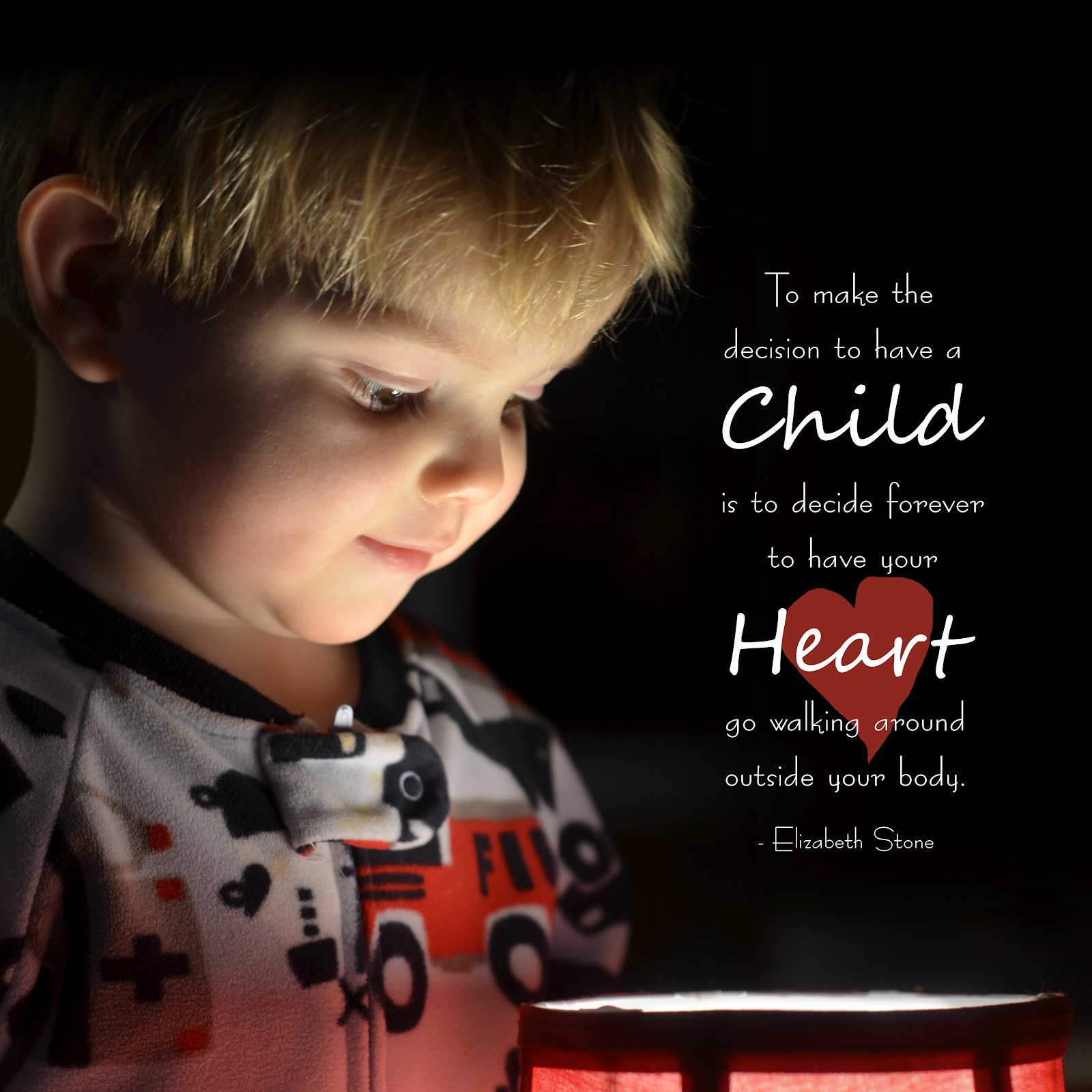
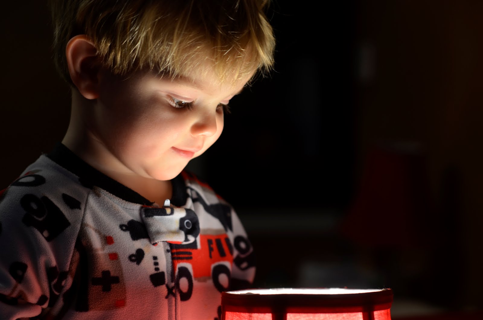
I've settled for a mix of typed text and handwritten wording, like in the layout above. My photographer friend, Ashley Martineau, took this picture of us this past fall. It was a good opportunity include pictures of the four of us in my pages. Since I wasn't involved in the photography aspect, I wanted to add my own writing to make it feel like I was involved in the creation of the page. Here's what it says:

Daddy

Loves coming home every day to his kids who are eagerly awaiting his arrival. Cuts Thomas' hair. Cooks dinner and works out almost every night. Doesn't do art, refuses to carve a pumpkin and will not dress up for costume parties. But he still has a good sense of humor and makes mommy laugh.

Thomas

Loves to eat pasta and cheese. Enjoys climbing on chairs and tables. Goes down slides at the playground all by himself. Still hasn't spoken a coherent word, but can communicate with grunts and squeals. Always puts a blanket in his mouth when he is tired. Loves to cuddle and is not ashamed to wear pink around the house.

Sophia

Is learning how to write letters. Still needs her Ducky to go to sleep. Favorite snack is Cherios and raisins and milk. Likes going head first down slides. Can do a 36 piece puzzle by herself. Is an active participant in bible class. Loves to hang out with mommy and daddy in their bed.

Mommy

Loves getting Sophia and Thomas up in the morning. Enjoys taking pictures of the kids. Takes the kids to the zoo almost every week. Loves scrapbooking, photography, card making, and writing on her blog. Favorite season is autumn. Likes to jog outside and doesn't like food shopping or TV.


The background was created by Kim Christensen.

Getting my writing onto the digital page was pretty simple. I wrote the words out with a black marker on a white piece of paper. I scanned it in, erased the white paper, and inverted the colors to turn the text white. I set the layer mode to “overlay” so it was a little transparent.

All the scrapbooking handbooks tell me I need to put my own writing on the page to make them more genuine, so here it is!

Friday, March 16, 2012

Quadrant style layouts


The journaling reads:

Like most newborn babies, early spring is not pretty. The snow has melted away to reveal a greyish-brown lawn. The trees are still bare except for their tiny buds. The flowers have not yet blossomed into vibrant colors. Yet it's the end of misery and the beginning of new life that makes this time so beautiful. ~March 12, 2012

I have started to do a lot of quadrant style layouts like the one pictured above. It is an attractive way to display multiple photos from a shoot. It's also an easy way out when I'm trying to decide how to lay out my pictures. The pictures take up the entire frame, so I don't need to worry about a background. This style also leaves little room for text, which is good if I'm feeling a little short on words.

There are a few tricks to making the quadrant style layout work. It looks best with a thin border. I usually use black or white, but sometimes I'll use a color from a photo. I play around a bit to see what looks best. Also, when two pictures have similar colors, I place them diagonal to each other to balance out the page.

Another option is to add a title in the color of the photo in the diagonal quadrant. For the layout below, I needed to add red in the upper left to balance the page:


Yet using the quadrant style does not mean you have to use four photos. You can save one or two for text and journaling, like this one:


I have discovered in my scrapbooking endeavors that sometimes simple is best, and a quadrant style often is the best solution. Thanks for looking!

Friday, March 9, 2012

A sequence of fun events


I'm not much of a videographer. I prefer instead to capture moments in time. As an art form, it's much easier to control 1/50th of a second rather than 50 seconds or more. Yet sometimes I can't fully capture what transpired in just one photo. One solution is to put the camera in continuous shutter mode and then display them together in sequence.

I wanted to capture my kids horsing around before a real fight broke out. She seemed to enjoy it as much as he did, so I let it go on. They started doing this upstairs but it was too dark to freeze the action with my camera. So, I quickly carried them downstairs where we have big open windows and told them to carry on. I was able to capture several action shots with smiling faces. Here's the journaling:

Siblings who don't wrestle aren't real siblings. My brother and I did it, and now my kids are doing it. I used to have to watch out for the younger Thomas, but now he is the attacker. He comes up from behind his sister, wraps his arms around her, and pulls her down. I play the referee who blows the whistle when things get out of hand, as well as the photographer who records the event. I say play on as long as everyone is laughing and having a good time.

I turned it into a football theme for fun. Maybe my son will be a linebacker when he gets a little bigger. Thankfully, they kept on laughing and no tears were shed during the recording of this event.

Showing a sequence of events is just one more way to use multiple photos to show the whole picture. Thanks for looking!

Friday, March 2, 2012

Using a single light source to get a black background


There are many ways to get rid of background clutter and make room for text in a photo. One great way is to use a single strong light on the subject. An on-camera flash will do this, but it flattens out the facial features and make for an uninteresting picture. It is much better to use an off-camera light source. Professionals get this effect in their portrait studio. Since I don't have a studio, I used a lamp.

For this shot, I turned off all the lights in our bedroom except this lamp on our end table. My son was intrigued by the light and came over to peek inside. I made sure to tell him not to touch the light bulb (his sister had to learn that lesson the hard way). I dialed down the exposure by -0.7 stops so that the background would remain dark and the face wouldn't have blown-out highlights. Here's the original:


“To decide to have a child is to decide forever to have your heart go walking around outside your body.” ~Elizabeth Stone

I think the quote is very true and I have been waiting for the right photo to use it with. I edited the photo just a little in GIMP to darken the background. When I cropped it into a square, it allowed just enough room for the quote. I used the font Berlin and Segoe Script for the text.

So, try using a lamp to get pictures of kids. You just might have some happy surprises with creative pages to follow!