Friday, October 26, 2012

Want to Feel Really Old?

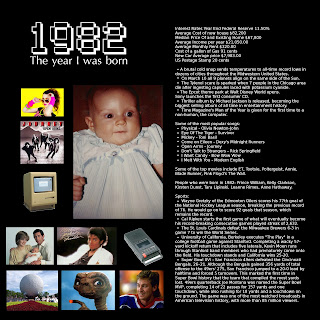
This would make a great first page of a Book of Me album. It's easy, fun, and can give you a sense of nostalgia (or horror at the fashions of the time). I've seen this idea done before, and I thought I'd make my own.

There are sites all over the Internet that list facts and events from any given year. I found these facts at www.totally80s.com. I'm sure there are similar sites for the 60's, 70's, and (gasp!) 90's. I had to narrow it down to what I thought were the most interesting stories to make them fit on one page.

I would strongly suggest including prices to make you feel REALLY old. I could have filled my car for $15 and bought a nice new home for $85,000! Then again, we'd only have an annual income of $21,000.

This is also a rare page that doesn't include any photos taken by me. I gave myself a pass because I was an infant and could not possibly hold a camera in 1982. I had no problem grabbing small, low-res images from the Internet to give the viewer a taste of this bygone era (I hope I'm not violating any copyright laws).

By the time the kids are old enough to read and understand this page, they will think that I am ancient history. We all thought that way about our parents and soon they will think that way about us. Here's how to encapsulate it on a page.

Sunday, October 21, 2012

Word Collage

Here's another Book of Me layout. I like to incorporate words as part of the art whenever I can, and here is one simple way to do it.  There's a million word collages out there, and I obviously didn't invent that concept.  I just made my own with a picture of myself.

This was fun for me to make because I like puzzles and lists. I simply jotted down some of the things that I enjoy doing, then spent some time fitting them together.

My initial idea was to do just “Things I Love,” but this would have confined me to a list of nouns. Being an action-oriented person, I found that I much prefer verbs.

I don't really like photographs of myself, but I thought it needed some visual image of the author. A silhouette was the solution. This is a self-portrait that I took in my basement studio. All I did to the picture was to add some contrast and lighten a red background into a more subdued pink. This effect can also be accomplished by photographing yourself in front of a white wall and cutting around it in GIMP.

I always say that it's important to put ourselves in our albums, too. A simple layout like this is one way to do it without worrying about fancy prose or imperfect skin.

Thursday, October 11, 2012

Terrific Two's


I've finally gotten around to making a page about my little boy. My daughter has been involved in so many activities lately, I had to make a point to sit down and write an update just about him. I think that these “just because” pages are just as important, if not more so, than ones that depict events. It forces me to get past a simple recording of a story, and helps me think about what makes a person so special.


I have built a small studio in my basement, which I've been slowly but surely tweaking to my liking. One advantage of having a studio for my digital scrapbooking is that I can get a pure white background. This becomes a blank slate for text, pictures, or anything else.

 I had him do the painting based on the color scheme of the page. I put the colors that I wanted on his plate and let him go to town.  As soon as it was dry, I scanned it into the computer and put it on the page.  I find that this is a nice way to preserve their “artwork” before it takes a form of its own.

The journaling reads:

Some dread what has been called the “terrible two's.” This has certainly not been my experience with you. Granted, you have dumped about $22 worth of liquid soap and beauty products onto the floor, to which your frugal mom tried to scoop as much of it back into the container with a spoon as she could. But this is just a drop in the bucket compared to the joy you've brought us over the last 2 1/2 years. In fact, I'd like to rename this age the “terrific two's.” You are a loving, generous, and cooperative little boy. Your generous nature comes as a surprise to your big sister, as she has finally come to realize that she can usually get what she wants from you by simply asking politely. You adore your sister, though you are only able to pronounce the last syllable, so it comes out “ehh.” Your not quite ready for the little bible class, which is fine with me because I love having you cuddle in my lap upstairs. But at home you cherish your “me time.” You turn your light on and play with your cars when you wake up. If I go in there to greet you before your ready for me, you say “no, bed,” and I obediently close the door until you call for me. I guess I'm greedy to say I want 8 more little kids like you, but having just one makes me cherish you all the more. Thank you for being such a joy to us.

Thursday, October 4, 2012

First Day of School

It's been awhile since I've posted. I've been busy building a studio at my house, taking pictures for friends, tutoring my daughter, playing soccer, and various other life activities. This is why I haven't been creating the same quantity of pages that I had been in the past. Yet that's what happens when I create only when inspired. I never do pages because I feel like I should. I refuse to make it a chore or a project on my “to do” list. That means, of course, that some outings don't make it into the scrapbook albums. But it also means that many ordinary aspects of life that often get overlooked will be there.

But one event that I wanted to mark was my daughter's first day of school. I wanted to get a picture of her with her matching backpack and lunchbox, which she was barely able to wrap her arms around. School shopping was quite the adventure for us, too. We ran up and down the isles of Walmart to get all the stuff on the list. So I thought, why not include the receipt in the page?

The journaling reads:

It finally hit me that you will be going to school when I took you shopping. Your teacher gave me quite the list. I may have to bring along the double stroller on your first day just to drag all the stuff inside. She wrote the brand names in the list, so brand names it is. I would have bought the store brand and saved a few bucks, but I didn't want to give the impression that your mother is cheap. Your backpack looks huge on you. I can't wait to see if she fills it up with homework. I bet that you will have a great school experience, and I've tried to do my part to get you off on the right foot with your material needs, at least. And in case you were wondering, the chocolates were for me.

Wednesday, June 6, 2012

Capturing memorable conversations


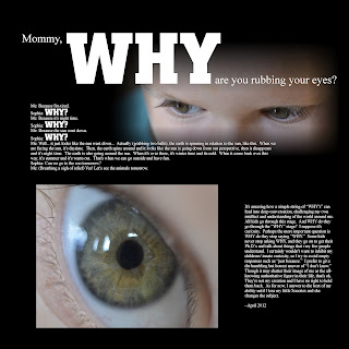
Conversations with a 3 ½ year old can get pretty interesting, especially when everything I say is followed by a “why” from her. I see many people post conversions with their kids on Facebook, but we are very likely to forget about it later and the kids won't get to look back at the early exchanges with their parents.

Many people video record conversations, and parents would have had no recollection of the event were it not captured on video. But these are usually an interview-style format, where the parent asks a set of questions or tells the kids to perform some trick. But writing conversations down in the scrapbook is another option, especially if it is an impromptu exchange that didn't get recorded. After all, you can't predict when memorable moments are going to happen.

You should write it down within a few hours when all the details are still fresh. If you don't have the time right away, just type it into a word processor and make the page later (that's what I did). Then you can add pictures and your own comments later when you have the time. Here's how mine went:

Mommy, why are you rubbing your eyes?
Me: Because I'm tired.
Sophia: Why?
Me: Because it's night time.
Sophia: Why?
Me: Because the sun went down.
Sophia: Why?
Me: Well... it just looks like the sun went down... Actually (grabbing two balls), the earth is spinning in relation to the sun, like this. When we are facing the sun, it's daytime. Then, the earth spins around and it looks like the sun is going down from our perspective, then it disappears and it's night time. The earth is also going around the sun. When it's over there, it's winter time and its cold. When it come back over this way, it's summer and it's warm out. That's when we can go outside and have fun.
Sophia: Can we go to the zoo tomorrow?
Me: (Breathing a sigh of relief) Yes! Let's see the animals tomorrow.

It's amazing how a simple string of “WHY's” can lead into deep conversation, challenging my own intellect and understanding of the world around me. All kids go through this stage. And WHY do they go through the “WHY” stage? I suppose it's curiosity. Perhaps the more important question is WHY do they stop saying “WHY.” Some kids never stop asking WHY, and they go on to get their Ph.D.'s and talk about things that very few people understand. I certainly wouldn't want to inhibit my childrens' innate curiosity, so I try to avoid empty responses such as “just because.” I prefer to give the humbling but honest answer of “I don't know.” Though it may shatter their image of me as the all-knowing authoritative figure in their life, that's ok. They're not my creation and I have no right to hold them back. As for now, I answer to the best of my ability until I lose my little Socrates and she changes the subject.

Wednesday, May 30, 2012

First final exam


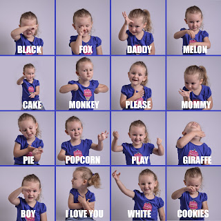
My daughter finished her first sign language class last week. It took her a long time to really get into it. She didn't want to follow along with the other kids at first. I had to bribe her by taking her out to lunch afterward to get her to participate. But for the last two sessions, she did all the signs without me having to nudge her. She even started teaching her daddy and aunts some of the words.

Since she was having so much fun, I brought her down to the basement and took pictures of her signing to me. It also gave me an opportunity to use some new flash units I recently bought. I decided to arrange the photos “Brady Bunch” style to fit as many as I could on the page. She was excited and moved around a lot, so the photos are not all framed the same way. That's OK, though. It kind of adds to the dynamic quality of the page.

The teacher gave her a certificate of completion on the last class. I plan to put this layout on the opposing page from the certificate. I try to include photos with every event included in the scrapbooks, and this is the one that came to my head for her sign language class.

Wednesday, May 23, 2012

Putting collections in a scrapbook


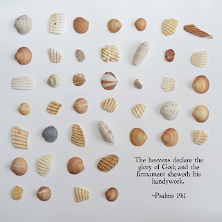
I try not to collect things. They clutter up the house and then when I die, my kids will be stuck trying to decide what to do with all the stuff I held onto. I do, however, enjoy collecting unique shells when I go the the beach. I'll use them to decorate picture frames or put them in jars to display in the house. There was a big bag of shells left over in my craft room, so I decided to use them for my more important collection -- my scrapbook albums.  This converts my seashell collection to a more compact digital format that will fit neatly on my shelves.
You could do the same thing with coins, pens, or anything that is small enough. Any kind of background can be used, though I like the clean look of white. Just keep in mind the dimensions of your page and how you want the page to look. You may want to include space for words, like I did here.
For this photo, I put the shells on a piece of white poster paper and hand-held the camera directly above the shells. I used a hot shoe-mounted flash and bounced it off a reflector at a 90 degree angle to the floor. If you don't have flash equipment, you could also take it outside on an overcast day to get adequate lighting.
Making a page out of trinkets could be considered “upcycling” – making something with greater value out of something of lesser value. I'll probably end of throwing many of the shells away, but at least I got to use them for a project.

Tuesday, May 15, 2012

The scary side of parenthood


This is another post about getting away from the “sweet baby” page. A “sweet baby” page (as I call them) is a pretty pages with a cute baby picture and a big title reading “sweet baby.” I have nothing against them. Many of them are really gorgeous, with a coordinating color scheme and heartfelt journaling. And down the road, giving your kids a personally crafted book is certainly much better than handing them a shoebox full of pictures or, as I dread many of today's technology-driven young parents will do, CD's and memory cards. I have many “sweet baby” pages in my albums that I am quite proud of. Yet scrapbooking is also a form of personal expression for me, which means that I have to include the sad, infuriating, and downright scary aspects of parenthood.

I think every parent has had some scary moments. I find it therapeutic to write about them when they really bother me. I certainly felt better after making this page. Maybe some people would like to write about it, but not for their kids or house guests to see. I've heard some scrapbookers suggest that you make a personal album to store away. I don't have one right now, but I have put away some pages that I wasn't comfortable displaying. It's nothing “inappropriate” and I don't have any dark secrets, but I wouldn't necessarily want everyone who visits my house to be reading my thoughts and opinions about everything. I AM comfortable putting this particular page on my coffee table (duh, it's on my blog). I think that it's a pretty universal experience for us moms and dads.

The journaling reads:

A friend of mine who has been married for about 10 years says she is afraid to have kids. I realize now that this is a perfectly rational feeling. I would be wrong to tell her that her fears are ungrounded and that everything turns out fine. Pregnancy and childbirth come and go rather quickly, but motherhood is a lifetime of decision making that we will be held accountable for. Success in other areas of life cannot make up for bad parenting and one wrong move can destroy my life forever. Before I had kids, I had only my own death to worry about. Yet in reality, dying is not that scary. I won't suffer after my own death. But having children means I have a far worse fate to fear – the death of my own children, particularly if is caused by my own neglect.

There have been several recent failures on my part to protect my kids. Last week, Sophia fell off her bike without a helmet and probably got a mild concussion. Then today, Thomas escaped from me at the zoo and I had to face the shame and embarrassment of having someone else bring him back to me. These are things that make me feel completely worthless as a mother and as a human being. I get so depressed I just want to throw in the towel, declaring myself incompetent and let some institution take over.

Yet on the positive side, it gives me a wake-up call. Nothing serious happened to them, and I have the opportunity to make sure it doesn't happen again. It also puts my priorities in perspective. Staying home to care for children is not a vacation. It needs to be taken seriously and should be my first priority. I don't need to excel at hobbies or win footraces to prove my worth. Even raising just one child would be all I need to be important, and I am blessed with two! There should be no room for boredom or self-absorbed anxiety. So, we're just going to make sure we wear helmets and go slowly.

Thursday, May 10, 2012

Food shopping


Some call it food shopping.  Some call it grocery shopping.  But whatever you call it, it is an essential part of every family's life.  So why not put a receipt in your scrapbook? It will be fun to look back in ten or twenty years to see the prices, though sometimes it's hard to imagine that they will go much higher. A receipt by itself is boring, so add a photo and journaling to make it more interesting. For my layout I chose a health food theme. My husband and I have been trying to eat healthier over the last year, so we've put a lot of focus on what we buy at the store.

To get the photo, I chopped some veggies and arranged them on a cutting board. I placed the board on the floor in front of our sliding door to let in lots of natural light. I put white poster paper under the board and curled it up along a coffee table to get the seamless white background (I've found through experience that shooting against the desired background looks much better than just cutting it out with digital scissors). I used a hot shoe-mounted flash angled slightly upward toward the top of the poster paper to keep it bright white instead of mucky gray (again, learned through experience). I shot at several angles and chose this one as my favorite. No food was wasted during this shoot, because I ate it all for dinner that night.

The receipt, as you may have guessed, is scanned in. I'm not particularly sentimental about original copies in general. I actually prefer to use scanned receipts, birth certificates, and tickets. It's neater, easier to use, and you can “write” on them without damaging anything. The high-resolution scanners of today make nearly identical images, anyway.

Here's the journaling:   

   Eating right starts with shopping right. As a rule of thumb, we do most of our shopping around the edge of the store, where the meat and produce are. And choosing what NOT to buy is just as important as choosing what TO buy. After all, if you don't bring it home, you won't eat it. I stopped drinking soda the day we stopped buying it. Same with cereals and crackers. I don't do too well with candy, either. I could have bottles of booze sitting all over the house, but chocolate? No way!   
   Eating well is not tricky. Some say that can't afford it but it really doesn't cost that much more. I think that the reason that it's so hard for many people is that it's much more work. It requires planning and spending a lot more time in the kitchen. I'm blessed to have a husband who's willing the cook and educates himself on healthy eating.  I would have a hard time managing it all if I didn't have his help. 
   It sometimes seems so much easier to believe the lies that are written on the labels of packaged foods. I've literally made it a point to avoid anything that is advertised as healthy, or at least to go straight to the ingredients list to see what's hiding inside. I don't want to a food snob. It's just that eating well makes a huge difference in my life. I have more energy to take the kids out and stay all day. I don't need to lie down in the afternoon, so I can spend time making pages for my albums instead. 
   And because we are raising kids, we are doubly responsible for our habits. At the very least, I wouldn't want anyone in our family suffering health problems that could have been prevented with better nutrition.   
   Of course, I could be doing better. At some point, I'd like to try my thumb at growing my own food and perhaps even raising chickens. Like most people, I'm pathetically dependent on technology for my food. If our food supply was cut off and I couldn't go to the market anymore, I dread what could happen. I also need to eat more fish and red meat. I may be missing out on some valuable nutrients there. The most important thing is to keep healthy eating a priority. If life gets hectic and I start eating at the drive thru, maybe I should cut back on scheduling.

Friday, March 23, 2012

Handwriting in the digital age


In this computer age, I get little opportunity to practice my penmanship. Maybe that's why it's so bad. At least that's my excuse. Yet there are so many traditional scrapbookers with elegant handwriting whose lettering really makes the layout pop. I'm not gifted and I don't have the motivation to study calligraphy. So most of the time I settle for typing because I feel that putting my messy chicken scratch on the page will would take away from it. Yet when I think about it, typing is really just using someone else's creation. Especially when I use fonts that are meant to look handwritten. Since I try to do as much as I can from scratch, I force myself to put my own handiwork on the page once in a while.

I've settled for a mix of typed text and handwritten wording, like in the layout above. My photographer friend, Ashley Martineau, took this picture of us this past fall. It was a good opportunity include pictures of the four of us in my pages. Since I wasn't involved in the photography aspect, I wanted to add my own writing to make it feel like I was involved in the creation of the page. Here's what it says:

Daddy

Loves coming home every day to his kids who are eagerly awaiting his arrival. Cuts Thomas' hair. Cooks dinner and works out almost every night. Doesn't do art, refuses to carve a pumpkin and will not dress up for costume parties. But he still has a good sense of humor and makes mommy laugh.

Thomas

Loves to eat pasta and cheese. Enjoys climbing on chairs and tables. Goes down slides at the playground all by himself. Still hasn't spoken a coherent word, but can communicate with grunts and squeals. Always puts a blanket in his mouth when he is tired. Loves to cuddle and is not ashamed to wear pink around the house.

Sophia

Is learning how to write letters. Still needs her Ducky to go to sleep. Favorite snack is Cherios and raisins and milk. Likes going head first down slides. Can do a 36 piece puzzle by herself. Is an active participant in bible class. Loves to hang out with mommy and daddy in their bed.

Mommy

Loves getting Sophia and Thomas up in the morning. Enjoys taking pictures of the kids. Takes the kids to the zoo almost every week. Loves scrapbooking, photography, card making, and writing on her blog. Favorite season is autumn. Likes to jog outside and doesn't like food shopping or TV.


The background was created by Kim Christensen.

Getting my writing onto the digital page was pretty simple. I wrote the words out with a black marker on a white piece of paper. I scanned it in, erased the white paper, and inverted the colors to turn the text white. I set the layer mode to “overlay” so it was a little transparent.

All the scrapbooking handbooks tell me I need to put my own writing on the page to make them more genuine, so here it is!

Friday, March 16, 2012

Quadrant style layouts


The journaling reads:

Like most newborn babies, early spring is not pretty. The snow has melted away to reveal a greyish-brown lawn. The trees are still bare except for their tiny buds. The flowers have not yet blossomed into vibrant colors. Yet it's the end of misery and the beginning of new life that makes this time so beautiful. ~March 12, 2012

I have started to do a lot of quadrant style layouts like the one pictured above. It is an attractive way to display multiple photos from a shoot. It's also an easy way out when I'm trying to decide how to lay out my pictures. The pictures take up the entire frame, so I don't need to worry about a background. This style also leaves little room for text, which is good if I'm feeling a little short on words.

There are a few tricks to making the quadrant style layout work. It looks best with a thin border. I usually use black or white, but sometimes I'll use a color from a photo. I play around a bit to see what looks best. Also, when two pictures have similar colors, I place them diagonal to each other to balance out the page.

Another option is to add a title in the color of the photo in the diagonal quadrant. For the layout below, I needed to add red in the upper left to balance the page:


Yet using the quadrant style does not mean you have to use four photos. You can save one or two for text and journaling, like this one:


I have discovered in my scrapbooking endeavors that sometimes simple is best, and a quadrant style often is the best solution. Thanks for looking!

Friday, March 9, 2012

A sequence of fun events


I'm not much of a videographer. I prefer instead to capture moments in time. As an art form, it's much easier to control 1/50th of a second rather than 50 seconds or more. Yet sometimes I can't fully capture what transpired in just one photo. One solution is to put the camera in continuous shutter mode and then display them together in sequence.

I wanted to capture my kids horsing around before a real fight broke out. She seemed to enjoy it as much as he did, so I let it go on. They started doing this upstairs but it was too dark to freeze the action with my camera. So, I quickly carried them downstairs where we have big open windows and told them to carry on. I was able to capture several action shots with smiling faces. Here's the journaling:

Siblings who don't wrestle aren't real siblings. My brother and I did it, and now my kids are doing it. I used to have to watch out for the younger Thomas, but now he is the attacker. He comes up from behind his sister, wraps his arms around her, and pulls her down. I play the referee who blows the whistle when things get out of hand, as well as the photographer who records the event. I say play on as long as everyone is laughing and having a good time.

I turned it into a football theme for fun. Maybe my son will be a linebacker when he gets a little bigger. Thankfully, they kept on laughing and no tears were shed during the recording of this event.

Showing a sequence of events is just one more way to use multiple photos to show the whole picture. Thanks for looking!

Friday, March 2, 2012

Using a single light source to get a black background


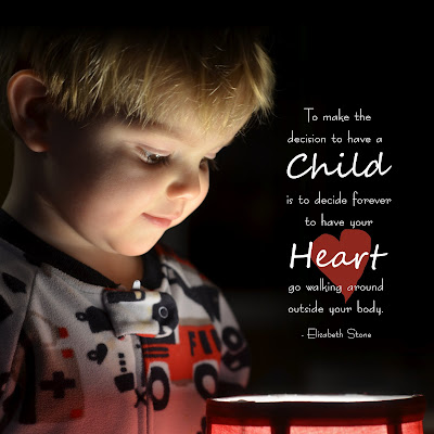
There are many ways to get rid of background clutter and make room for text in a photo. One great way is to use a single strong light on the subject. An on-camera flash will do this, but it flattens out the facial features and make for an uninteresting picture. It is much better to use an off-camera light source. Professionals get this effect in their portrait studio. Since I don't have a studio, I used a lamp.

For this shot, I turned off all the lights in our bedroom except this lamp on our end table. My son was intrigued by the light and came over to peek inside. I made sure to tell him not to touch the light bulb (his sister had to learn that lesson the hard way). I dialed down the exposure by -0.7 stops so that the background would remain dark and the face wouldn't have blown-out highlights. Here's the original:


“To decide to have a child is to decide forever to have your heart go walking around outside your body.” ~Elizabeth Stone

I think the quote is very true and I have been waiting for the right photo to use it with. I edited the photo just a little in GIMP to darken the background. When I cropped it into a square, it allowed just enough room for the quote. I used the font Berlin and Segoe Script for the text.

So, try using a lamp to get pictures of kids. You just might have some happy surprises with creative pages to follow!

Friday, February 24, 2012

Friends of all kinds


My kids are the most frequent subject of my pages, so why miss the place where they spend 1/3 of their lives – in bed! If all kids are like mine, their bed is piled high with little friends. Sometimes when I go to get her up from her nap, I have to dig through them to find her. We can't help it. Friends and relatives keep buying them. They feel how cute and soft they are in the store, and can't resist. She loves all her friends, both new and old, and wants them with her when she sleeps.

I lined up the friends in a neat row for this shot. I took the picture in the middle of the day to get the most light. I stood on a chair and used a wide angle lens to get the whole crib in the frame. The animals cooperated very well and did not move. My daughter, on the other hand, is a bit more tricky to photograph. I complain in all my posts that she doesn't pose for me, and this shot was no exception. This picture of her inspecting her toe was the best I could do. At least I got her to lie there for 1/5 of a second, which I consider a success.

I have learned that wide angle shots need to be printed big, so I used the whole 12 inch width of the page for this layout. That left just enough room for the title and journaling. I added a border to tie the page together.

The journaling reads:

You go to bed every night to your own bed, but you're not alone. You have another little family waiting for you where you sleep. Ducky has proven to be your BFF. He's the one you can't do without. The other friends seem to be there on a rotating basis. You may forget about one of your friends for awhile, only to reacquaint yourself with him later on. Right now, the lineup is as follows: Ducky, Tiger, Monkey, Clifford, Horsey, Pooh, Fluffy Kitty, Violet, Bath Doll. You can rattle them off like it's second nature. When we say it's time to go to bed, you say, “I want milk ducky blankey pillow tiger monkey clifford horsey pooh kitty violet babydoll.” They are quite loyal as friends, too. They are always there when you need them. They don't get jealous of each other. And most importantly, they never get mad when you pee on them. In fact, you may never find friends as good as these, so enjoy them!

Background paper by Poppy Andrews

Friday, February 17, 2012

Behind the scenes


Everyone wants perfect pictures for their scrapbook. I certainly do, and I expend a significant effort to get them. Yet in the process, I get many, many bad ones. It can be frustrating taking pictures of small children. They don't yet understand the great service I am doing for them -- that my efforts will give them treasures to enjoy for years and decades to come. For now, they have no interest in smiling into an inanimate box and will usually do whatever they can to avoid getting their picture taken. Reflecting on this sad reality gave me the idea to make a page ABOUT our photo shoots. These are a few goofy pictures I've saved. Too bad I delete the REALLY bad ones right off the camera as soon as I took them. Otherwise, I could fill a whole album with our failures. Yet I saved a few pictures that are a few steps below perfect just to laugh at. And they've found a home right on this page. The journaling reads:

The photo shoot has become an intense competition between myself and my three-year-old. My objective is to get at least one picture that is in focus, framed correctly, and shows her smiling naturally. In this sense, it is more like baseball than soccer. There is no time limit. It's over when it's over. My equipment is top-of-the-line DSLR camera that focuses and shoots faster than you can blink. I also have an unlimited supply of toys and bribes to get her to cooperate. One would think that I would win every time, but the resistance is strong. She does everything in her power to prevent me from getting good pictures. When she sees a camera pointed at her, she runs away, cries, or makes silly faces. I use all of the athleticism that I have. I run, crouch, and jump to get in front of her and catch her off-guard. The game leaves me exhausted and out-of-breath. She is the reason I consider myself a candid-only photographer instead of the portrait artist I want to be. At least I can get my workout in before the sun goes down.

For the background, I used an overexposed shot of the sun poking through the trees in our backyard. I thought that would give the page a little visual context. Thanks for looking!

Sunday, February 12, 2012

Minimalism in scrapbooking


My pages are evolving into a more simple style. This is because I think that including just a few elements on the page is more effective than filling all 144 square inches with pictures, decorations, and words. The phrase “less is more” could be applied here. In fine art, it's called “minimalism,” which means the elimination of all non essential features. I'm not a fine artist, but I can borrow these principles to make my family album.

I've made lots of pages about the kids, and I wanted to take a break and make a page about other aspects of life that get overlooked unless I make an effort to find them. Nothing is too boring to dedicate at least one page to, including the small amount of time I spend reading magazines.

I put together a makeshift studio to get this picture. I actually used some of my traditional scrapbook supplies for this shot. I took two pieces of 12x12 inch plain white paper (see, they can still be used for something). I taped one against the wall and put one on the floor, making the edges touch to form a corner. I opened my favorite magazine, Popular Photography, and rested it on the paper on the floor. I chose not to show the faces of the pages because it would be too distracting. I used a camera angle that shows only the edges of the pages, enough for viewers to know that it is a magazine. Also, with the camera resting on the floor, I could use a slow shutter speed and still get a sharp picture.

The rest was easy. I added white space to the bottom in GIMP. I threw in a pair of blue brackets so to give it a splash of color and wrote a few words:

There is a time to work and there is a time to relax. Yet halfway between work and play are magazines. They're great to read right before I go to bed because they've got lots of pictures and don't require too much concentration. Still, I read them cover to cover, ripping out those annoying inserts and using them as bookmarks. I even study the pages and get some layout ideas. If nothing else, they get me off the computer and allow me to lie down. And best of all, we save $115.89 off of news stand prices! (Or so they say. Who would buy more than one issue at the store anyway?) I wouldn't want magazines to substitute for more substantive reading but they do have a place in my life.

Thanks for looking!

Saturday, January 21, 2012

Creating a snowy white background


The snow is FINALLY here in southeastern Massachusetts. We got one strange snowstorm in October then nothing until mid-January. So when it came this week, I bundled the kids up and rushed them outside before it melted. I took my camera with me to capture these precious childhood memories, of course. In the process, I also discovered that snow makes a great blank background for a scrapbook page!

The hardest part, after accepting the fact that my toddlers don't pose for the camera, was getting the right exposure. When you put the camera in full auto mode, the snow becomes a yucky gray and the subject comes out very underexposed. That's because the camera thinks you want an image with an even tone. Under most conditions, that is correct. But snow is different because most of the image is SUPPOSED to be a very bright white. It took me a while to realize this, meanwhile missing the opportunity to get good pictures of my daughter playing the snow for the first time.

One solution is to change the camera setting to “snow.” I've never used it, but I would think that it would produce results much better than it would in “auto.” The other solution, if your camera allows, is to use exposure compensation. I took test shots of my kids against the snow, increasing the exposure until the snow turns into one big blown-out highlight (also known as "the blinkies”), then dialed it back one stop to get healthy-looking white snow and a correctly exposed subject.

The next step is to take pictures with the snow surrounding the entire subject. After chasing my kids around the yard and begging them to move this way or that way, here's what I got:


Using GIMP, I used a soft brush to paint over the woods and some stray twigs popping out the the ground. To make sure that it blended correctly, I used a sample color from the snow, which is a little darker than true white. I was debating whether to leave the leaf in the picture. I decided to keep it there to give the impression that they are indeed standing on ground and are not floating in the air. Then I added the title, journaling, and a border. For those interested, the journaling reads:

Look who's bringing up the rear! It's my little boy, who is now almost as big as his sister. And at 27 pounds, he's just three pounds lighter than her and almost as strong. I have been looking forward to this day since he was a 9 pound newborn and I had to make sure she didn't crush him. Now that they are just about equals, I can relax a little and watching them chase each other around the yard. Having a baby and a toddler is tough, but having two preschoolers is fun! I'm so glad they're just 18 months apart in age and I wouldn't have it any other way. They are quickly becoming best friends and I hope it stays that way forever. ~January 2012

I love using blank backgrounds for my layouts. They isolate the subject and can give the image a surreal quality. This is very hard to accomplish with candid shots of people, as there always seems to be something distracting behind them. A beautiful snow-covered lawn makes a great background, as well as a nice canvas to add text later. I'll also add that for those unfortunate people who don't get snow where they live, you can do the same thing at the beach against the bright sand.

Thanks for looking!

Tuesday, January 10, 2012

You're just like your...


I saw this layout in a scrapbooking magazine and I loved the idea. My three-year-old is finally at an age where we can see little personality traits coming through, and it's fun to analyze her and speculate where those traits come from. It is completely unscientific and can change at any time, but at least it's an excuse to talk about the three of us. It's also an exercise in using “you're” and “your” correctly!

The page that I got the idea from was paper and glue. She had to order an 8x10 print and print out the text on strips of paper. That seemed like a lot of work. It's so much easier to put it together digitally. It was easy to grab the colors from the shirt and the background to create a nice color scheme, too.

The journaling reads:

You are a mix of genes from your mother and your father. There's also a little of your grandparents (both mommy's parents and daddy's parents), and a little of your aunts and uncle. Yet though you share characteristics of your family, you are not truly "just like" anyone. You are unique. Even if mommy and daddy had a hundred babies, none of them would be the same as you. Yet here are are some ways that I've noticed that you resemble your mother and father even at the young age of three.

Mother:

...we both like to stay up at night and cuddle in the bed (daddy asks me to put you in your own bed when he gets tired).

...we can both be very stubborn and have trouble accepting when things don't go our way.

...our faces look alike, so I've been told.

...we both enjoy listening to music and dancing around the living room.

...we both have curly hair.

...we both prefer pasta over meat. We never get sick of eating spaghetti!

...we're both very curious and ask questions about things we don't understand. I know this will be tough for us to handle but it will make you smart!

...we both avoid strict routines. We just wake up each morning and decide what we want to do and where we want to go. You're naptime always changes and we do schoolwork whenever we can fit it in.

...we both like junk food and can't leave it alone if it's in sight.

Father:

...you both have the same eye color. Sort of green, sort of blue, but definitely beautiful!

...You both of the same dirty blonde hair (or you did before he started getting greys). I love how it lights up in the sun!

...you both follow through on tasks. When I try to help, you say, "no, I'll do it myself." Your father is the same way. If I try to help, I'm just in the way. I know that this will help you be independent in the future.

...you both like to have things neat. Everything has a place. Your father gets mad when he goes to look for something and it's not where he expected it to be. You are the same way. You tell me when something is different or out of order. This makes you very good at doing puzzles and sticker books and will make you very successful as an adult.

...you are both outgoing and will talk to strangers. Your mother rarely talks to strangers unless she has to but your father will go up to anyone and start a conversation. Likewise, you will talk to and play with kids you've never met. You are a natural born leader.

Tuesday, January 3, 2012

Writing about our hobbies


Hobbies say a lot about a person and should be included in your “book of me” (which everyone should have). You can talk about how you became interested in the hobby, why you enjoy it, and how it adds to your life.

I've seen people make a page about scrapbooking itself. Other hobbies people might have could be cooking, playing sports, knitting, or going out to dinner. I've even seen pages dedicated to favorite movies or TV shows.

For this layout, I chose to write about running. My daughter has started asking me every Saturday, “Are you going running, Mommy?” I tell her I run to work out, and she thinks people work out to make money so we can buy her food. I think she is confusing the word “work” with the idea the her dad goes to “work” everyday. This made me think about why I run for fun now that I have adult responsibilities and we have cars to take us where we need to go. That's why I thought it would be worthwhile trying to explain my little hobby in writing.

I have started to take pictures of objects, carefully composing them to create the layout I envision. I took a picture of my running shoes on our lawn to symbolize the theme (I certainly wasn't going to pose and have my husband take a picture of me running). I also wanted to show leaves on the ground because fall is my favorite time to run. I put the shoes on the lower left of the frame to make room for the title and journaling. I think a good image adds a lot to the page and is much more interesting than straight text. Lets face it, we live in a visually-oriented culture.

The journaling is very long, but I had a lot to say about the topic. Here it is:

I have been running for exercise for about 14 years now, even before I had a drivers' license. There have been stretches where I go out every day, then other times that I only go once a week or so. Of course, the weather has alot to do with how frequently I don the sneakers. I go more in the cooler months than the hotter months. I even go in the dead of winter with a hat and gloves. I don't do it to lose weight. I never time myself, and often do not even measure the distance I've covered. I don't stretch before or after I run. I just walk out the door and go. I don't consider it an achievement, just an enjoyable activity in and of itself.

So what is the point of jogging? I'm not being chased, nor am I chasing anyone. I end up the same place I started, seeming to accomplish nothing except aging myself about an hour.

For one thing, we're meant to run. God didn't invent the bicycle or elliptical machine. He designed legs that could run. I have had aches and pains in my joints after using man-made equipment, but never after running.

Even many fitness-minded individuals approach exercise in the wrong way. Most people at the gym are there to improve their appearance or their overall health, as they impatiently count down the minutes and seconds until the “workout” is over. TV's and music are needed to distract from the torture. This is not a sustainable approach, as many gym members stop going soon after committing to their exercise plan. Us outdoor joggers, on the other hand, consider running a lifelong activity and do it for the sheer enjoyment of it. Benefits such as weight loss and longevity come with it, but it is not the primary focus.

The body and mind are related, which becomes evident when jogging. It is impossible to feel sad or depressed while in motion. For this reason, I consider running to be a natural anti-depressant with no negative side effects. It has certainly worked for me. If the glass was half empty when I left, it is half full when I return. The physical exercise increases my alertness and mental clarity as well. Right after a good run is a great time to tackle a challenging project.

Running has always been a solitary activity for me. I sometimes wish my husband could join me. He insists that he will never run unless his is being chased. Maybe it's better that way. If we had to compromise on a pace, I would feel restless while he would feel exhausted. Alone, I can go my own pace and avoid both of these equally undesirable states.

As I enter the next decade in my life, I need to jog more than ever to feel youthful. It is easy to fall into a sedentary lifestyle, pushing exercise down on my priority list as I juggle my adult responsibilities of caring for kids and home. But I'll always try to make time for it. No excuses.