Showing posts with label children. Show all posts

Friday, February 24, 2012

Friends of all kinds


My kids are the most frequent subject of my pages, so why miss the place where they spend 1/3 of their lives – in bed! If all kids are like mine, their bed is piled high with little friends. Sometimes when I go to get her up from her nap, I have to dig through them to find her. We can't help it. Friends and relatives keep buying them. They feel how cute and soft they are in the store, and can't resist. She loves all her friends, both new and old, and wants them with her when she sleeps.

I lined up the friends in a neat row for this shot. I took the picture in the middle of the day to get the most light. I stood on a chair and used a wide angle lens to get the whole crib in the frame. The animals cooperated very well and did not move. My daughter, on the other hand, is a bit more tricky to photograph. I complain in all my posts that she doesn't pose for me, and this shot was no exception. This picture of her inspecting her toe was the best I could do. At least I got her to lie there for 1/5 of a second, which I consider a success.

I have learned that wide angle shots need to be printed big, so I used the whole 12 inch width of the page for this layout. That left just enough room for the title and journaling. I added a border to tie the page together.

The journaling reads:

You go to bed every night to your own bed, but you're not alone. You have another little family waiting for you where you sleep. Ducky has proven to be your BFF. He's the one you can't do without. The other friends seem to be there on a rotating basis. You may forget about one of your friends for awhile, only to reacquaint yourself with him later on. Right now, the lineup is as follows: Ducky, Tiger, Monkey, Clifford, Horsey, Pooh, Fluffy Kitty, Violet, Bath Doll. You can rattle them off like it's second nature. When we say it's time to go to bed, you say, “I want milk ducky blankey pillow tiger monkey clifford horsey pooh kitty violet babydoll.” They are quite loyal as friends, too. They are always there when you need them. They don't get jealous of each other. And most importantly, they never get mad when you pee on them. In fact, you may never find friends as good as these, so enjoy them!

Background paper by Poppy Andrews

Friday, February 17, 2012

Behind the scenes


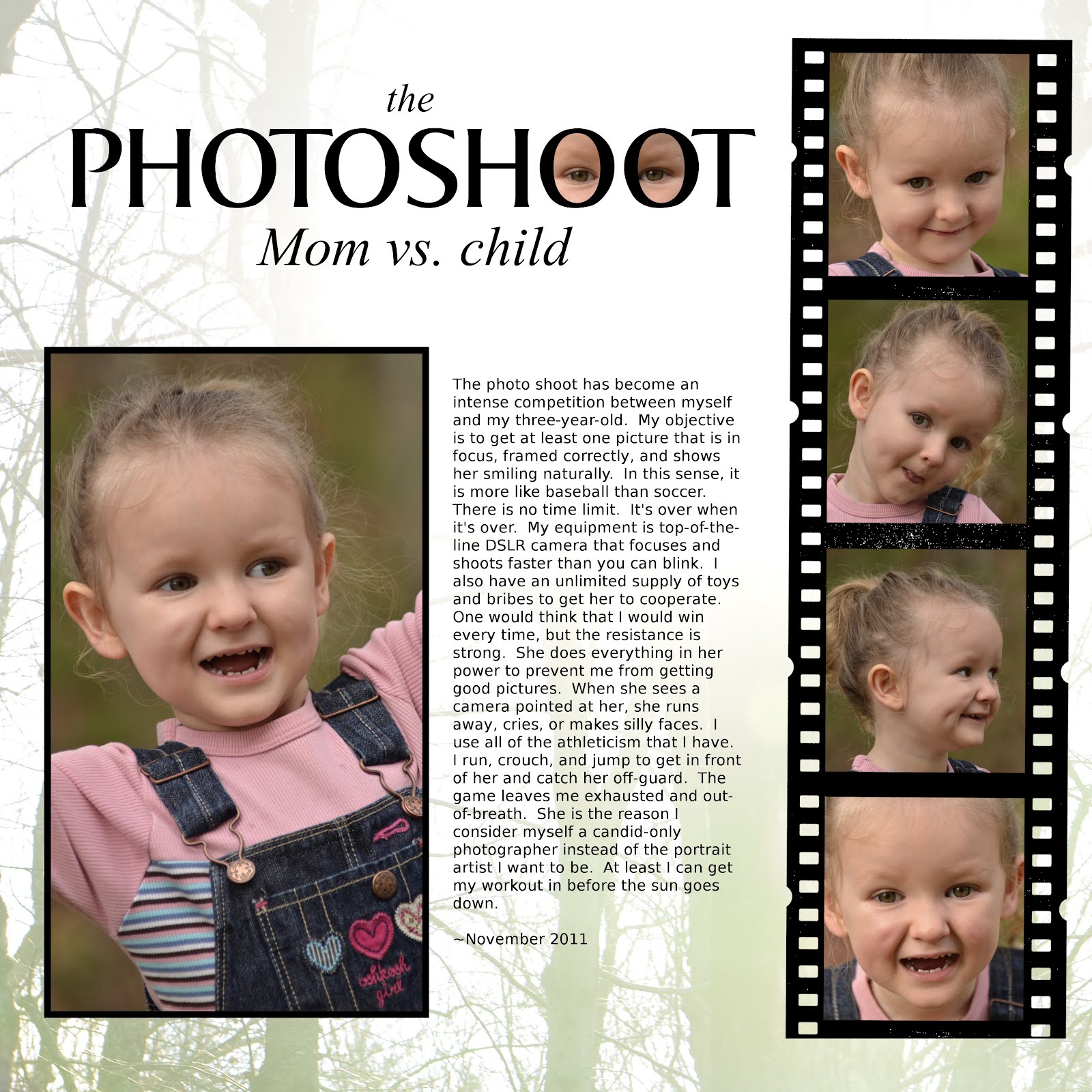
Everyone wants perfect pictures for their scrapbook. I certainly do, and I expend a significant effort to get them. Yet in the process, I get many, many bad ones. It can be frustrating taking pictures of small children. They don't yet understand the great service I am doing for them -- that my efforts will give them treasures to enjoy for years and decades to come. For now, they have no interest in smiling into an inanimate box and will usually do whatever they can to avoid getting their picture taken. Reflecting on this sad reality gave me the idea to make a page ABOUT our photo shoots. These are a few goofy pictures I've saved. Too bad I delete the REALLY bad ones right off the camera as soon as I took them. Otherwise, I could fill a whole album with our failures. Yet I saved a few pictures that are a few steps below perfect just to laugh at. And they've found a home right on this page. The journaling reads:

The photo shoot has become an intense competition between myself and my three-year-old. My objective is to get at least one picture that is in focus, framed correctly, and shows her smiling naturally. In this sense, it is more like baseball than soccer. There is no time limit. It's over when it's over. My equipment is top-of-the-line DSLR camera that focuses and shoots faster than you can blink. I also have an unlimited supply of toys and bribes to get her to cooperate. One would think that I would win every time, but the resistance is strong. She does everything in her power to prevent me from getting good pictures. When she sees a camera pointed at her, she runs away, cries, or makes silly faces. I use all of the athleticism that I have. I run, crouch, and jump to get in front of her and catch her off-guard. The game leaves me exhausted and out-of-breath. She is the reason I consider myself a candid-only photographer instead of the portrait artist I want to be. At least I can get my workout in before the sun goes down.

For the background, I used an overexposed shot of the sun poking through the trees in our backyard. I thought that would give the page a little visual context. Thanks for looking!

Saturday, January 21, 2012

Creating a snowy white background


The snow is FINALLY here in southeastern Massachusetts. We got one strange snowstorm in October then nothing until mid-January. So when it came this week, I bundled the kids up and rushed them outside before it melted. I took my camera with me to capture these precious childhood memories, of course. In the process, I also discovered that snow makes a great blank background for a scrapbook page!

The hardest part, after accepting the fact that my toddlers don't pose for the camera, was getting the right exposure. When you put the camera in full auto mode, the snow becomes a yucky gray and the subject comes out very underexposed. That's because the camera thinks you want an image with an even tone. Under most conditions, that is correct. But snow is different because most of the image is SUPPOSED to be a very bright white. It took me a while to realize this, meanwhile missing the opportunity to get good pictures of my daughter playing the snow for the first time.

One solution is to change the camera setting to “snow.” I've never used it, but I would think that it would produce results much better than it would in “auto.” The other solution, if your camera allows, is to use exposure compensation. I took test shots of my kids against the snow, increasing the exposure until the snow turns into one big blown-out highlight (also known as "the blinkies”), then dialed it back one stop to get healthy-looking white snow and a correctly exposed subject.

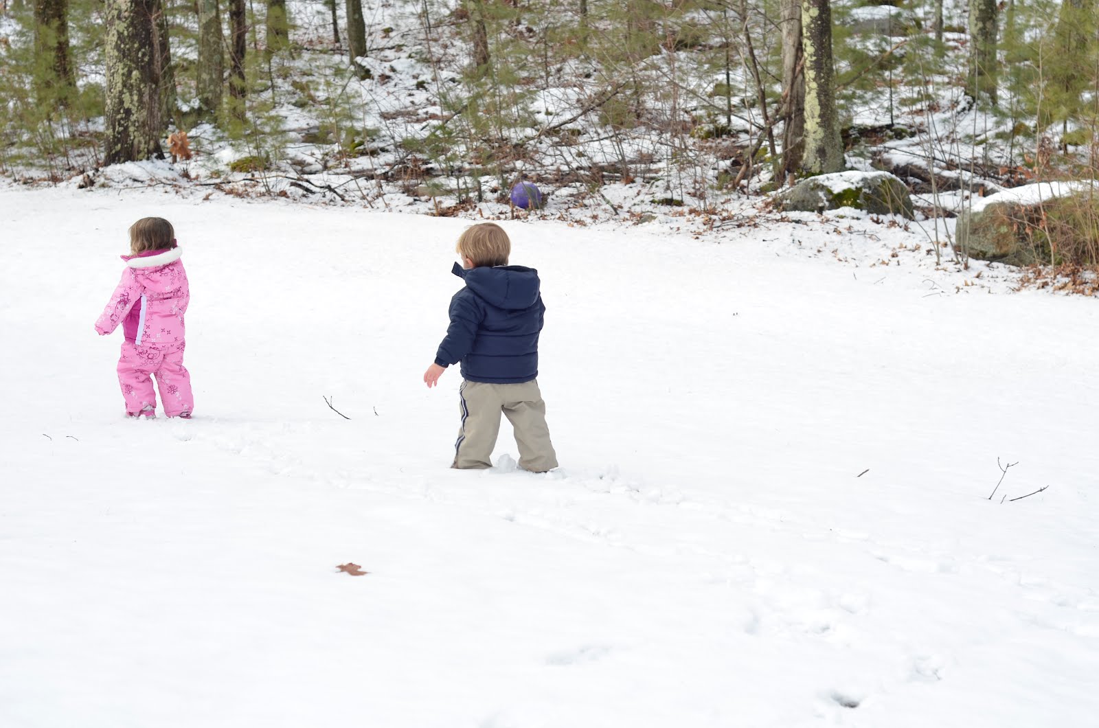
The next step is to take pictures with the snow surrounding the entire subject. After chasing my kids around the yard and begging them to move this way or that way, here's what I got:


Using GIMP, I used a soft brush to paint over the woods and some stray twigs popping out the the ground. To make sure that it blended correctly, I used a sample color from the snow, which is a little darker than true white. I was debating whether to leave the leaf in the picture. I decided to keep it there to give the impression that they are indeed standing on ground and are not floating in the air. Then I added the title, journaling, and a border. For those interested, the journaling reads:

Look who's bringing up the rear! It's my little boy, who is now almost as big as his sister. And at 27 pounds, he's just three pounds lighter than her and almost as strong. I have been looking forward to this day since he was a 9 pound newborn and I had to make sure she didn't crush him. Now that they are just about equals, I can relax a little and watching them chase each other around the yard. Having a baby and a toddler is tough, but having two preschoolers is fun! I'm so glad they're just 18 months apart in age and I wouldn't have it any other way. They are quickly becoming best friends and I hope it stays that way forever. ~January 2012

I love using blank backgrounds for my layouts. They isolate the subject and can give the image a surreal quality. This is very hard to accomplish with candid shots of people, as there always seems to be something distracting behind them. A beautiful snow-covered lawn makes a great background, as well as a nice canvas to add text later. I'll also add that for those unfortunate people who don't get snow where they live, you can do the same thing at the beach against the bright sand.

Thanks for looking!

Friday, November 11, 2011

Teasing our little ones


Most pages about babies have a similar theme. “Sweet Baby,” “Beautiful Baby,” and “Adorable” come to mind. I've done plenty of these layouts. Yet while we do love our babies to death, raising children brings about other emotions as well. They make us tired and frustrated and sometimes we just wish they would hurry up and reach the next stage of independence. Shouldn't we tell these stories in our scrapbook as well?

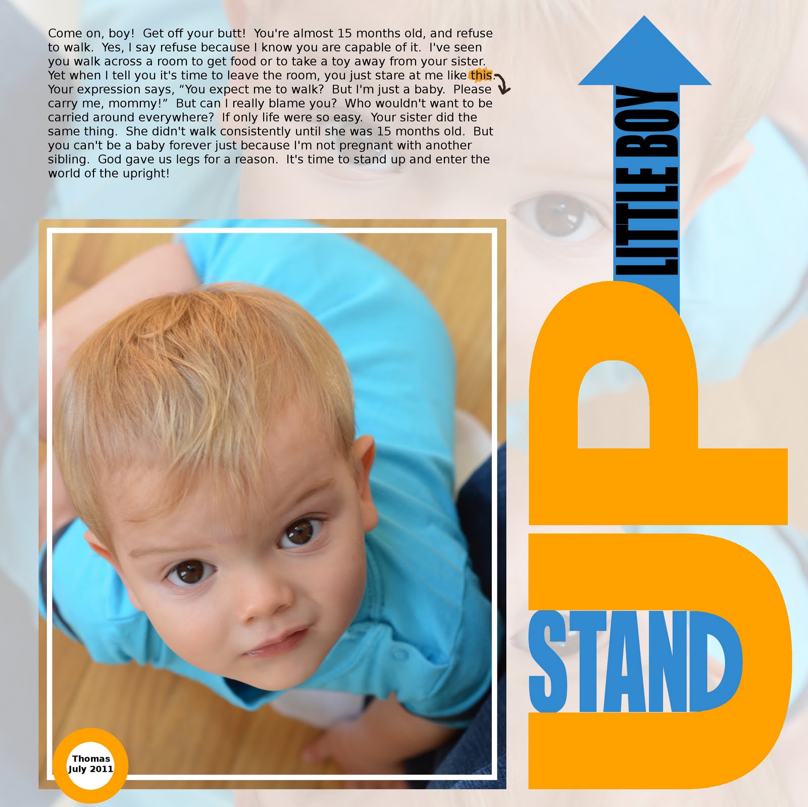
I took this photo of my son this past summer. He knew how to walk, but was just as happy to sit there and look up at me. I liked this photo and I wanted to feature it in a layout. But I had already done many “Sweet Baby” pages (just look at my walls). It was time for a “Pain-In-The-Neck Baby” page. Here's what I wrote about my reluctant walker:

Come on, boy! Get off your butt! You're almost 15 months old, and refuse to walk. Yes, I say refuse because I know you are capable of it. I've seen you walk across a room to get food or to take a toy away from your sister. Yet when I tell you it's time to leave the room, you just stare at me like this. Your expression says, “You expect me to walk? But I'm just a baby. Please carry me, mommy!” But can I really blame you? Who wouldn't want to be carried around everywhere? If only life were so easy. Your sister did the same thing. She didn't walk consistently until she was 15 months old. But you can't be a baby forever just because I'm not pregnant with another sibling. God gave us legs for a reason. It's time to stand up and enter the world of the upright!

Though fun to write about, venting our minor frustrations can be educational as well. My son is now 18 months old and walks just fine. In fact, I had forgotten about this little stage until now. It reminds me how fast each stage goes by, and makes me realize that the little problems I face now will be over and forgotten before I know it. It almost makes me angry at myself for wishing them away. I've learned to just enjoy each stage for what it is... and then joke about it in a scrapbook page!

Monday, May 9, 2011

Creating texture with brushes


When I started digital scrapbooking, I didn't really know the power of the brush. I figured that the brush tool is just used for drawing and writing, and I stuck with the circle-shaped brush that came with the program.

Then I realized that there are many kinds of brushes out there, in many shapes and colors. I noticed other scrapbookers were using them as stamps to make beautiful embellishments. Still, I held out for a while. I figured that it amounted to using someone else's work, and I wanted to do as much as I could do myself. I even experimented with making my own brushes, as described here.

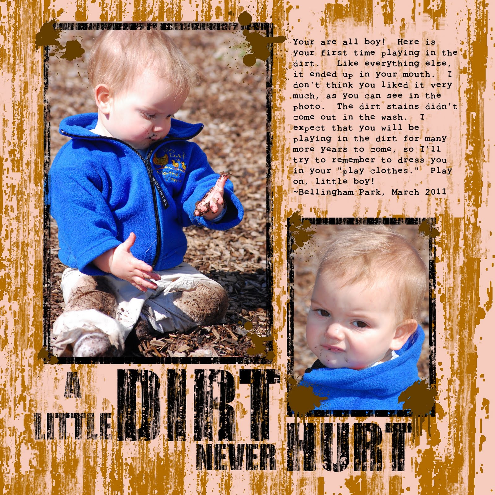
My scrapbooking style is generally clean and simple, but some layouts call for something a little more fun. Certainly, a layout of a boy in the dirt needs a dirty texture. Yet I had always had trouble when I tried to create texture with the GIMP's basic tools. The artistic filters just weren't cutting it. I definitely needed the right brush.

The Journaling reads:

You are all boy! Here is your first time playing in the dirt. Like everything else, it ended up in your mouth. I don't think you liked it very much, as you can see in the photo. The dirt stains didn't come out in the wash, either. I expect that you will be playing in the dirt for many more years to come, so I'll try to remember to dress you in your "play clothes." Play on, little boy!
~Bellingham Park, March 2011


Doing a quick Google search, I realized that there are lots of messy, grunge-style brushes out there. The brush I used in this layout is from a brush set called “Scratchie” at DeviantArt here. They served my purpose to create a messy, streaky look.

To create the effect, I chose a nice brown color and stamped away. I then went over it again using the same brush as an eraser. I used different sizes and tried to make it as random as possible to avoid creating a repetitive pattern.

I used the same brush to make distressed lettering. Big and bold font works best to create the distressed texturing without destroying the letters. I used “Impact Condensed.” I then used the erase brush and randomly stamped on top of the letters to create a worn appearance. To make the letters more legible, I used the erase brush on the “dirt” under the letters to create more contrast. All-in-all, I think it came out dirty enough to complement my son's hands, knees, and face.

There is a huge variety of free brushes on the Internet. Most are compatible with both Photoshop and GIMP. While many people have spent hundreds of dollars for Photoshop, us GIMP users can get the same stuff with our free program.

Be sure to read the terms of use before using the brushes. Most permit free, unlimited personal use as long as we give credit. Many also allow commercial use, but some charge a royalty fee.

Indeed, the power of the brush has overtaken my need to earn artistic merit. Now that I have started to use pre-made brushes, I don't think that I can go back to my strict DIY ways. Digital brushes are one of the most versatile tools available to us digital scrapbookers, and creating texture is just one way to use them.

Saturday, April 2, 2011

Scrapping a child's artwork


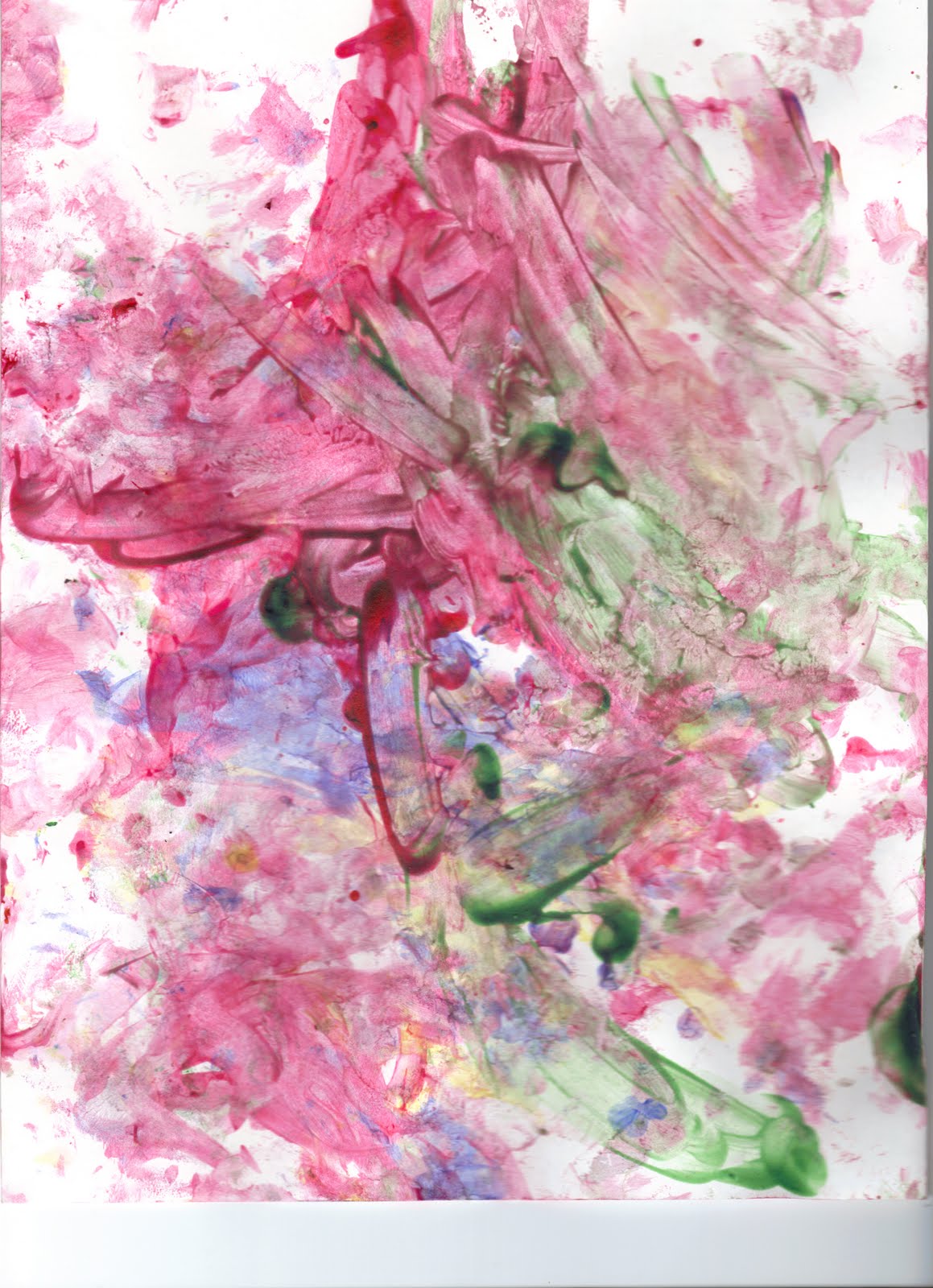
This was a collaborative effort between myself and my two-year-old. I don't think she knew that she was helping me create a layout, though. I think she was just having fun and making a mess. Still, I like to call this project her first work of art.

Many people include their child's artwork in a scrapbook album. When the kid is older and can paint something that actually resembles a real-life object, the artwork could stand alone on the page. Right now, however, my daughter's style is purely abstract. That's why I added my own touch to make it a little more, ummm, interesting.

How to do it
This is actually one of the easiest layouts I've done. Of course, I should give credit where credit is due, as my daughter did most of the work for me. I started off with these two images:


Open the images in two separate layers. On the image with the face, erase around the background. It doesn't have to be perfect because most of the detail will be eliminated in the end anyway. Duplicate the layer to save a copy.

Then use the threshold function (colors > threshold) for the layer with the face. The threshold function turns the image into two colors – black and white. By adjusting the threshold, you can determine how much of the image is black and how much is white. Play around with it to get the best effect.

Change the layer mode to “darken only.” This will make the white parts invisible so that you can see the painting under her face.

I know that it is controversial to alter someone else's artwork, but I thought that the color in her painting needed a little help. So I adjusted the saturation to the highest level (color > hue/saturation). This really brightened up the painting and helped the black image of her face show up more clearly. I hope she forgives me when she's older and realizes what I've done to her masterpiece.

For the text, I used Seagull Bold. I stretched it out a little to make it fit.

Other ideas
You could also make a layout ABOUT her projects, not just OF the project. Include pictures you took of the process. Here are a few I've done:


All of this is to say that there are many unique ways to incorporate a child's artwork into your layouts. Rather than simply throwing them in an album (which is still better than nothing), have a little fun with it. For me, it makes the mess-making worth it.

Saturday, February 12, 2011

Color splash!


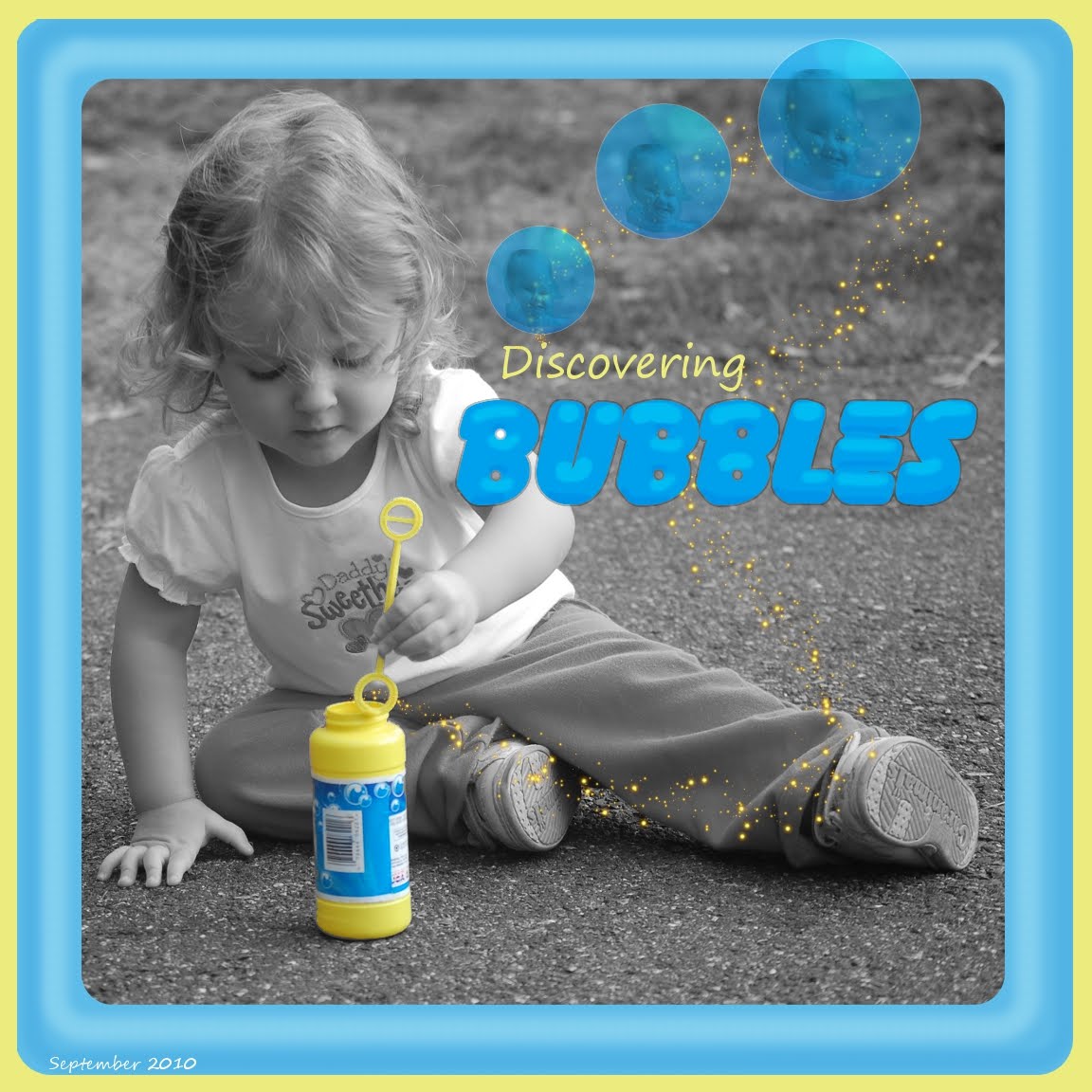
I remember I used to be so impressed when I saw wedding photos with the flowers in color and the rest of the photo in black and white. I think those photographers impress many people with these tricks, as most of them command thousands of dollars for a wedding.

This trick is super easy to do in GIMP. Just select the area you want to remain in color, go to select > invert, then color > hue-saturation, and a move the "saturation" bar down to -100.

I like to use color splash because I think that a simple color scheme is more pleasing than a layout with every color in the rainbow. For this layout, I think the blue and yellow went well together.

The hard part is deciding which photos to use the effect on. I decided to do a color splash on this photo because the yellow of the bubble bottle was so bright and she was looking at it so intently.

For the bubbles, I painted one and duplicated it twice. To paint the bubble, I simply opened a new layer, made a circle selection, filled it with light blue, and added some dodge and burn. I drew a thin white line around it to make it more realistic.

I added a picture of my daughter's face in the reflection for fun. To give the reflection a rounded look, I did a lens distortion on the face.

I adjusted the opacity down to make it transparent, then flattened the bubble and duplicated the layer twice. I then scaled each bubble to give a little depth perspective.

What colors do you think go well together? I'm going to go through my photos and think of different color schemes to use for layouts.