Showing posts with label backgrounds. Show all posts

Saturday, January 21, 2012

Creating a snowy white background


The snow is FINALLY here in southeastern Massachusetts. We got one strange snowstorm in October then nothing until mid-January. So when it came this week, I bundled the kids up and rushed them outside before it melted. I took my camera with me to capture these precious childhood memories, of course. In the process, I also discovered that snow makes a great blank background for a scrapbook page!

The hardest part, after accepting the fact that my toddlers don't pose for the camera, was getting the right exposure. When you put the camera in full auto mode, the snow becomes a yucky gray and the subject comes out very underexposed. That's because the camera thinks you want an image with an even tone. Under most conditions, that is correct. But snow is different because most of the image is SUPPOSED to be a very bright white. It took me a while to realize this, meanwhile missing the opportunity to get good pictures of my daughter playing the snow for the first time.

One solution is to change the camera setting to “snow.” I've never used it, but I would think that it would produce results much better than it would in “auto.” The other solution, if your camera allows, is to use exposure compensation. I took test shots of my kids against the snow, increasing the exposure until the snow turns into one big blown-out highlight (also known as "the blinkies”), then dialed it back one stop to get healthy-looking white snow and a correctly exposed subject.

The next step is to take pictures with the snow surrounding the entire subject. After chasing my kids around the yard and begging them to move this way or that way, here's what I got:
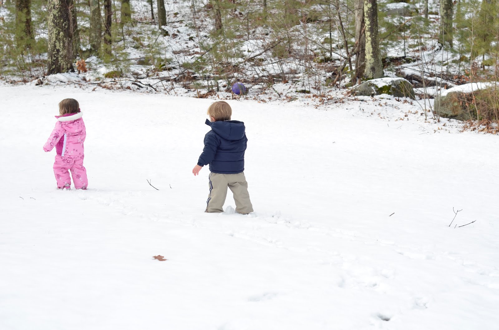


Using GIMP, I used a soft brush to paint over the woods and some stray twigs popping out the the ground. To make sure that it blended correctly, I used a sample color from the snow, which is a little darker than true white. I was debating whether to leave the leaf in the picture. I decided to keep it there to give the impression that they are indeed standing on ground and are not floating in the air. Then I added the title, journaling, and a border. For those interested, the journaling reads:

Look who's bringing up the rear! It's my little boy, who is now almost as big as his sister. And at 27 pounds, he's just three pounds lighter than her and almost as strong. I have been looking forward to this day since he was a 9 pound newborn and I had to make sure she didn't crush him. Now that they are just about equals, I can relax a little and watching them chase each other around the yard. Having a baby and a toddler is tough, but having two preschoolers is fun! I'm so glad they're just 18 months apart in age and I wouldn't have it any other way. They are quickly becoming best friends and I hope it stays that way forever. ~January 2012

I love using blank backgrounds for my layouts. They isolate the subject and can give the image a surreal quality. This is very hard to accomplish with candid shots of people, as there always seems to be something distracting behind them. A beautiful snow-covered lawn makes a great background, as well as a nice canvas to add text later. I'll also add that for those unfortunate people who don't get snow where they live, you can do the same thing at the beach against the bright sand.

Thanks for looking!

Monday, March 28, 2011

Masking Ugly Backgrounds


The best photos of people have clean, uncluttered backgrounds. Professionals can accomplish this in a studio with fancy lighting and backdrops. Even though I'm no professional, I move around to try to get the best angle to isolate the subject. Yet when you're trying to capture a fleeting moment like this, you can't wait around until you get a better background.

Yet us scrappers can take a little artistic license and cheat a little by masking the background. One option for dealing with ugly backgrounds is to paint your own (see my post about it here). Masking the background is a much simpler way to eliminate it.

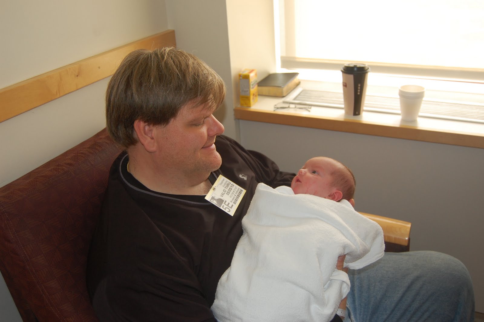
The original

I took this photo of my husband and son in the hospital just after he was born. Here's the original:


I managed to capture my newborn staring into his father's eyes, but the window and coffee cups weren't doing anything for the photo.

The mask

To create the mask, I simply did a lasso select around the area above the subjects, filled it with the color of the wall, then blurred it to get the desired effect. I repeated this technique to get a border around the bottom of the layout. It's as easy as that!

Using the blank space for text

Masking the background also creates a clean slate for text. Rather than simply making the photo smaller in order to fit the title and journaling into the layout, you can fill the page with the photo and write your words on the mask. Play around with different fonts, sizes, and positions to get a fun, dynamic title. Play with different filters as well. I added a drop shadow under the word "eyes" to make it pop.

Masking ugly backgrounds is one of the simplest, quickest tricks I've learned in the GIMP. With digital scrapbooking, there is no need to include cluttered backgrounds in your layout. Just mask them!

The journaling on this layout reads:

Looking into the eyes of a new person is an amazing experience. I always wonder what babies think when they see the world for the first time. They study the faces of the people around them, bonding with the ones who will help him survive the first few years of their lives. Here, two-day-old Thomas is getting acquainted with his father through some intense eye contact. I'm sure he recognized the sound of his deep voice from when he was in the womb, but now he finally gets to see him in person. That look of wonder and amazement in his eyes is priceless.
-- May 2010

Sunday, March 20, 2011

Painting your own background


Happy spring, everyone! Spring is my second favorite season, after autumn. It's an opportunity to get outside and witness the rejuvenation of nature before the oppressive heat sets in. My poor kids have been cooped up all winter, and I'll try to get outside as much as possible now that everything is thawed.

I took this photo of my daughter last spring in our backyard. She loves being on a swing more than anything else in the world. For this photo shoot, I dressed her up in a spring dress and took her out into the yard. Here is the original photograph:


I love the perspective I got by lying down and pointing the camera up at her. But as you can see, the background does nothing for the photo. So what do I do when I don't like the background? Paint my own, of course.

I don't consider myself a painter or fine artist by any means. But it is easy to make a very cute layout with a few brush strokes and some simple GIMP tricks.

Select Carefully

Getting a clean selection around the subject is important to creating a high-quality image. Any stray pixels around the subject will show up in a 12x12 print and will look horrible. For this layout, I started with the lasso tool. I then used the magic wand around the edge (make sure the selection tool is set to "add to selection"). After you are satisfied with the selection, simply invert it and hit the "delete" key. Then, zoom in to the pixel level and make sure there isn't any of the background around the subject.

Painting the Background

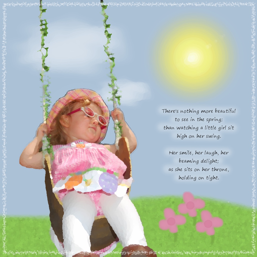
I started off with a blue layer. I added the grass in another layer using a fuzzy brush. I created texture in the grass by making noise (Filters > Noise) and then a motion blur (Filters > Blur > Motion Blur). For the sun, I drew a yellow circle and blurred it. For the flowers, I simply drew one and duplicated the layer twice to make three of them. For the clouds, I did a combination of dodge/burn and smudge to get healthy-looking clouds.

Oilify

I then took the layout a bit further and gave it an artsy-fartsy feel. The GIMP offers a wide variety of ways to make an image look like a hand-made work of art. For this layout, using an artistic filter helped me reduce the harsh contrast between her photographed image and the painted background.

To accomplish this, I flattened the image, drew a circle selection around her face, inverted the selection, feathered it (use trial-and-error to get the right amount), then Oilified it (Filters > Artistic > Oilify). This made the layout look like a painting, while keeping her face looking photographically clear.

Creating a background from scratch is just one more way you can demonstrate your creativity and hide an ugly background. With the GIMP, the sky is the limit!