
Happy spring, everyone! Spring is my second favorite season, after autumn. It's an opportunity to get outside and witness the rejuvenation of nature before the oppressive heat sets in. My poor kids have been cooped up all winter, and I'll try to get outside as much as possible now that everything is thawed.
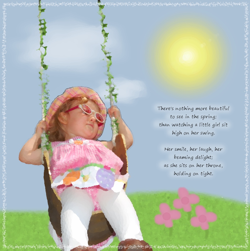
I took this photo of my daughter last spring in our backyard. She loves being on a swing more than anything else in the world. For this photo shoot, I dressed her up in a spring dress and took her out into the yard. Here is the original photograph:

I love the perspective I got by lying down and pointing the camera up at her. But as you can see, the background does nothing for the photo. So what do I do when I don't like the background? Paint my own, of course.
I don't consider myself a painter or fine artist by any means. But it is easy to make a very cute layout with a few brush strokes and some simple GIMP tricks.
Select Carefully
Getting a clean selection around the subject is important to creating a high-quality image. Any stray pixels around the subject will show up in a 12x12 print and will look horrible. For this layout, I started with the lasso tool. I then used the magic wand around the edge (make sure the selection tool is set to "add to selection"). After you are satisfied with the selection, simply invert it and hit the "delete" key. Then, zoom in to the pixel level and make sure there isn't any of the background around the subject.
Painting the Background
I started off with a blue layer. I added the grass in another layer using a fuzzy brush. I created texture in the grass by making noise (Filters > Noise) and then a motion blur (Filters > Blur > Motion Blur). For the sun, I drew a yellow circle and blurred it. For the flowers, I simply drew one and duplicated the layer twice to make three of them. For the clouds, I did a combination of dodge/burn and smudge to get healthy-looking clouds.
Oilify
I then took the layout a bit further and gave it an artsy-fartsy feel. The GIMP offers a wide variety of ways to make an image look like a hand-made work of art. For this layout, using an artistic filter helped me reduce the harsh contrast between her photographed image and the painted background.
To accomplish this, I flattened the image, drew a circle selection around her face, inverted the selection, feathered it (use trial-and-error to get the right amount), then Oilified it (Filters > Artistic > Oilify). This made the layout look like a painting, while keeping her face looking photographically clear.
Creating a background from scratch is just one more way you can demonstrate your creativity and hide an ugly background. With the GIMP, the sky is the limit!
No comments:
Post a Comment