When I started digital scrapbooking, I didn't really know the power of the brush. I figured that the brush tool is just used for drawing and writing, and I stuck with the circle-shaped brush that came with the program.
Then I realized that there are many kinds of brushes out there, in many shapes and colors. I noticed other scrapbookers were using them as stamps to make beautiful embellishments. Still, I held out for a while. I figured that it amounted to using someone else's work, and I wanted to do as much as I could do myself. I even experimented with making my own brushes, as described here.
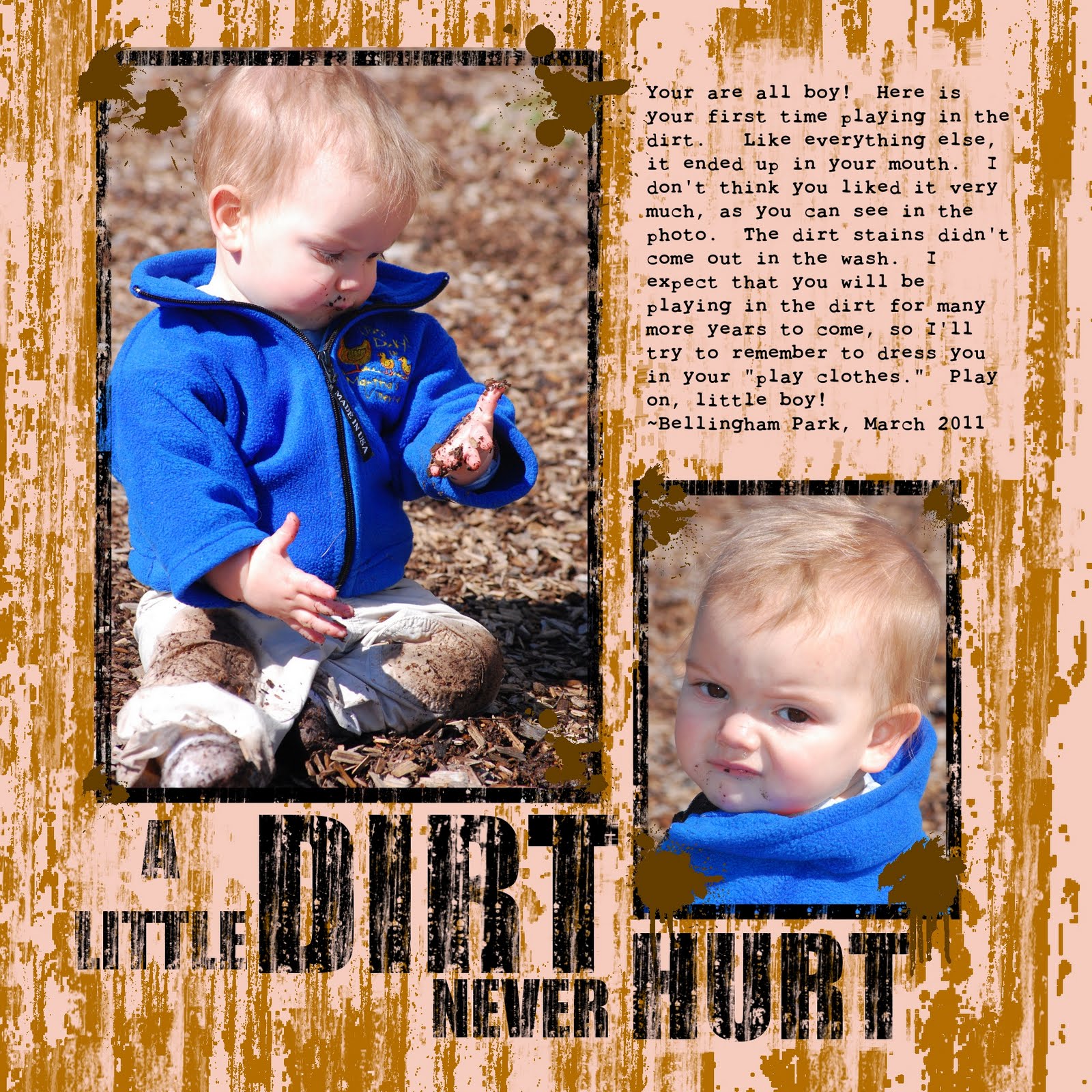
My scrapbooking style is generally clean and simple, but some layouts call for something a little more fun. Certainly, a layout of a boy in the dirt needs a dirty texture. Yet I had always had trouble when I tried to create texture with the GIMP's basic tools. The artistic filters just weren't cutting it. I definitely needed the right brush.
The Journaling reads:
You are all boy! Here is your first time playing in the dirt. Like everything else, it ended up in your mouth. I don't think you liked it very much, as you can see in the photo. The dirt stains didn't come out in the wash, either. I expect that you will be playing in the dirt for many more years to come, so I'll try to remember to dress you in your "play clothes." Play on, little boy!
~Bellingham Park, March 2011
Doing a quick Google search, I realized that there are lots of messy, grunge-style brushes out there. The brush I used in this layout is from a brush set called “Scratchie” at DeviantArt here. They served my purpose to create a messy, streaky look.
To create the effect, I chose a nice brown color and stamped away. I then went over it again using the same brush as an eraser. I used different sizes and tried to make it as random as possible to avoid creating a repetitive pattern.
I used the same brush to make distressed lettering. Big and bold font works best to create the distressed texturing without destroying the letters. I used “Impact Condensed.” I then used the erase brush and randomly stamped on top of the letters to create a worn appearance. To make the letters more legible, I used the erase brush on the “dirt” under the letters to create more contrast. All-in-all, I think it came out dirty enough to complement my son's hands, knees, and face.
There is a huge variety of free brushes on the Internet. Most are compatible with both Photoshop and GIMP. While many people have spent hundreds of dollars for Photoshop, us GIMP users can get the same stuff with our free program.
Be sure to read the terms of use before using the brushes. Most permit free, unlimited personal use as long as we give credit. Many also allow commercial use, but some charge a royalty fee.
Indeed, the power of the brush has overtaken my need to earn artistic merit. Now that I have started to use pre-made brushes, I don't think that I can go back to my strict DIY ways. Digital brushes are one of the most versatile tools available to us digital scrapbookers, and creating texture is just one way to use them.