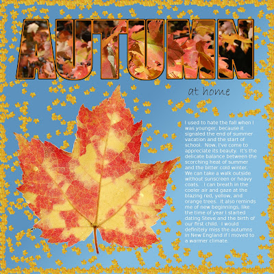
I love the autumns here in New England, and I love taking pictures of the leaves in all their splendor. Although yes, I realize that autumn seems like a distant memory as we are buried under all this snow.
For the background, I used a dark-to-light blue gradient to simulate the color of the sky. The photo of the large leaf was taken against the sky, but I cropped around it so I could get a seamless background in a 12x12 format.
For the yellow leaves, I made a photo of a yellow leaf into a GIMP brush. I then created the maximum amount of jitter and adjusted the spacing to make it look random. To get the different orientation of the leaves, I just duplicated the layer twice and rotated 90 and -90 degrees, respectively. I merged the layers together to simplify, and erased the leaves that fell under the text.
For the border, I did a rectangle select close to the edge, went to edit > stroke selection, and selected "paintbrush." I decreased the spacing and jitter to make the leaves clump together a bit more.
The title is "impact condensed" font. I added the image in a new layer, right-clicked on the text layer and selected "alpha to selection," inverted the selection, went back to the image layer and pressed "delete." I created a border of brown and orange to make the text more readable.

No comments:
Post a Comment