Monday, March 28, 2011

Masking Ugly Backgrounds


The best photos of people have clean, uncluttered backgrounds. Professionals can accomplish this in a studio with fancy lighting and backdrops. Even though I'm no professional, I move around to try to get the best angle to isolate the subject. Yet when you're trying to capture a fleeting moment like this, you can't wait around until you get a better background.

Yet us scrappers can take a little artistic license and cheat a little by masking the background. One option for dealing with ugly backgrounds is to paint your own (see my post about it here). Masking the background is a much simpler way to eliminate it.

The original

I took this photo of my husband and son in the hospital just after he was born. Here's the original:
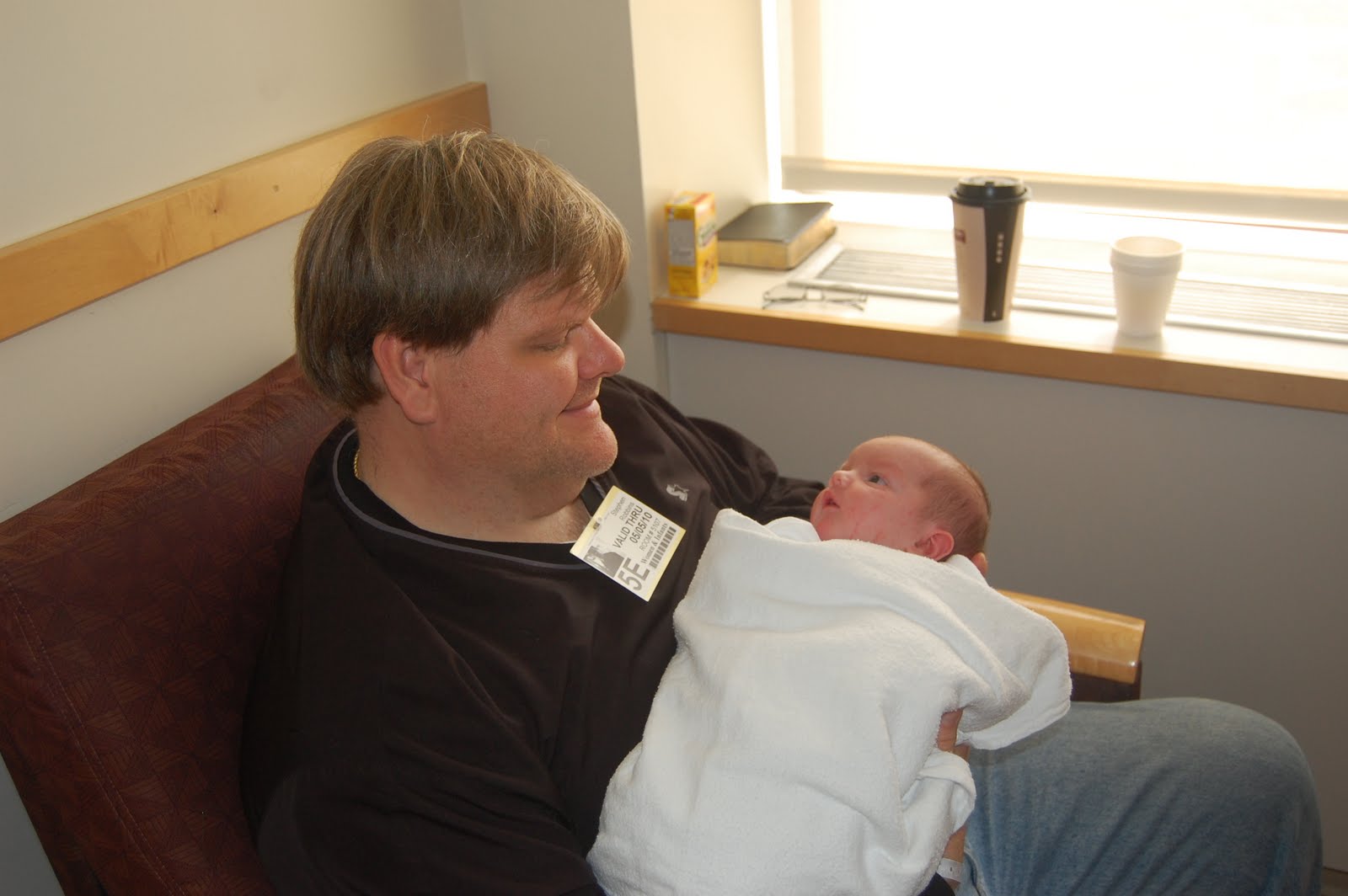


I managed to capture my newborn staring into his father's eyes, but the window and coffee cups weren't doing anything for the photo.

The mask

To create the mask, I simply did a lasso select around the area above the subjects, filled it with the color of the wall, then blurred it to get the desired effect. I repeated this technique to get a border around the bottom of the layout. It's as easy as that!

Using the blank space for text

Masking the background also creates a clean slate for text. Rather than simply making the photo smaller in order to fit the title and journaling into the layout, you can fill the page with the photo and write your words on the mask. Play around with different fonts, sizes, and positions to get a fun, dynamic title. Play with different filters as well. I added a drop shadow under the word "eyes" to make it pop.

Masking ugly backgrounds is one of the simplest, quickest tricks I've learned in the GIMP. With digital scrapbooking, there is no need to include cluttered backgrounds in your layout. Just mask them!

The journaling on this layout reads:

Looking into the eyes of a new person is an amazing experience. I always wonder what babies think when they see the world for the first time. They study the faces of the people around them, bonding with the ones who will help him survive the first few years of their lives. Here, two-day-old Thomas is getting acquainted with his father through some intense eye contact. I'm sure he recognized the sound of his deep voice from when he was in the womb, but now he finally gets to see him in person. That look of wonder and amazement in his eyes is priceless.
-- May 2010

Sunday, March 20, 2011

Painting your own background


Happy spring, everyone! Spring is my second favorite season, after autumn. It's an opportunity to get outside and witness the rejuvenation of nature before the oppressive heat sets in. My poor kids have been cooped up all winter, and I'll try to get outside as much as possible now that everything is thawed.

I took this photo of my daughter last spring in our backyard. She loves being on a swing more than anything else in the world. For this photo shoot, I dressed her up in a spring dress and took her out into the yard. Here is the original photograph:


I love the perspective I got by lying down and pointing the camera up at her. But as you can see, the background does nothing for the photo. So what do I do when I don't like the background? Paint my own, of course.

I don't consider myself a painter or fine artist by any means. But it is easy to make a very cute layout with a few brush strokes and some simple GIMP tricks.

Select Carefully

Getting a clean selection around the subject is important to creating a high-quality image. Any stray pixels around the subject will show up in a 12x12 print and will look horrible. For this layout, I started with the lasso tool. I then used the magic wand around the edge (make sure the selection tool is set to "add to selection"). After you are satisfied with the selection, simply invert it and hit the "delete" key. Then, zoom in to the pixel level and make sure there isn't any of the background around the subject.

Painting the Background

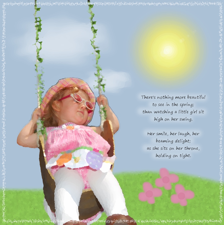
I started off with a blue layer. I added the grass in another layer using a fuzzy brush. I created texture in the grass by making noise (Filters > Noise) and then a motion blur (Filters > Blur > Motion Blur). For the sun, I drew a yellow circle and blurred it. For the flowers, I simply drew one and duplicated the layer twice to make three of them. For the clouds, I did a combination of dodge/burn and smudge to get healthy-looking clouds.

Oilify

I then took the layout a bit further and gave it an artsy-fartsy feel. The GIMP offers a wide variety of ways to make an image look like a hand-made work of art. For this layout, using an artistic filter helped me reduce the harsh contrast between her photographed image and the painted background.

To accomplish this, I flattened the image, drew a circle selection around her face, inverted the selection, feathered it (use trial-and-error to get the right amount), then Oilified it (Filters > Artistic > Oilify). This made the layout look like a painting, while keeping her face looking photographically clear.

Creating a background from scratch is just one more way you can demonstrate your creativity and hide an ugly background. With the GIMP, the sky is the limit!

Monday, March 14, 2011

Highlighting Part of Your Photograph


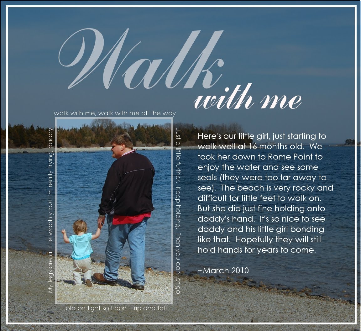
Using large photos for my layouts gives me the ability to re-frame images to my liking. Here, I've highlighted the most important part of the image -- my husband and daughter walking hand-in-hand. I've seen many other digital scrapbookers use this technique very well, and I wanted to give it a shot.

I took this photo last spring at Rome Point in Jamestown, Rhode Island. My daughter was a late bloomer and was just starting to walk well at 16 months old. The beach at Rome Point is very rocky and she definitely needed to hold a adult's hand. I thought it was so sweet to see them walking together like this.

Here, I simply darkened the remaining area to get the desired effect. However, I can think of several other ways to de-emphasize the background. Here are some other possibilities:

-Lighten the area.
-Reduce the contrast.
-Apply a pattern over the area, reducing the opacity to get the best effect.
-Blur the area.
-Apply any "artistic" filter (Filters > Artistic).
-Any combination of the above.

Another advantage of using this technique is that it allows plenty of room for journaling. Most landscape photographs have large areas of low contrast, such as the sky or water. This provides a great background for text. After darkening the water and sky in my layout, the white text became very easy to read.

So, this is one way to enhance your landscape shots with your family. There are many possibilities, so play around with it and have fun!