Monday, April 25, 2011

Blending Layers


I love trying new, creative ways to put words on a layout. Here, I used a photo of the word game, Scrabble. Many of my friends enjoy playing Scrabble and take it very seriously. I can't say I'm the best Scrabble player in the world. In fact, I often come in last. Yet as you can see here, I do alright when I play by myself.

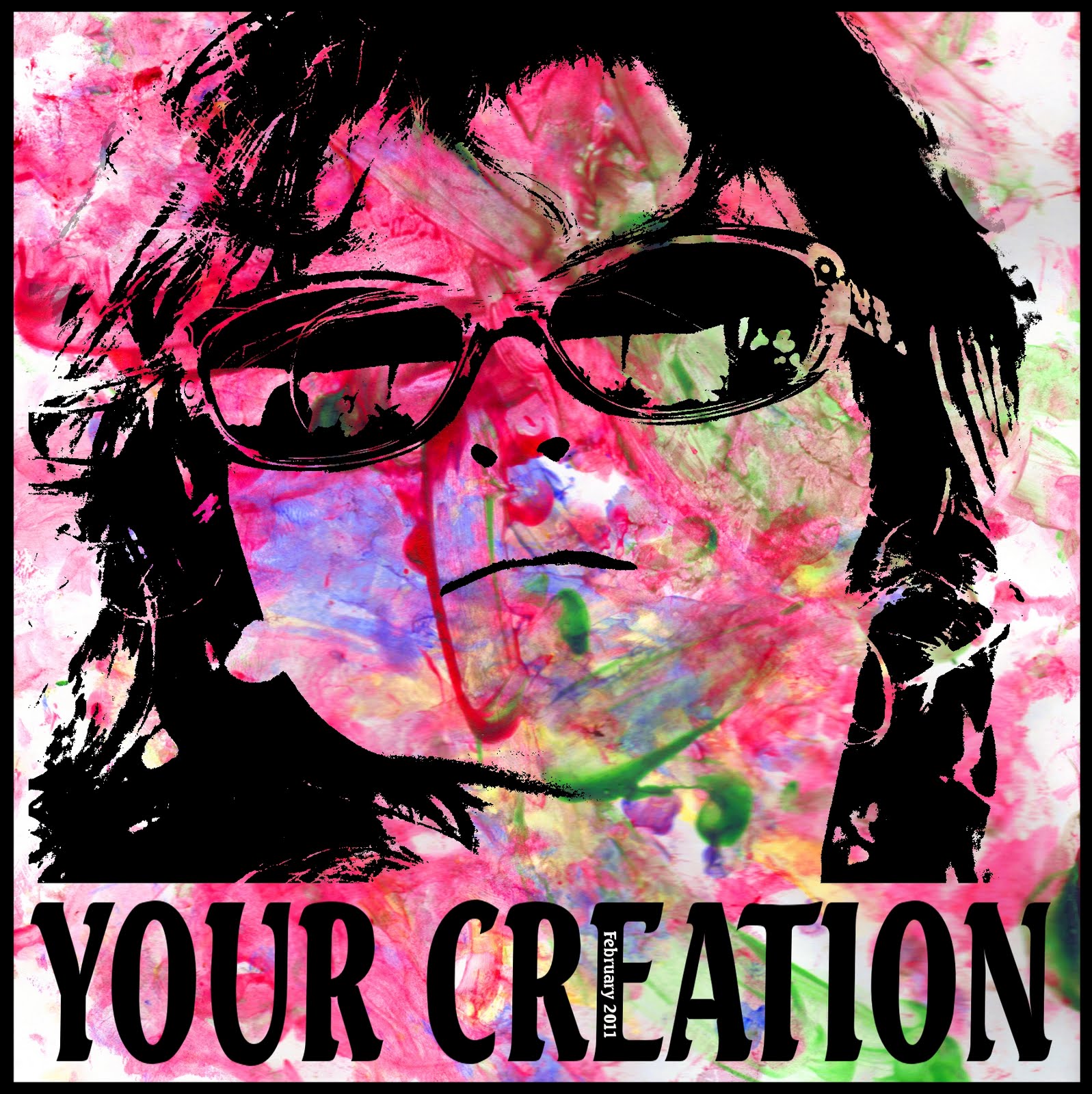
I can't say that using a Scrabble board in a scrapbook layout is totally my idea. I've seen it floating around in the scrapbooking universe. This is my take on it, and I've included a photo of my daughter. Though now that I look at it, I'm not sure that I like the colors. Maybe I'll try one for my son and see if I can make something that looks more bright and cheerful.

The trick to this layout was blending the layers so the words remained legible. The ability to blend layers in different ways is just one more reason why digital scrapbooking blows away traditional scrapbooking. I have just recently started playing with different layer modes in the GIMP, and I already see the possibilities.

The layer mode tells the GIMP how to blend layers together. The default layer mode is "normal." However, in the "normal" mode, the only way to see underlying layers is to adjust the opacity. This can make the underlying layer look muddy. Instead, you can use other layer modes to help them blend together more attractively.

To adjust the layer mode, click on where it says "Mode: Normal" in the Layers toolbox. You will see that there are 20 other layer modes to choose from. Try different modes to see if you can produce better effects than using the "Normal" mode.

I am still learning what each mode does. I found a good, well-researched explanation of layer modes in the GIMP here.

For this layout, I wanted to include a picture of my daughter without shoving her to the side of the page or blocking out the Scrabble tiles. To accomplish this, I simply added her face above the scrabble image, changed it to black and white, changed the layer mode to "Darken Only," and adjusted to opacity to 50%. I believe these settings work best in order to see both her face and the Scrabble board clearly.

This is just one way that I have been able to use different layer modes to create an interesting layout. There are an infinite number of ways to blend layers. I will continue to experiment with layer modes in the future.

Monday, April 18, 2011

Turning fuzzy shots into clear concepts


My photography techniques have changed since I started scrapbooking. For one thing, I don't hit the “delete” button quite as often. I have learned that just because a photo is not perfect doesn't mean it's useless. In fact, imperfect photos are like my children's “play cloths.” You can have more fun because you don't have to worry about ruining something nice.

I used to think that all my shots had to be perfectly in focus, have vibrant colors, and be free of any motion blur in order to show them to anybody. Yet even shots that I love have at least one thing wrong with them. In fact, I count on my husband to point out the flaws in my photos. The other day, I showed him a picture of our children when they were 6 months and two years old. The shot was in focus, the lighting was good, and my daughter had a smile on her face. He stared at it for a minute, frowned, and said, “there's dirt on her shoe.” I mean, come on! I'm lucky if there's not food all over her face!

Indeed, most people who consider themselves photographers frown on imperfection. This may be a good approach for professionals. After all, most people who pay good money for portraits want photographically perfect photos.

I, on the other hand, am just doing this for fun. Now I tell my husband that I'll take whatever kind of pictures I want and people can decided if they like them or not. I mean, if a few squiggles can pass for fine art, my bad photos can be made into something artistic.

With digital scrapbooking, I combine titles, journaling, and photos to convey a concept. In this layout, I wanted to convey a loud, in-your-face quality. Here's the shot I took of my daughter as she ran around in circles in our driveway:


The harsh sunlight cast a nasty shadow on her face. And because she was running, the photo was out of focus and blurry. Indeed, the picture does lack detail. But I liked the position of her body and the look of sheer delight on her face. You couldn't get a kid to smile better than that in Disney World. So I kept my finger off the “delete” button and saved it for a fun layout.

The journaling reads and repeats: “Bounce, bounce, bounce, bounce. Run, run, run, run. Spin, spin, spin, spin. You go in circles and never seem to get tired. Where does all that energy come from, and when will it run out?” I like repeat journaling because I can do funky things to it and not worry about the entire thing being legible. Here, I put a gradient mask over the words to make them fade at the top.

I exaggerated the harsh lighting to add contrast. High contrast to me equals high energy. And energy is just what this layout is about. To do this, I simply duplicated the layer and set the layer mode to “hard light.”

I made it into 8x10 format so that I can print it out on my computer. I figured that there is no reason to spend the money to get a print when detail doesn't matter so much.

I read an article in the magazine Popular Photography that said that making photos appear old or faded is a “fad.” It is true that I would not want to take a great photo and mess with it. That's why I wait for the bad ones to have fun. In the words of the famous photographer Ansel Adams, “there is nothing worse than a clear shot of a fuzzy concept.” I take these words to heart and make fuzzy shots into clear concepts.

Monday, April 11, 2011

Getting layout ideas


While writers often struggle with writers' block, scrapbookers struggle with (um...) scrapper's block. It's happened to me many times before. I sit down to scrap my photos, assuming that the layout is going to automatically manifest itself on the screen. Then my mind goes blank and I can't think of how to start. How many pictures should I include? Should I do a collage or just one big photo? What color scheme and fonts should I use?

Ideas can sometimes feel like a limited commodity, but they don't have to be. Ideas are everywhere. No man exists on an island, and this couldn't be more true for us scrapbookers. In fact, the best way to get ideas is look around and seek inspiration from others. I get many ideas from these sources:

Books
When you go to your local thrift store, look for books about scrapbooking. I've built a small library of scrapbooking books that I've picked up for a couple of bucks each. When I'm looking for some fresh ideas, I pick one off the shelf and flip through it.

Surf the Internet
Surfing the Internet is the most obvious solution, as you are already on the computer. Search Google images for scrapbook layouts that people have posted to blogs and websites.

Scrapbook.com
Users like me have uploaded hundreds of thousands of layouts on Scrapbook.com. I scan through them every few days to get ideas. You can return the favor by uploading your own, too! This is also a great way to connect with other scrappers.

Advertisements
The most talented people in graphic design go into advertising. The rest of us make scrapbooks and blog about it. Magazine ads, catalogs, and billboards can give you great ideas about how to arrange your own pictures on a page. They also have catchy word art that you can mimic with your software.

Artists
Yes, I believe scrapbooking itself is an art. Yet we can also look at other art for inspiration. I've gotten many ideas from other artists, such as this word mask here.


Play pretend
I have had fun making layouts look like something else. There are many ways you can do this. I have made a newspaper article:


And a comic strip:


I've also seen layouts done to look like a wanted poster, a magazine cover, or an ad for a TV show. Playing pretend is a clever, fun way to depict your story or event.

Nature
Nature inspires many artists, and scrapbookers are no exception. Nature has been the inspiration of many of my layouts:


The key to finding ideas is to develop a scrapbooker's eye (yes, I made that term up). If you are always thinking about your next layout, you will constantly be inspired by things around you. You will find that you have more ideas than time to use them.

Saturday, April 2, 2011

Scrapping a child's artwork


This was a collaborative effort between myself and my two-year-old. I don't think she knew that she was helping me create a layout, though. I think she was just having fun and making a mess. Still, I like to call this project her first work of art.

Many people include their child's artwork in a scrapbook album. When the kid is older and can paint something that actually resembles a real-life object, the artwork could stand alone on the page. Right now, however, my daughter's style is purely abstract. That's why I added my own touch to make it a little more, ummm, interesting.

How to do it
This is actually one of the easiest layouts I've done. Of course, I should give credit where credit is due, as my daughter did most of the work for me. I started off with these two images:


Open the images in two separate layers. On the image with the face, erase around the background. It doesn't have to be perfect because most of the detail will be eliminated in the end anyway. Duplicate the layer to save a copy.

Then use the threshold function (colors > threshold) for the layer with the face. The threshold function turns the image into two colors – black and white. By adjusting the threshold, you can determine how much of the image is black and how much is white. Play around with it to get the best effect.

Change the layer mode to “darken only.” This will make the white parts invisible so that you can see the painting under her face.

I know that it is controversial to alter someone else's artwork, but I thought that the color in her painting needed a little help. So I adjusted the saturation to the highest level (color > hue/saturation). This really brightened up the painting and helped the black image of her face show up more clearly. I hope she forgives me when she's older and realizes what I've done to her masterpiece.

For the text, I used Seagull Bold. I stretched it out a little to make it fit.

Other ideas
You could also make a layout ABOUT her projects, not just OF the project. Include pictures you took of the process. Here are a few I've done:


All of this is to say that there are many unique ways to incorporate a child's artwork into your layouts. Rather than simply throwing them in an album (which is still better than nothing), have a little fun with it. For me, it makes the mess-making worth it.