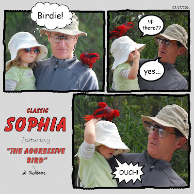
I took these photos of my daughter and my dad at a zoo in Florida. Unfortunately, my poor little daughter has not had much luck with zoo animals. Just a few months ago, she had her hair pulled by a monkey. Here, she is getting bit by a bird! It left a small mark but didn't break any skin. Now, she enjoys telling the story and pointing to the spot where the beak pinched her tiny hand.
The mistake we made was telling her that the bird was on her head. As you can see, she pointed upward inquisitively before putting her hand up there.
I wanted to portray this scene as a sequence of events, and I thought showing it comic-strip style would be cute.
The layout was very easy to do. I drew the outlines of the pictures with the mouse to give it a more hand-drawn feel. The bubbles I grabbed from the internet (I hope I'm not violating any copyright for that).
For the title, I copied the format of the Peanuts comic strip. To get the outline of the text, simply right-click on the layer > Alpha to Selection. Then, Edit > Stroke Selection. Make sure the forground color is black and have it draw a straight line.
I threw my signature in there to make it look even more like a cartoon.
I've always thought that a scrapbook layout should tell a story, and this is just one more way that it can be done.

No comments:
Post a Comment