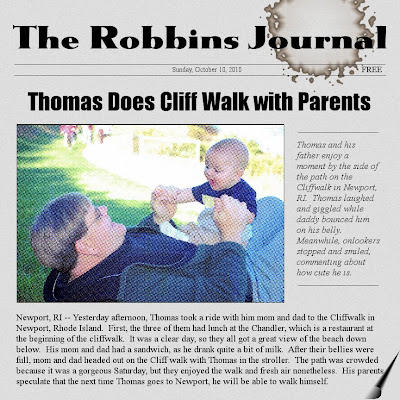
Ever try making a layout that looks like a newspaper? I got the idea when I was playing around with the filters and I found the "newsprint" filter. Go to filters > distort > newsprint.
Ok, so it doesn't look exactly like a newspaper, but getting it perfect would have taken way more time and aggravation than I was willing to spend on this layout.
I set the background layer to a light grey. I added some noise and Gaussian blur to get the desired paper texture. The page curl effect can be found under filter > distorts > pagecurl. The coffee stain (most things in this house get stained from coffee) can be found under filters > decor > coffee stain. Play with different fonts to get the desired look. The text is Times New Roman and I put the caption in italics.
This is a photo I took of my husband and son on the Cliff Walk in Newport. I thought it would be cute to portray it as a "news" report. I'll put it in my bag of tricks and will probably do more of these in the future.
DID YOU KNOW? To draw a straight line, hold the "shift" button down. To draw one that is perfectly horizontal or vertical, hold down the "shift+ctrl" button. I wouldn't have figured out how to draw the lines on this layout without these keyboard shortcuts.

No comments:
Post a Comment