
I remember I used to be so impressed when I saw wedding photos with the flowers in color and the rest of the photo in black and white. I think those photographers impress many people with these tricks, as most of them command thousands of dollars for a wedding.
This trick is super easy to do in GIMP. Just select the area you want to remain in color, go to select > invert, then color > hue-saturation, and a move the "saturation" bar down to -100.
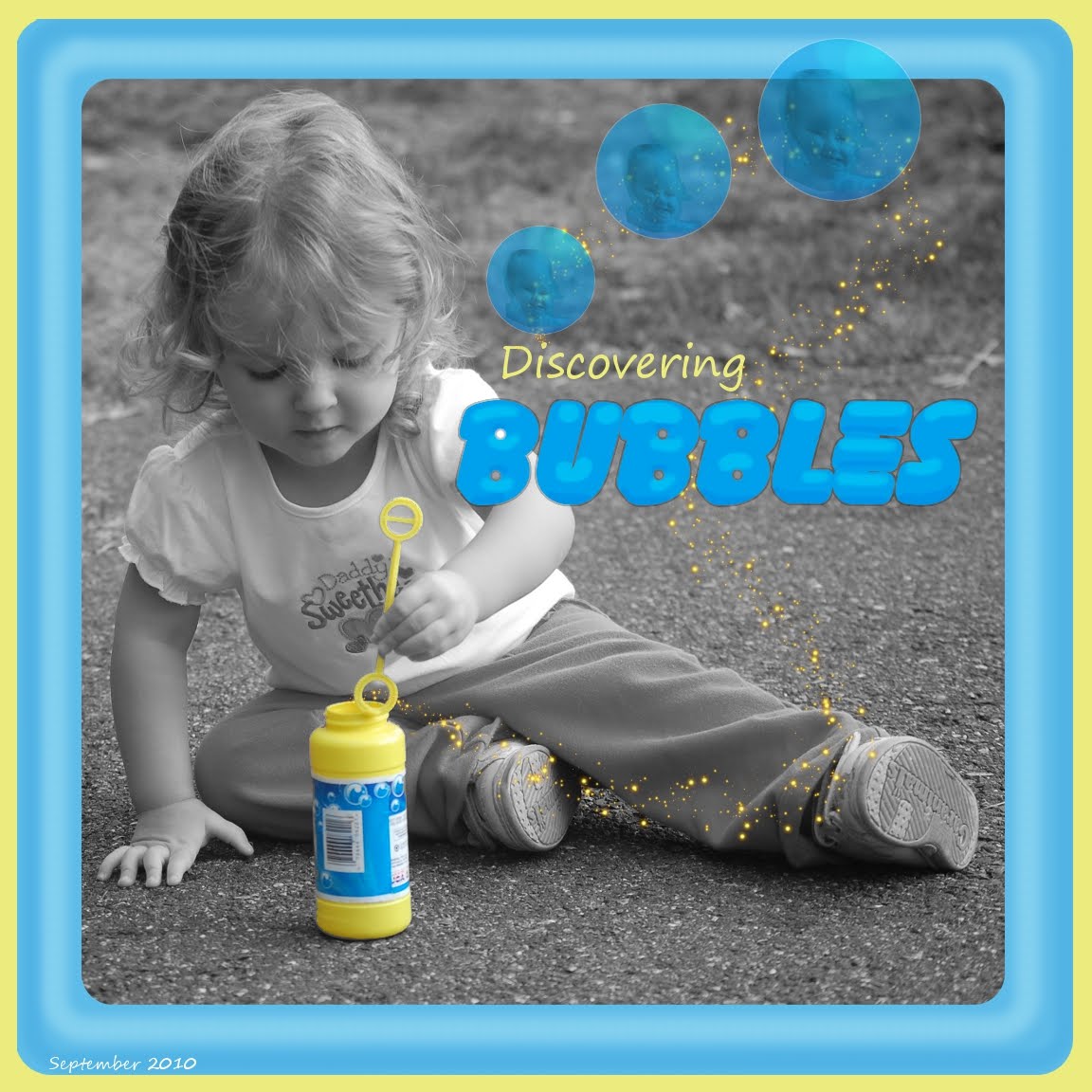
I like to use color splash because I think that a simple color scheme is more pleasing than a layout with every color in the rainbow. For this layout, I think the blue and yellow went well together.
The hard part is deciding which photos to use the effect on. I decided to do a color splash on this photo because the yellow of the bubble bottle was so bright and she was looking at it so intently.
For the bubbles, I painted one and duplicated it twice. To paint the bubble, I simply opened a new layer, made a circle selection, filled it with light blue, and added some dodge and burn. I drew a thin white line around it to make it more realistic.
I added a picture of my daughter's face in the reflection for fun. To give the reflection a rounded look, I did a lens distortion on the face.
I adjusted the opacity down to make it transparent, then flattened the bubble and duplicated the layer twice. I then scaled each bubble to give a little depth perspective.
What colors do you think go well together? I'm going to go through my photos and think of different color schemes to use for layouts.
No comments:
Post a Comment